
Tips from a Pro: The Power of Paint
Writer Meg Fox-
Charlotte Cosby Head of Creative at Farrow & Ball London, with a new U.S. store in Paramus 888-511-1121 | farrow-ball.com
-
As the weather warms this spring, many of us are looking for ways to freshen our homes. Why not start with the front door to ramp up curb appeal?
“Color used outside can have a truly transformative effect,” says color expert Charlotte Cosby, head of creative at Farrow & Ball, the iconic paint manufacturer from England known for its rich pigments and depth of color. The company recently opened a showroom in Paramus.
“Whether you want to complement pale honeyed stonework with modest shades, disguise a home [clad in clapboard or vinyl siding] into its surroundings or make a stunning backdrop for plants and foliage, work with your architectural elements as well as with nature,” Cosby says.
DNJ: The architectural style of our home, the siding, trim, roof color and other factors in the immediate surroundings should all be taken into consideration when choosing a paint color?
COSBY: The architectural style of your property and the period in which it was built are certainly very relevant when painting the front door. For example, traditional and colonial-style houses need only neutrals on their facades and an equally understated color on the front doors, while more ornate or Victorian-style houses can definitely sustain stronger colors. Also take into account dominant features such as brickwork, natural wood and other expanses of color, including paved or graveled areas, lawns, fencing, shrubs and flowers. They should all affect your color choice. The color of guttering or downpipes should be chosen to complement the current color scheme just as the color of a bench under a fabulous blossom tree should be selected to enhance the shade of flowers.
DNJ: Should we look around our neighborhood for color cues? Is there a happy balance between fitting in and standing out? Any common pitfalls to avoid?
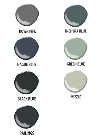
COSBY: In urban settings it is a bit more important to be sensitive to the colors of your neighboring homes; you need to decide whether you want a complementary or contrasting scheme. If the entire street has white trim, it may be wise to follow suit—even the subtlest off-white could look dirty against bright white on an adjacent building. For this reason, charcoal-grays such as ‘Down Pipe’ are now popular on exterior trim because they stand out from the crowd.
DNJ: Is it important for the exterior door color to relate to the interior?
COSBY: Using the same color on the exterior and interior of a house creates a seamless continuity and often makes rooms feel larger; the color of the door should complement and enhance the color tones guests see upon entry. To create this flow, take the wall color of a room, however vibrant, and use it on a flowerpot or bench in the garden, to visually connect the two spaces. If the same color is chosen for both exterior and interior window frames, this helps to blur the distinction between the house and the garden. Of course, if the window frames are also painted the same color as the walls, you will instantly feel more connected to your outside space.
DNJ: How do various lighting conditions—or the degree of sunlight or shade —impact the way the color appears?
COSBY: When decorating the exterior of your home, you can afford to consider a shade that is darker than you might choose for the interior because the light conditions are so different. It certainly makes sense to choose colors that suit the environment, and it is always best to look at possible colors in your immediate surroundings. In rural settings you may want the house to recede into the landscape, while in urban settings it is more important to be sensitive to the style and color of the neighboring buildings. If you’re conflicted, try sampling a few hues to see what works best.
DNJ: Once we’ve chosen a door color, what finish would you recommend: high-gloss, semi-gloss or low luster?
COSBY: One must always consider the paint finish as well as the color for a front door. Exterior Eggshell creates a relaxed feel in soft colors and a more contemporary look in strong colors, for example. Full Gloss, meanwhile, gives a classic, more traditional look and is especially effective in strong colors such as Hague Blue, Black Blue or Railings, which appear both chic and discreet.
DNJ: To ensure the best results, what are the optimal weather conditions for painting?
COSBY: There are so many variables that go into painting—such as the direction your surface is facing, the weather conditions at the time and the palette of the surrounding space—that the optimal conditions will depend on your precise painting situation. I’d advise working with a trusted paint professional or color consultant in your area who can see the surface and the surrounding variables and advise from there.
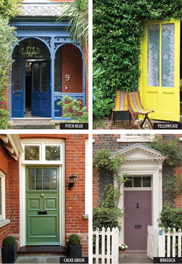
DNJ: The varied-style doors pictured above—painted in an assortment of high-impact hues from Farrow & Ball—make a unique statement. What other shades do you find inspiring?
COSBY: In terms of specific hues, I think Inchyra Blue is a fantastic choice for a front door; the strong color creates a dramatic entrance and complements the expansive sky above. Green Blue is a great selection when working with a stone home, as it complements the variety of tones already on the facade while making a very welcoming entrance. Mizzle, the color inspired by drizzle, is a great use on the exterior of a more neutral home. Inside, Mizzle has a definite blue tone, but outside the blue virtually disappears and it looks like a soft, weathered gray.