
Time for Refreshments
Writer Marirose Krall | Photographer Linda Pordon | Designer Corinne Vassallo | Location Essex Fells, NJIn Essex Fells, it’s out with the old and in with the blue
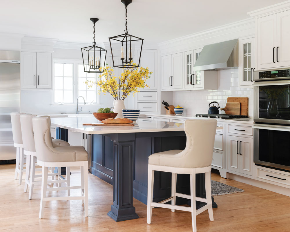
“The wife had a fresh, airy look in mind,” designer Corinne Vassallo says of the project’s goal. Stools at the newly extended island are upholstered in performance fabric. New quartz countertops resist scratches and spills.
“I think most of us can agree that the pandemic forced us to take a second look at our homes,” says Corinne Vassallo of Corinne Victoria Design in Essex Fells, New Jersey. That was certainly true for her clients, who, after months confined to their residence, felt certain areas were in need of a renovation. “With seven people at home all day, those rooms were suddenly starting to feel cramped and impractical.”
Vassallo was tasked with updating the kitchen, breakfast nook and powder room to function more efficiently for her clients’ busy lifestyle while keeping the home’s original footprint intact. Covid, of course, multiplied the challenges. “All this had to be done while the entire family was working and schooling from home.”
Though the clients wanted a new look for their spaces, this renovation would involve more than just aesthetics. “They weren’t looking to just slap some lipstick up,” Vassallo says. “They wanted to make sure the changes also improved the spaces’ functionality and improved their mood.” That’s a tall order, but Vassallo focused on the issues that were important to her clients. “They’re a low-key, down-to-earth family that values functionality and practicality over aesthetics.”

A banquette nestled into a corner maximizes seating in the breakfast nook.
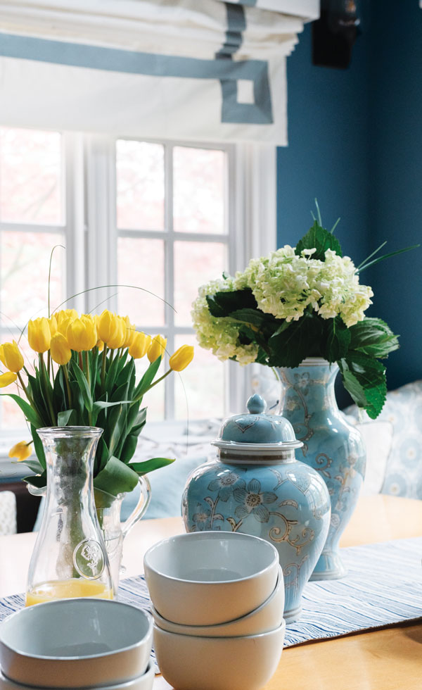
Linens, vases and tableware coordinate with the blue/gray walls.
Vassallo increased the functionality of the kitchen by enlarging the island. “We expanded it so the entire family could sit there together.” In addition to creating more room for food prep and dining, the designer ensured that the furnishings and fixtures she incorporated into the space were up to the task. “We gave the clients a durable new quartz countertop that resists scratches and spills.” The seating is just as resilient. “Those stools needed to stand up to homeschooling, three meals a day, and lots and lots of play dates,” Vassallo says. “We sourced performance fabric to upholster them with so they’ll hold up to the wear and tear of dozens of people coming through the home on a weekly basis.”
To make this gathering space brighter and more welcoming, the designer had the light wood cabinets painted crisp white and then added a deeper tone on the island for interest. “Navy blue paint adds a pop of fun color that energizes and grounds the space.” The color combination is repeated in the powder room, where Vassallo covered the top half of the walls in “a welcoming blue-and-white, pineapple-patterned wall covering.” She chose a coordinating blue-gray color on the walls in the breakfast nook. The rich hue offers a stunning contrast to the trees and shrubs on view through two walls of windows.
Despite the unusual circumstances, Vassallo says, “this house quickly transformed into an easy-to-care-for home that can stand the test of time.” She was able to work through the myriad challenges involved in this project thanks to skilled management of logistics. “We paid extra attention to scheduling to make the most efficient use of time,” she says. “It’s also why we opted for a primarily cosmetic design change, which eliminated the amount of dust and noise and cut down the time frame. We made sure all appliances, fixtures and materials were on site before starting construction to avoid any possible delays. I’m thankful for the wonderful trades!”
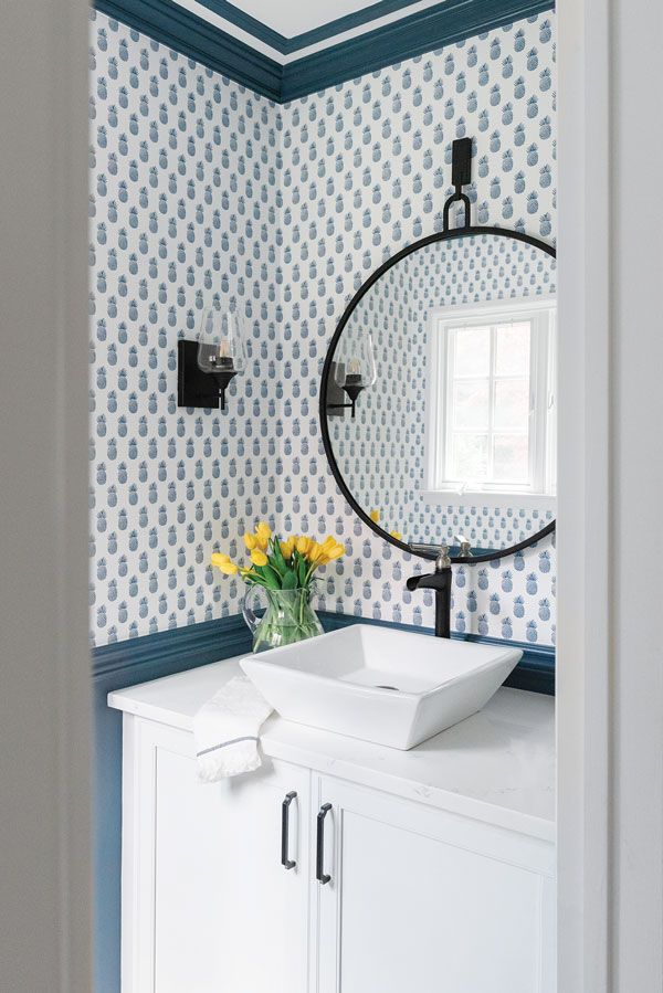
The blue-and-white wall covering in the powder room features a pattern of pineapples —a symbol of hospitality. Black accents on the mirror, faucet and sconces coordinate with the light fixtures in the kitchen and the breakfast nook.