
This Designer Downsized to a Gorgeous Summit Condo
Writer Ren Miller | Photographer Steven David | Designer Hope Sferra | Location Summit, NJ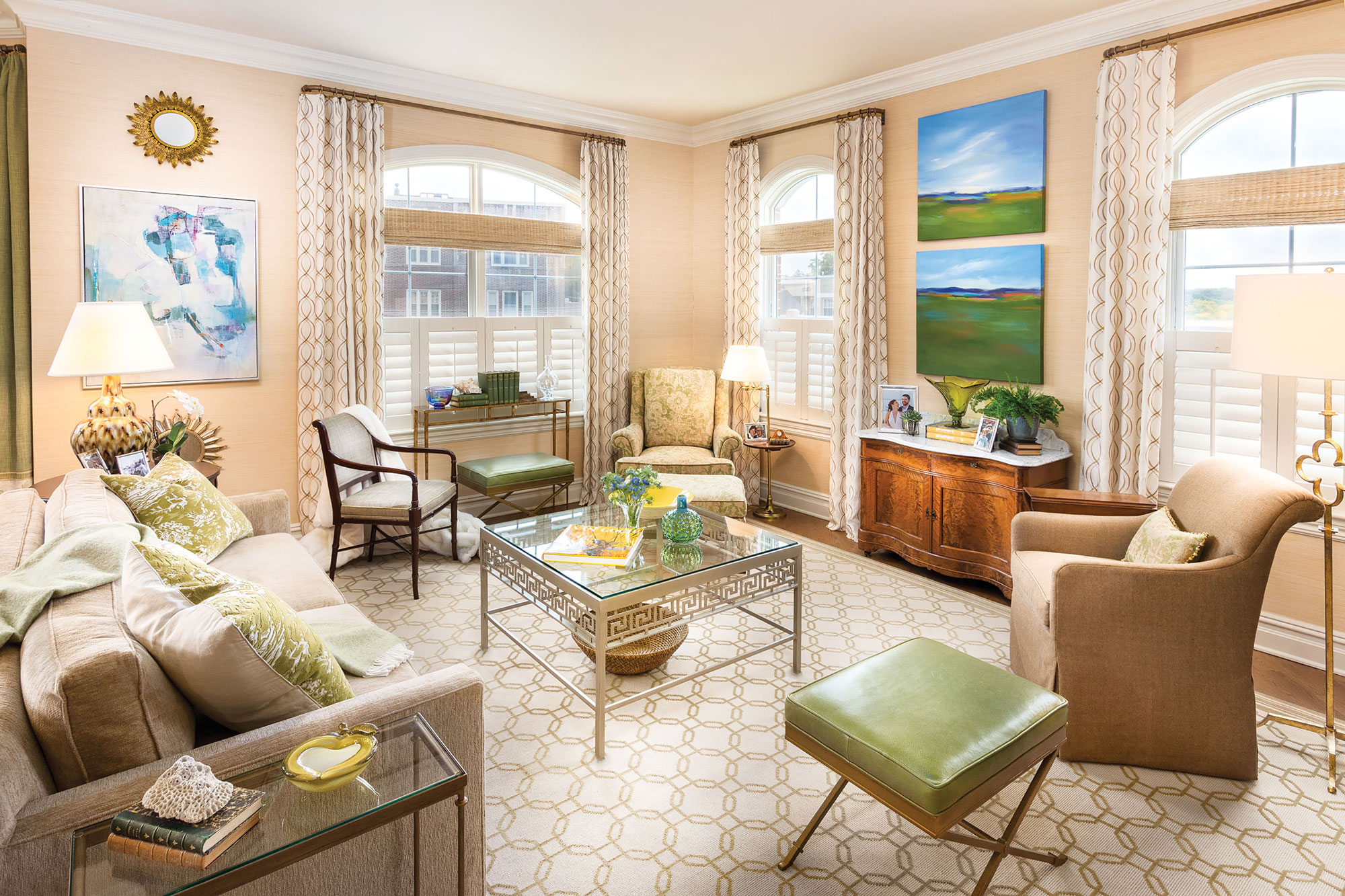
The living room is a place to watch television, entertain, lounge, read books and converse. Despite limited space, the room seats up to 10. Sferra wanted the space to have a soft feeling and a pared-down appearance. She designed the rug with tone-on-tone latte-colored yarns in a loop-and-cut pile combination to add subtle texture. The fabrics are textural also, including a loosely woven raw silk on the wing chair, a green leopard pattern chenille on the ottomans and chenille also on the sofa. She commissioned two paintings to hang above the 1880 serpentine cabinet, one of the few pieces she brought from her previous home.
Designer Hope Sferra leaves behind her big family home—and its demands—in favor of a new condo in Summit, New Jersey
After her son got his own place in Hoboken, New Jersey, and her daughter moved to Manhattan, interior designer Hope Sferra surveyed her empty nest and decided it was time for her own change. Her 3,500-square-foot home — complete with living, family and recreation rooms along with two offices, a dining room, eat-in kitchen, four bedrooms and 3½ baths — was just too big. “It was too much unnecessary space to maintain and simply live in,” says Sferra, a state-certified interior designer, allied member of the American Society of Interior Designers and owner of Hope Sferra Interiors Inc.
Around the same time, she heard about a new condominium building under construction in Summit, NJ. “Timing is everything,” she says. “I thought about what a great location Summit would be for me. The building is a short walking distance to the train station and the center of town. That lifestyle—walking into town to grab a cup of coffee, have dinner, go to the pharmacy or bank, and do other errands—was so appealing. Summit is centrally located for my work, family and activities.”
She knew that moving to the condo — at 1,927 square feet — would require major downsizing. “I lost tons of storage space with fewer closets, no attic or basement” and the loss of other space that came with her previous home, she says. “But I was ready to edit, reduce and cleanse. I have found it very freeing to own less.
“We should surround ourselves with things we love, [but] we all need so much less than we think. If something no longer brings you joy, it is time to say goodbye.”
Although the downsizing had advantages, not everything was smooth sailing with the relocation. Sferra had to choose from among four predetermined builder packages of appliances, cabinetry, fixtures, lighting, tile and flooring with no interchanging. Even simple changes that would better suit her needs — and that could have saved the builder money — were not allowed, she notes. “In some cases, I settled for choices I did not like; essentially I bought location and a lifestyle more than I bought a dream product. I knew I could make some small but significant changes once I moved in, stay within a budget and make the condo work for me.”
The dining area, located between the living room and kitchen in the open layout, features an alder trestle table with hidden extensions that Sferra designed.
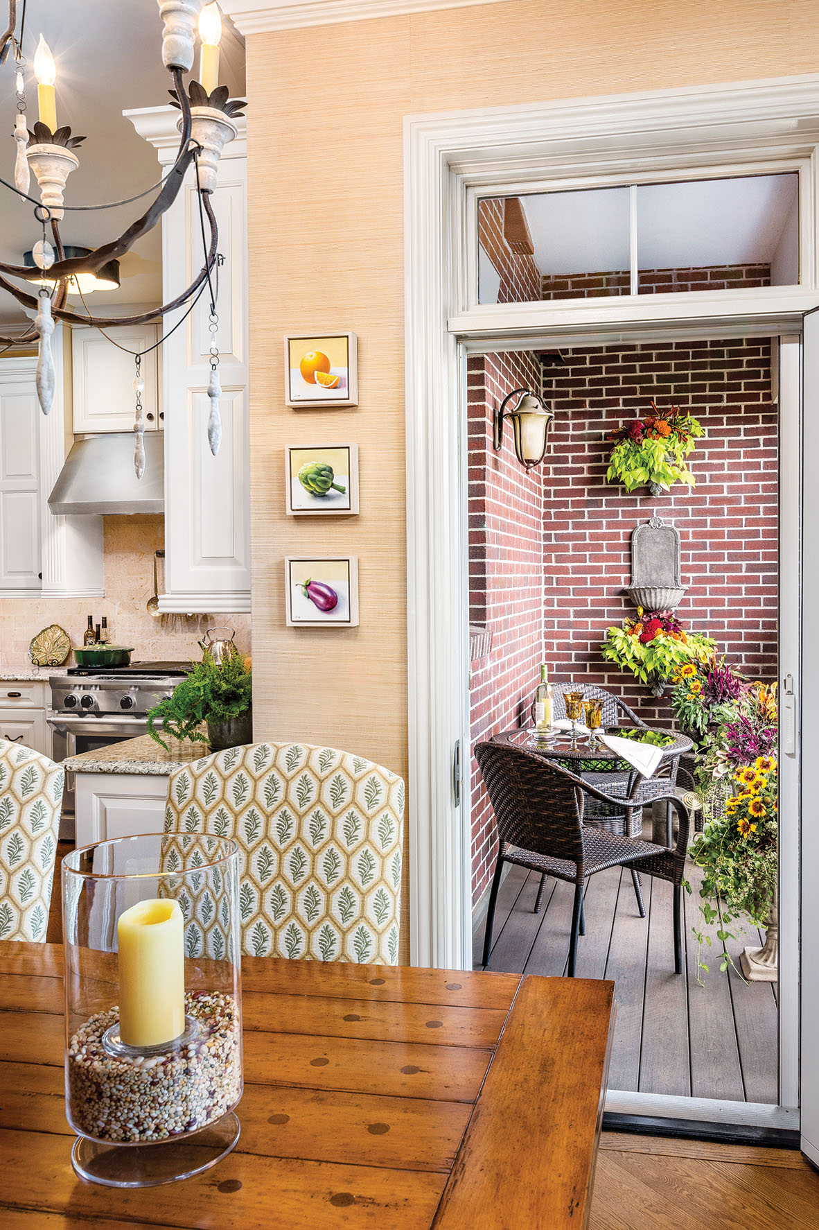
DINING AREA + PATIO Surrounding the table are chairs upholstered in a green, yellow and ivory pattern that repeats the living room and kitchen palettes. The table easily seats up to eight people at 46 by 72 inches and up to 14 people when the extensions are pulled out on both sides. On the terrace, Sferra added wall planters. It’s a lot less space than the patio with landscaped shrubs and gardens at her former residence, but she has enough space to sit outdoors with a book or enjoy a meal—and she doesn’t miss the maintenance. Sferra commissioned the three oil paintings of fruit from Elaine Kurie, whose style she describes as reflective of the realism of Vermeer.
Sferra chose a floor plan with living room, dining area, kitchen, two bedrooms, a den, 2½ bathrooms and laundry. “It’s a corner unit with wonderful light and views,” she says. The foyer separates a guest suite, her design office and a powder room from the master suite and laundry — “a great privacy advantage,” she says. The dining area and living room flow from an open kitchen and lead to a terrace. “It’s ideal for entertaining,” she says.
Several of the significant changes she made were in the kitchen. She designed additional cabinetry for a wall perpendicular to the island. Although the original cabinetry is painted cream, the new cabinetry (not shown) has a warm cherry finish and features a transitional door style. “More cream would have been overwhelming, plus I like mixing and contrasting finishes in kitchens and bathrooms,” Sferra says. “The new cabinetry cleverly houses and hides catalogs and materials I use for my business,” she adds. “I was sure to incorporate hidden electrical outlets in what can double as appliance garages for resale value.”
The designer replaced matching brushed chrome knobs that she describes as “mundane” with four kinds of aged-iron hardware: cup handles, drop pulls, pull handles and knobs. Because she also wanted a less fussy and pared-down look for the condo, she removed applied carving from the range hood, plinths and columns. She also installed some additional molding in select areas, including the kitchen ceiling and picture-frame molding in the master bedroom. “The 10-foot ceilings are very generous,” she notes.
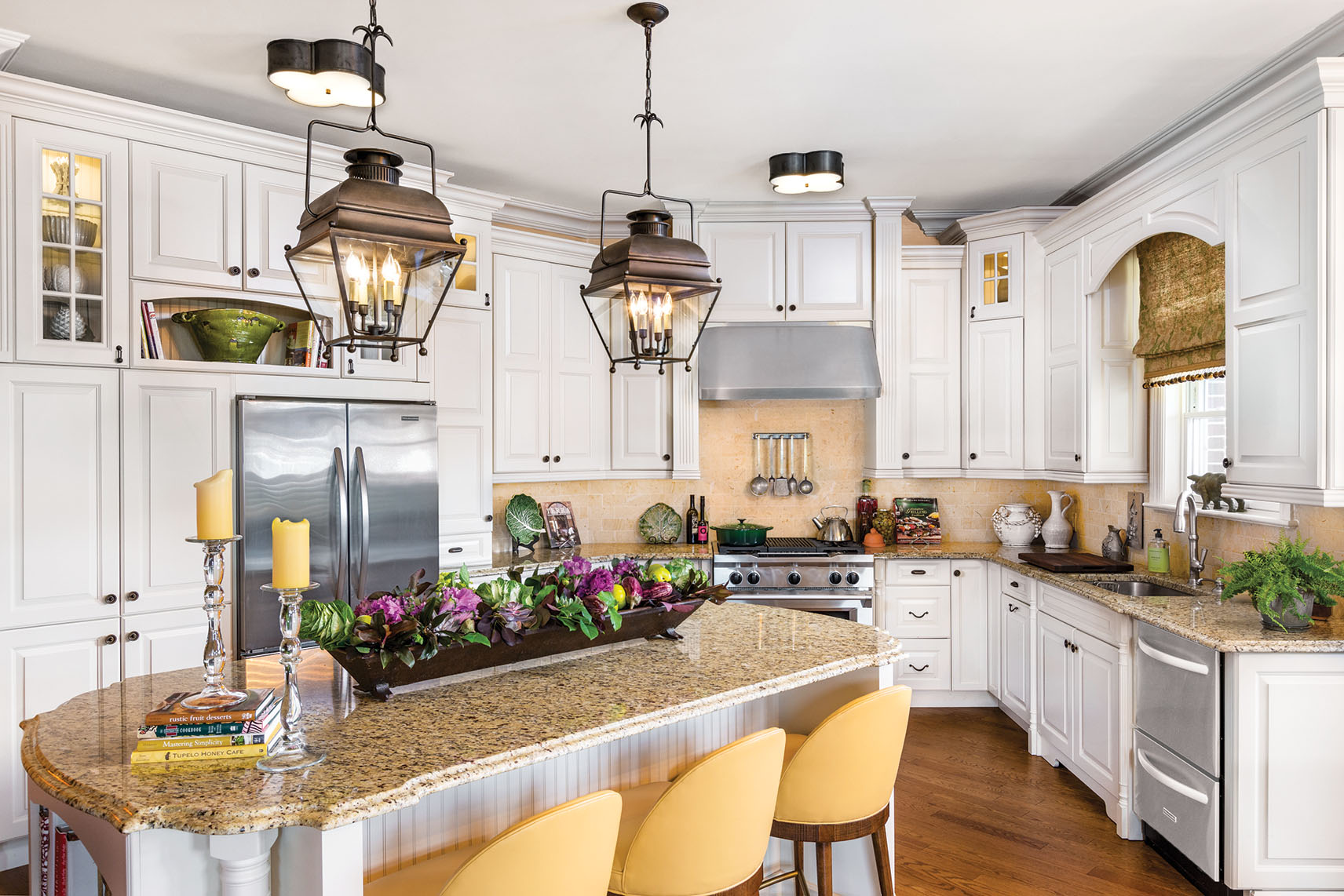
The designer modified the builder package of cabinetry by replacing wood shelves with glass for better spread of light in the glass-front cabinetry, eliminated one section of cabinetry to make way for a wine refrigerator and removed applied carvings for a simpler look.
KITCHEN “I am not a particular fan of granite countertops, and felt the scale and size of the center island is enormous,” she says. So she snatched up an 1880s pig trough originally from a Pennsylvania farm to fill with colorful seasonal items that divert attention from the mass of granite. Not shown in the photo is a new wall of cherry-stained cabinetry perpendicular to the island.
Those generous ceiling heights and room sizes also enticed Sferra to focus on wall finishes. “The foyer has a wonderful English floral wall covering,” she says. “The kitchen, dining room and living room are wrapped in a buttery grass cloth that adds texture and character. The bedroom walls are a combination of a very subtle geometric pattern below the applied molding and a high-gloss, almost lacquer-like finish above.
Sferra also paid close attention to the ceilings, just like she does in clients’ homes. “I consider them the fifth wall,” she notes. “Whether I add a blue tint to mimic the sky above, as I did in the master bedroom, or use a decorative wall covering, that detail can add more dimension to the room.
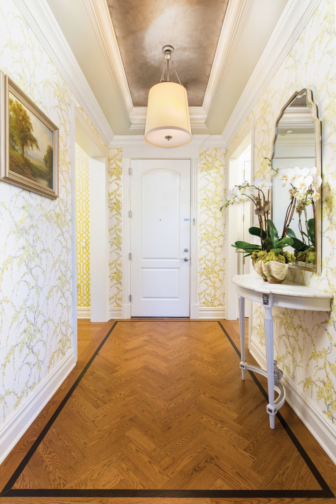
The wall covering inspired the design of the foyer.
FOYER “With so much negative space in the pattern,” the designer says, “I knew it would envelop and not overwhelm the foyer.” The metallic silver and graphite shades in the wall covering reappear on the ceiling. The French Louis XVI demilune console mounts to the wall, making a statement but not protruding into the foyer as much as a full console would have. The herringbone-patterned flooring has an outside 5-inch oak border and a 1½-inch walnut inset. Sferra collaborated with Laura Clare Floral Design in Bernardsville, New Jersey on the arrangement of orchids in an organic vessel. “It adds to the feeling of approachability as you enter,” Sferra says.
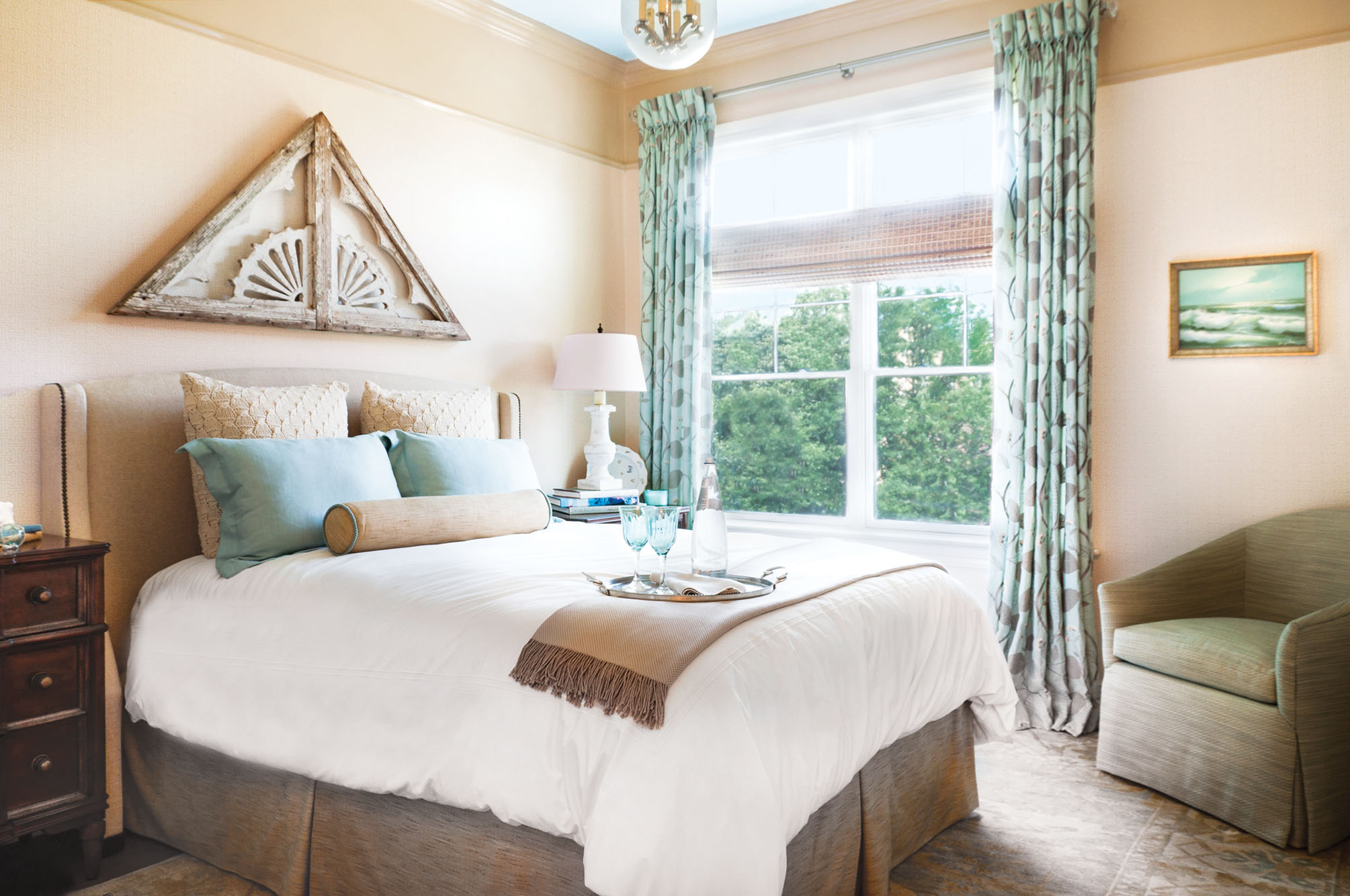
Serene and inviting were the goals for the master bedroom, achieved with embroidered fabric in mineral blue at the window, a subtly patterned rug, a headboard upholstered in a textured neutral shade and a small-scale geometric-print wall covering. The ceiling is painted a restful blue. The wood art above the bed was part of the exterior detailing on the gable of a seaside house in Newport, Rhode Island. “The weathered patina is exactly as the antiques dealer found it when he visited the property,” Sferra says.
She also replaced light fixtures room by room. “This is one of the most-overlooked design errors a homeowner can make,” she says. “Proper lighting choices can be pivotal.” In the kitchen, for example, she replaced chrome ceiling fixtures with two aged-iron lanterns and added quatrefoil-shaped ceiling fixtures as well to keep the room bright.
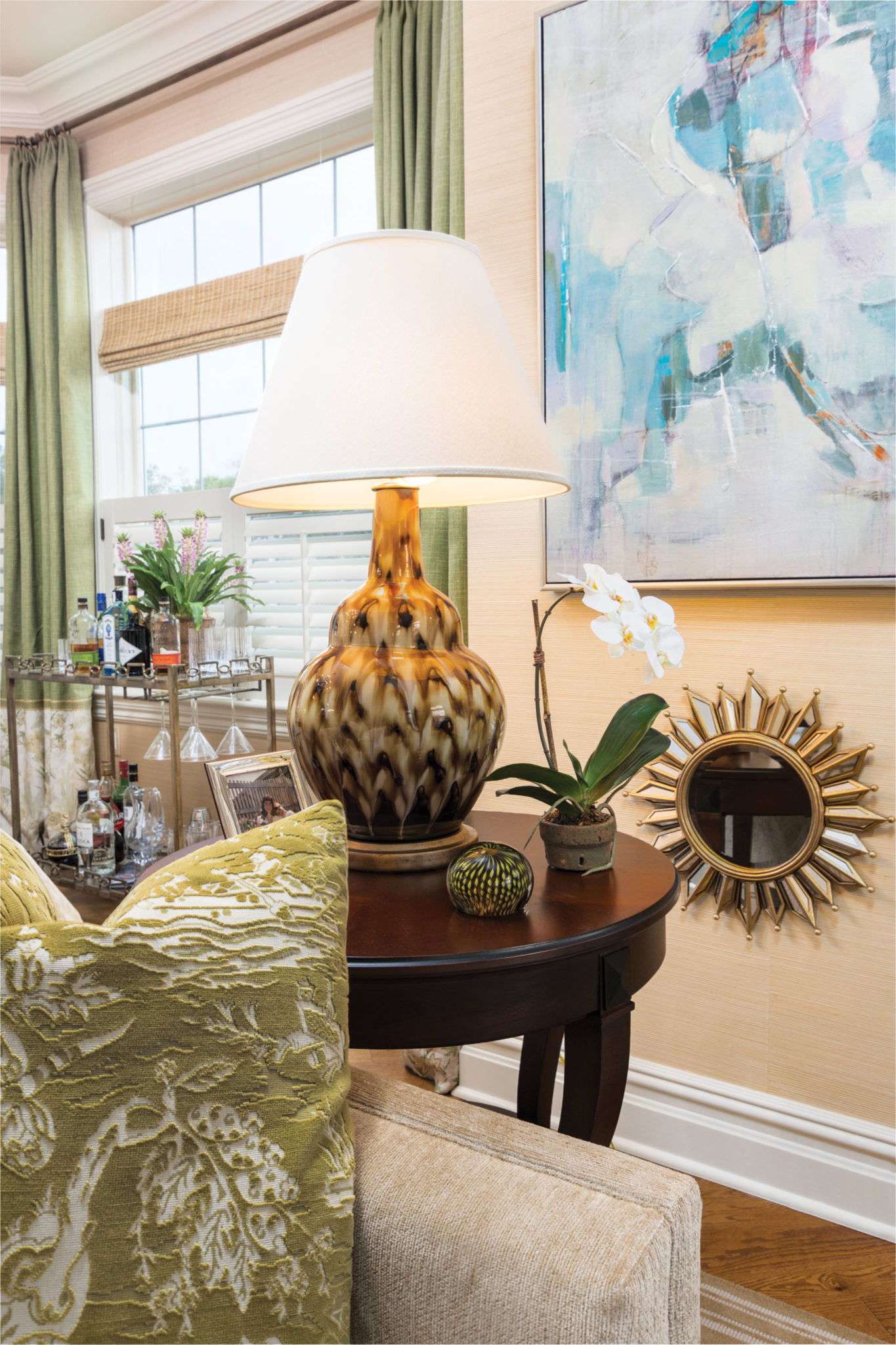
When choosing furnishings for her new home, Sferra was able to balance some of the limited-space issues with the large open areas and high ceilings. From any part of the foyer, kitchen, dining area and living room, the eye has a view to the other spaces, so they had to harmonize visually. To accomplish that and to achieve the approachable aesthetic she wanted, Sferra chose warm colors and warm woods, avoided highly patterned fabrics, added some antiques for interest and focused on seating that looks as comfortable as it feels. “Upholstered pieces should beg you to come sit in them,” she says. None of this furniture says “don’t sit in me.” She didn’t bring many pieces from her former home. “I was not particularly attached to a lot of the furnishings I owned, and many were just too large in scale.”
The fabrics are textural also, including a loosely woven raw silk on the wing chair, a green leopard pattern chenille on the ottomans and chenille also on the sofa. She commissioned two paintings to hang above the 1880 serpentine cabinet, one of the few pieces she brought from her previous home.
The color palette for the main areas encompasses warm neutrals, gold, leaf green and citron, an easy-on-the-eye combination, she says. The designer used eight kinds of wood in the main areas to create layers of character and interest. In the living room, for example, there is everything from an 1880 walnut Victorian Renaissance Revival washstand between two windows to a modern gilded console under a large window. “This combination of styles is always a delicate balance and demands an educated eye,” she says.
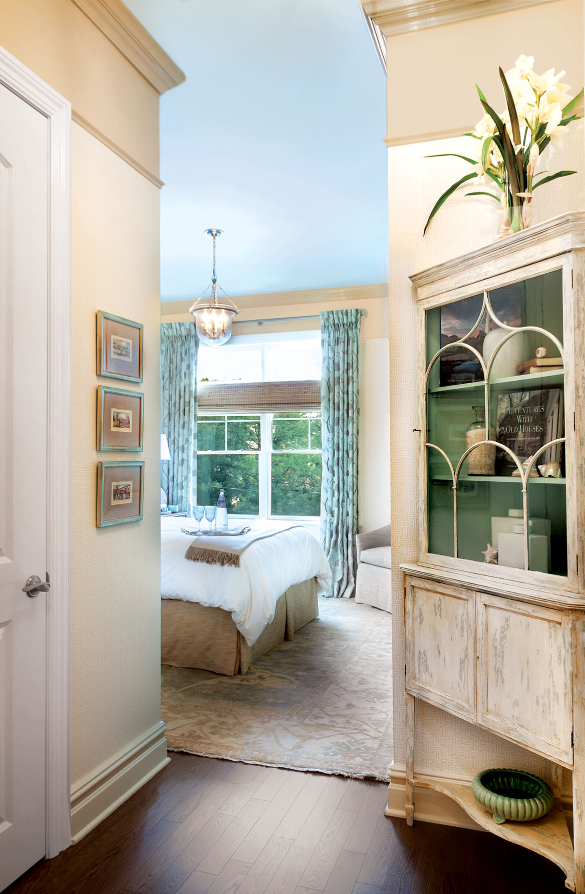
To furnish what Sferra describes as an awkward alcove in the entrance to the bedroom, she found an antique mahogany Hepplewhite corner cabinet. She added shades of blue to lighten and “de-traditionalize” it.
In the master bedroom, the designer’s primary goal was to create a space that is serene and inviting. The palette of sea-glass blue and warm neutrals creates a decompressing feeling. “I love being near water because it’s so relaxing, and I wanted to bring that feeling to this room,” she says. “I introduced many water elements reflective of the sea — but less nautical and more sophisticated — including simple lined drapery panels with embroidery fabric in mineral blue over woven wood blinds and a handmade oriental rug to ground the room.” The walls are covered in a small-scale geometric pattern in the same neutral color as the upholstered headboard. For what she calls an awkward alcove at the entrance to the bedroom, Sferra found an antique mahogany Hepplewhite corner cabinet. She “de-traditionalized” it by adding a shade of blue to the interior.
Today, as her lifestyle evolves, Sferra knows she made the right choice to move into the condo.
“It wasn’t a move I planned for,” she says, “but it became very clear the advantages the move would have for me.”