
Sense and Sensibility
Writer Marirose Krall | Photographer Raquel Langworthy | Designer Kerri Pilchik and Kristina PhillipsA Ridgewood home marries high style and high function
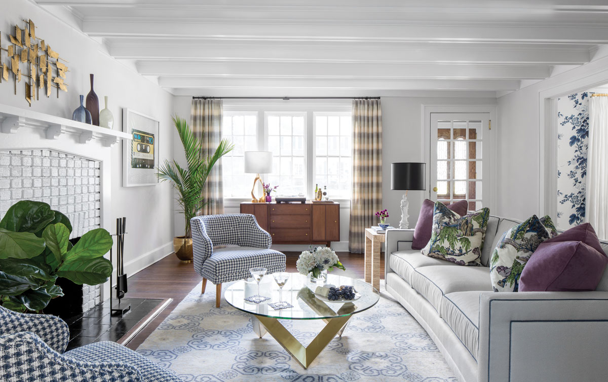
“The house is a 1920s Tudor and, as such, has low ceilings and small windows adding up to a dark and stodgy interior, not at all like its new inhabitants,” says interior designer Kristina Phillips. White paint makes the ceiling appear higher. The cassette tape art to the right of the fireplace is a nod to the couple’s love of music.
For two world-traveling movers and shakers, relocating from a city to this 1920s Tudor in the suburbs was all about settling in without losing their edge. “Having moved from hip and trendy Astoria, NY, the owners were looking to retain some of that urban flair,” says interior designer Kerri Pilchik of Ridgewood-based K + K Interior Design. “They requested that we make the spaces feel bright and hip.” At the same time, the clients also requested practicality for their family. “We wanted to create an atmosphere in our home that was vibrant and sophisticated, but comfortable and not overly fussy,” says the homeowner.
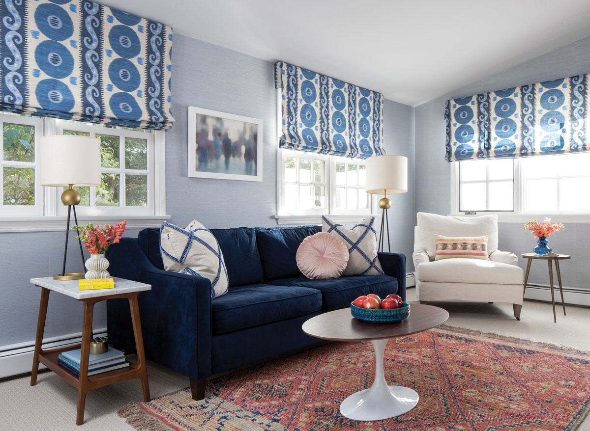
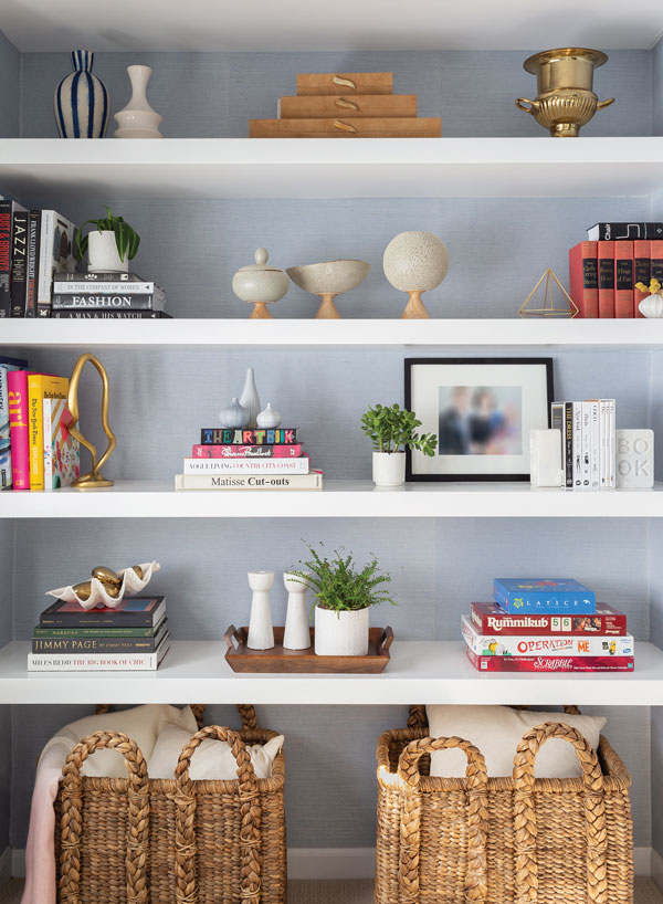
“The cozy family room is all about the couple relaxing with their two young children after a busy day at work,” says Phillips. “Custom Roman shades in a fun ikat pattern can be lowered for privacy or to block the abundance of light.” The family room, which was an addition to the home, “lacked storage, character or any kind of millwork,” says Pilchik. “We covered the walls in a watery blue grasscloth to draw the eye up and designed custom floating shelves in an empty niche to store books and mementos.”
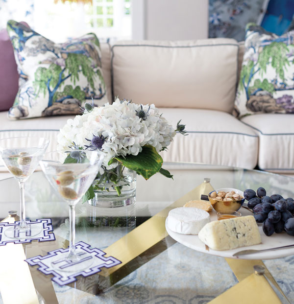
 Though the family’s lifestyle may have changed, their aesthetic hadn’t. “We wanted it to be functional,” explains the homeowner, “but we weren’t willing to compromise on style and quality. We love having friends over and entertain often; but we’ve traded intimate dinner parties for pizza and wine nights for our friends with kids.”
Those laid-back evenings often take place in the dining room where the wife’s love of the Greenbrier Hotel in West Virginia was the inspiration for the bold floral wallpaper. “It was one of the quickest design decisions we made,” she says. “It still makes me smile whenever I walk through the room.” The lively blue wall covering makes an emphatic statement alongside the simpler lines of the midcentury modern table and chairs.
Other rooms feature midcentury elements as well. Kristina Phillips, Pilchik’s partner at K+K, says, “We chose a walnut tulip coffee table for the family room, houndstooth fabric for the living room chairs and a wool striped fabric for the living room drapery.” These components represent an homage to—not a replica of—midcentury design. They are “forever chic and up to date,” notes Phillips. “They’re a nod to that era, but very current.”
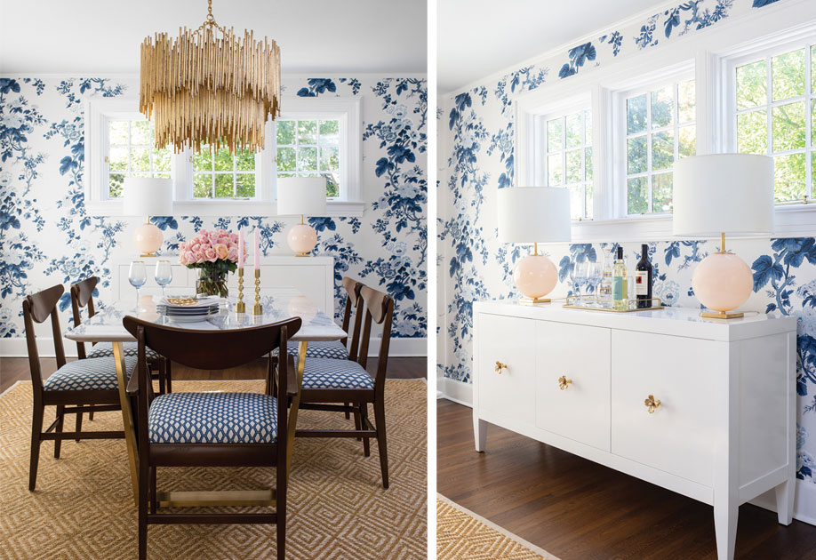
The midcentury modern dining room set was passed down from a great aunt. The wife says, “The chairs were refinished and recovered in a gorgeous fabric. I love how we’ve given these heirlooms a fresh look.” The light fixture was at the request of the homeowner who “wanted a glamorous chandelier to set the mood for dinner parties,” explains Pilchik. Of the dining room wallpaper, Phillips notes, “We used Schumacher’s Pyne Hollyhock pattern, which was created in the 1960s and re-introduced in 2010. It is the epitome of a timeless classic.” The wife adds, “When the designers presented it, I couldn’t say yes fast enough.”
The homeowner loves that her house is chic, yet welcoming. “There is a sense of formality, but also familiarity. The chairs are meant to sit in; the tables are meant to eat on; and, of course, the coasters are made to hold a drink.”
In addition to the midcentury elements, the designers “used colors and patterns to help tie the rooms together,” according to Pilchik, but gave each room “its own subtle accent color.” Blue is a constant from room to room, but in the dining room, pale pink lamps and rose quartz stones in the credenza hardware subtly contrast with the vivid wall covering. In the living room, sofa pillows and glass vessels on the fireplace mantel introduce violet into the soft grays and blues of the space. “The family room has a soft blue hue on the walls, with a bolder blue ikat pattern on the windows and coral pink accents in the area rug and throw pillows,” says Pilchik.
While the design is smart and stylish, it’s also durable. “With two young children, the home had to hold up to the rigors of family life,” notes Phillips. In the family room, “the white occasional chair is slipcovered so the cover can be removed for cleaning. We used performance fabric on the living room sofa, and a 100% wool area rug that naturally resists spills.” The homeowner can attest to that. “One of the pieces we love is the white couch in our living room. It was customized with a durable fabric, which looks beautiful and is also stain resistant. It was recently put to the test with cherry fun-dip—and passed!”
It’s clear that Phillips and Pilchik took time to understand the homeowners’ lifestyle. “The most important consideration to us is to listen to our clients’ needs and wants and implement them as best we can.” The homeowner appreciated that strategy. “They made it as easy as possible, and so much fun.”