
Renovation on Ridge Road
Writer Meg Fox | Photographer Mike Van Tassell | Designer Jaclyn Isaac | Location Rutherford, NJ
Designer Jaclyn Isaac with husband Anthony and dog Daisy.
Doni Douglas Design in Shrewsbury | 201-691-7546 | donidouglasdesigns.com
Interior designer Jaclyn Isaac, principal of Doni Douglas Design in Shrewsbury, New Jersey, loves a home with history. That’s among the reasons the self-described “serial old-home lover” and her husband, Anthony Frasciello, purchased a turn-of-the-century colonial-style home on Ridge Road, one of the grandest streets in Rutherford, New Jersey.
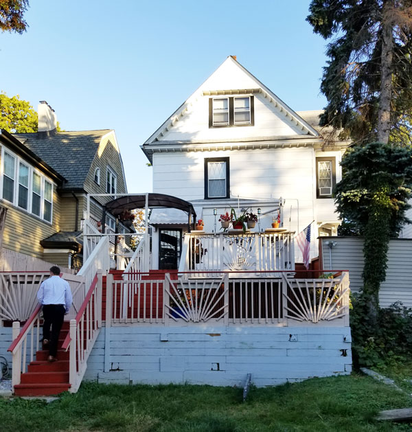
A.L. “Abram” Watson, a prominent real estate owner and agent, was the original owner of record in 1899, Isaac says. Surely, Watson would have balked at its current worn and weary state — and years of unfortunate alterations — until Isaac and her team recaptured its classic Colonial soul. “We wanted to bring her back to her former glory,” Isaac says. For one, “It was clear it needed its ‘Rutherford porch’ back.”
We share excerpts from our conversation with Isaac — along with her insights and tips — from the couple’s two-year renovation journey:
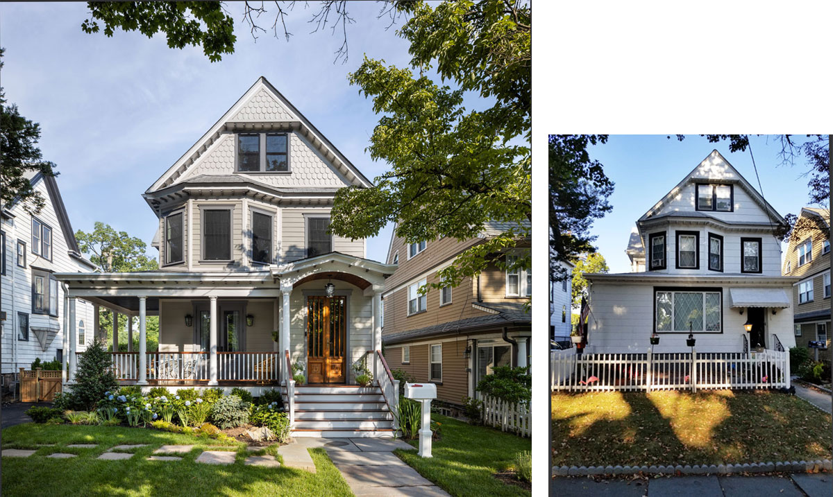
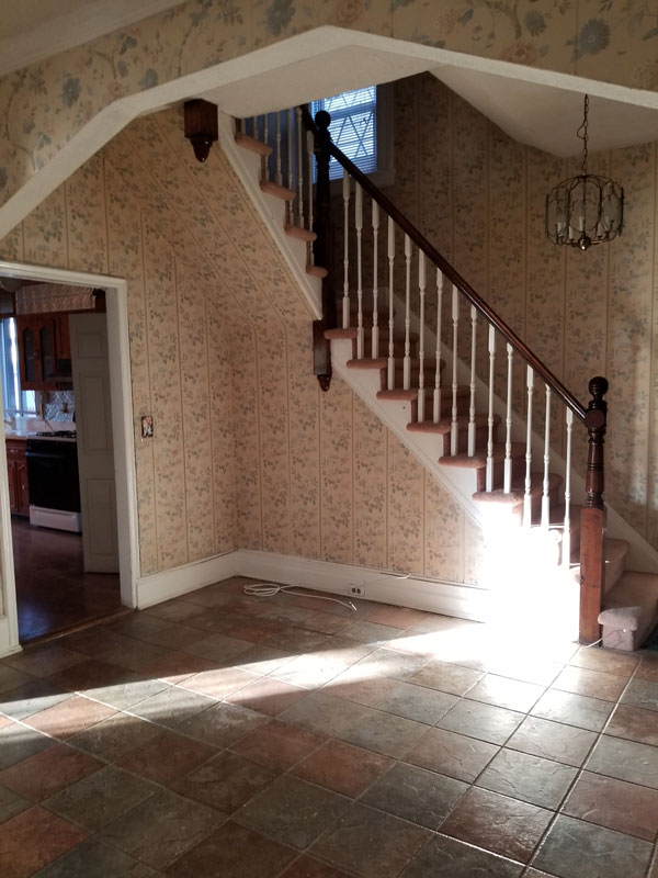
The exterior received a complete facelift along with a new porch and portico to return the home to a classic Colonial look. | Before: Built around the turn of the last century, the home was subjected to alterations over time. “We were told by a historian it was probable the home had a porch because the interior porch that was enclosed had exterior siding,” Isaac notes.
MEG: How did the current condition of the home influence — or challenge — your design direction?
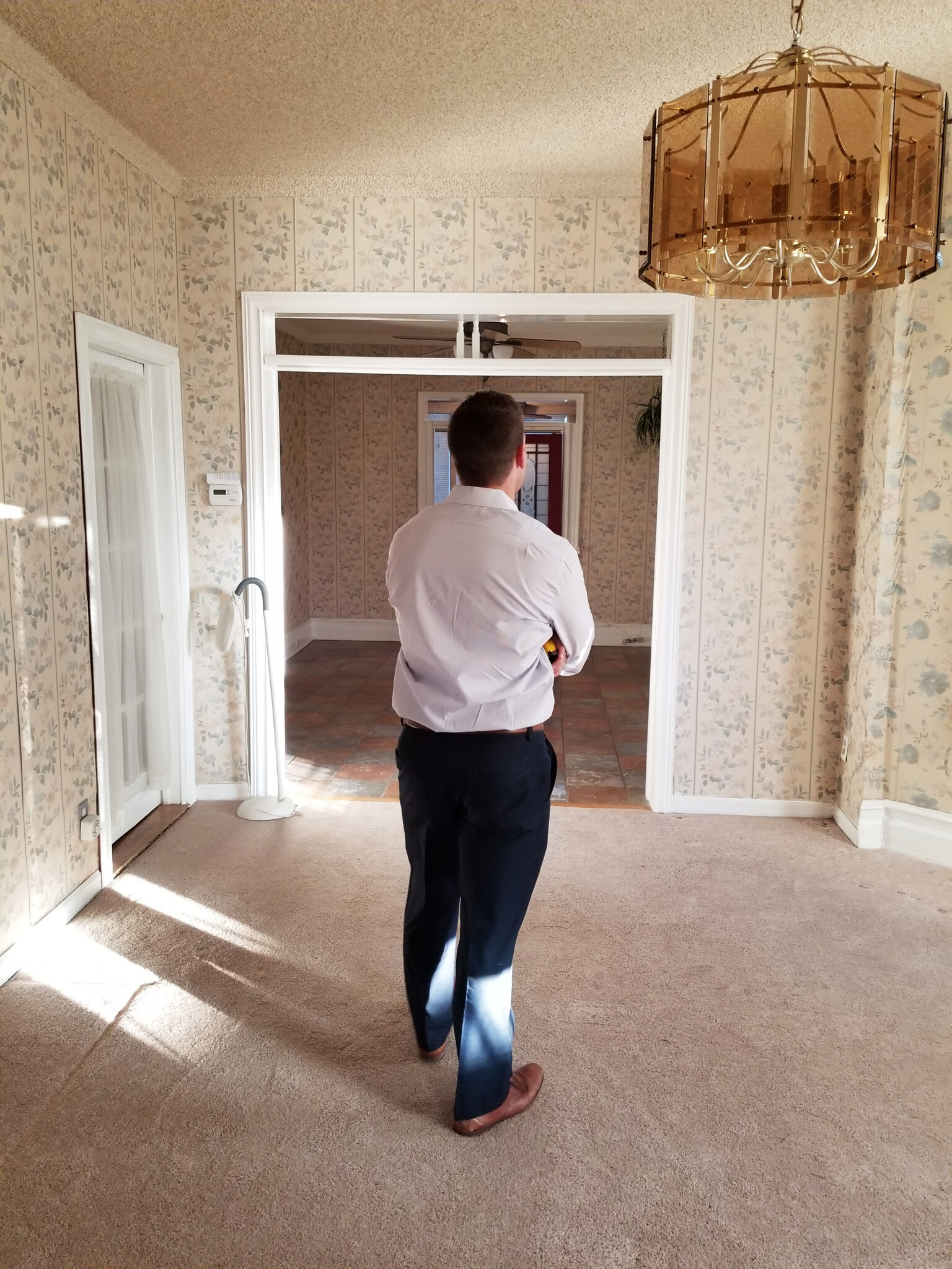
JACLYN: We approached the renovation with the idea that perhaps we would find hidden treasures: original wood floors, tin ceilings, old wallpaper or original tile. Most of the original details however, were so poorly maintained and altered they were not usable. The only items that remained after our gut was the stair baluster on the interior main level; the fireplace stack, which we were able to expose in a spare bedroom upstairs; and the bead-board ceiling on the porch. Thankfully, we found the latter nicely tucked under the insulation!
MEG: The exterior had certainly seen better days. How did you turn the ugly duckling into a swan?
JACLYN: I like to say we gave her a facelift because it was nearly unrecognizable once we started to remove all of the exterior layers, which were replaced with new Pella® windows, CertainTeed® trim, a Timberline® roof and James Hardie® siding and decorative scallops. The porch was completely rebuilt, including the structure. I was so obsessed with using real wood that we used mahogany on the porch despite our contractor’s insistence on using a more durable synthetic product like Trex®. We also used real mahogany railings. The way they patina and age over time is totally worth it!
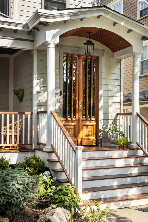
The vintage doors and portico — sourced from Recycling The Past in Barnegat — once adorned an old brownstone in Brooklyn.
MEG: The portico and antique doors are defining features. Do they have a history?
JACLYN: We custom designed the portico and salvaged doors from a brownstone in Brooklyn via Recycling The Past in Barnegat. Amighini Architectural in Jersey City was the source for the vintage hardware.
MEG: Did you reconfigure the interior layout?
JACLYN: We ended up keeping much of the interior floor plan, but we gutted the place to the studs. The interior renovation took seven months and the exterior renovation took eight months. In that span we fired an exterior contractor and worked over winter. We did the interior first so we could move in and tackle the exterior separately.
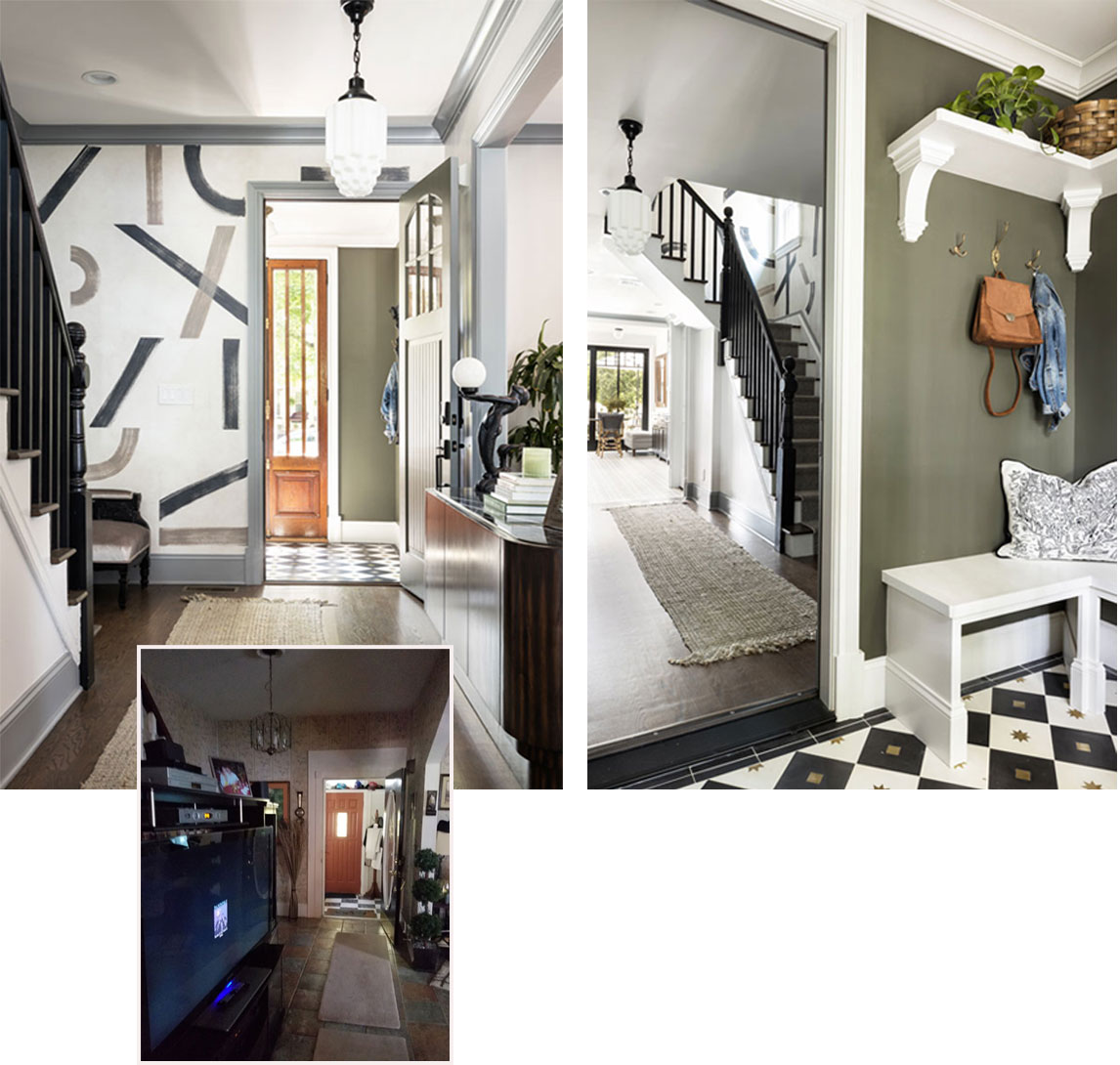
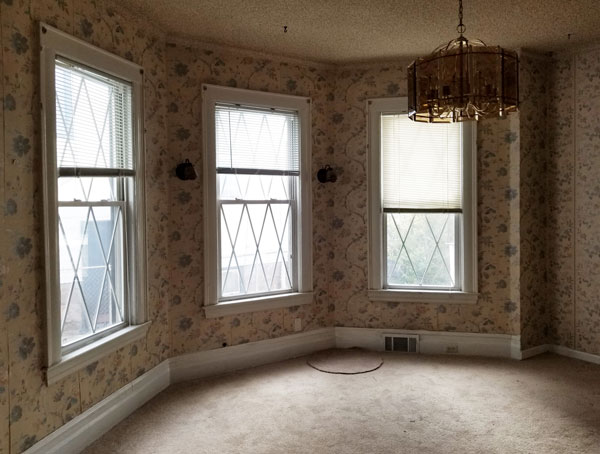
Left: A hand-painted mural modernizes the foyer, where original balusters were restored. The vintage front hallway light came from an old salon that was rehabbed in Philadelphia, says Isaac. | Right: Carving out space for keys, coats and other necessities kept clutter at bay in the small vestibule. Walls are painted in “Dark Olive” by Benjamin Moore. | Before: The existing hallway was a hodgepodge of activity with almost no original hallmarks of the home left intact.
MEG: How did you make the small entry vestibule more welcoming and functional?
JACLYN: We were so excited to rip out the black checkered vinyl flooring and replace it with something more modern and, dare we say, a classic! I saw this brass inlay tile from our representative at Cemento and nearly fainted. That was the first item I picked for the interior renovation. It’s a cement tile and super-high maintenance, but with a monthly sealer application and frequent cleaning, these tiles are beyond a statement. After assessing organizational needs, we got a great looking vintage umbrella holder, crafted floating shelves to hold baskets for winter hats and gloves, and hung hooks I picked up from a flea market in Florence for dog leashes and coats. An oversized mirror plopped on one wall (not shown) opened up the entire room.
MEG: What inspired the modern mural painted by Heather Jozak Studios?
JACLYN: Heather and I share a special creative bond, and I let her guide the design incorporating colors from tiles in the adjacent kitchen. To make the full wall mural make sense, Heather drew out the planned locations of each brush stroke in individual boxes and then planned to erase the lines after she was done. In the end, we really liked the look of the boxed lines so we kept it! Everyone who came in thought it was custom wallpaper. The beauty of this is that if someone ends up disliking the mural after a few years or wants a fresh start, they can simply paint over it. But I think Heather’s work will live for a long time.
MEG: The stair balusters were original but not much else. How about the flooring?
JACLYN: We so wanted to save the existing wood flooring, but there were so many large holes and missing sections it was beyond repair. Consequently, we used 4-inch red oak flooring in a Provincial Minwax® stain in the hallway and elsewhere. I was very concerned about the tile-to-wood transition in the open areas so we made sure the flooring was flush at each area. Our contractor employed the old-school technique of a “mud job” for the tile install to ensure the tile could be installed flush.
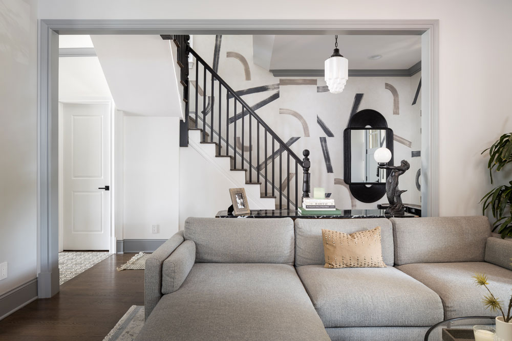
MEG: Describe the transition between the foyer and main living areas.
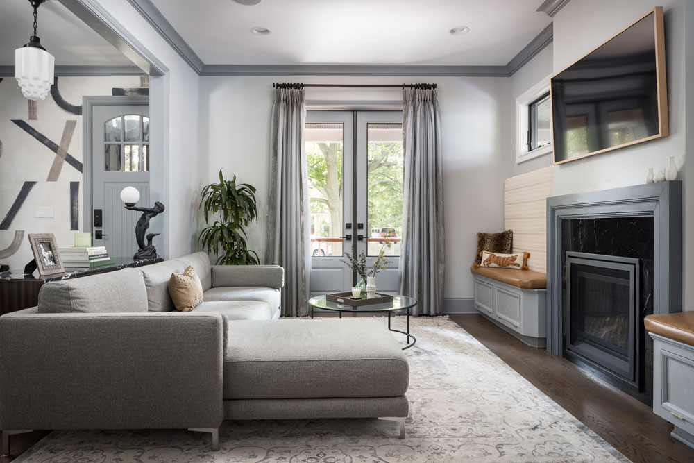
JACLYN: Sight lines are extremely important to me as a designer. I focused on ensuring a clear line of sight from the entryway to the back door. In doing so, we switched the direction of the living room to face the opposite direction. We also added a gas fireplace as a focal point with two banquettes for additional seating and storage on either side.
MEG: How comprehensive were the structural changes?
JACLYN: The living room was existing, but we added a bump-out for a gas fireplace and opened up the pass-through to the living room, kitchen and dining room as much as possible. I’m not personally a fan of open concept, but I wanted the home to feel like it had a modern layout. We always receive compliments about how open the flow feels. We didn’t have to knock down a ton of walls, install an expensive beam or get an architect involved to do so. That would be my tip for those who prefer an open layout but don’t want to deal with the headache of structural changes — or frankly, having to designate separate spaces for all different activities in one open room. Open up walls as pass-throughs. Furnishings, outlets and lighting need walls!
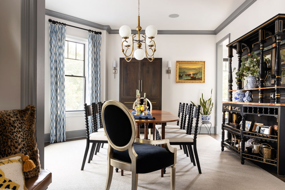

MEG: How did you alter the dining room, which is located off the living room? Did you incorporate any special finds?
JACLYN: We ripped this room to the studs and installed new lighting, windows, flooring and fresh new drywall. The table is a refurbished piece from Facebook Marketplace. It still had the yellowed tag from the furniture maker in Brooklyn. The chandelier was from an estate sale in Allendale and was custom made in the 1950s for the family we bought it from. The étagère is from the Gloria Crest Estate in Englewood Cliffs. We scored her at their legendary estate sale. It’s the one piece my husband won’t let me sell!
MEG: The kitchen was beautifully transformed. Did you encounter any obstacles along the way?
JACLYN: The kitchen had a fireplace stack between the dining room and kitchen walls, which meant if we wanted a true open concept, we would have had to spend thousands to remove it. We scrapped the idea quickly and embraced the wall between. To make the space feel more open, we opened up a pass-through between the dining room and the kitchen area, which was previously a wall. We also added a massive 8-foot-tall Andersen slider that completely opened up the space with light. The contractor initially discouraged it, thinking it would be too heavy to open frequently, but it was the best decision we ever made for the room.
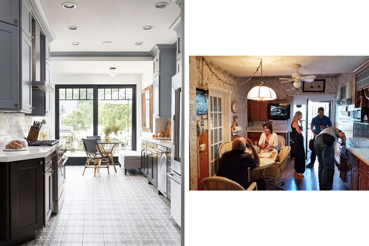
French blue accents deliver a European vibe in the newly configured kitchen. The room is fitted with 8-foot sliders, which open the room to light and views. | Before: The former kitchen was dreary, cramped and dated. The white fireplace stack (foreground, left) remained in place, a more cost-efficient alternative to removing it.
MEG: What was the inspiration behind the design and what were your primary needs?
JACLYN: We wanted a new traditional look with a European vibe. I came back from Paris a few days after we closed on this house and knew the kitchen would have a typical French blue as an accent. Because painted cabinets are not the greatest when it comes to functionality, we decided to throw in a classic wood tone for the base cabinets. It was more important for us to have a bright kitchen and lots of natural light than to have a lot of storage, so we made sure we had just enough cabinet space for everything and nothing extra. We went to the ceiling and used pullouts to ensure every possible area for storage was squeezed out.

Base cabinets have a classic wood tone. Upper cabinets are painted in a bluish-gray shade that picks up the tones in the graphic cement tile flooring. Countertops are SapienStone — a durable porcelain material — in Calacatta White.
MEG: Did you consult with a kitchen designer?
JACLYN: Yes! We collaborated with Meredith Weiss of Merri Interiors in Commack, New York. She has a custom kitchen line, and we knew we wanted some special details that general cabinetry companies just could not cover. I also needed someone who could be an unbiased designer of a very important space in my home and, frankly, I didn’t trust myself to make all of those small decisions without getting emotionally attached. Meredith was a gem to work with.
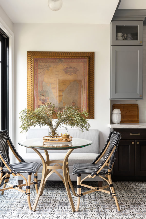
The French bistro-style chairs are from Kenian.® Wayne Dinettes in Little Falls crafted the custom table.
MEG: You initially set your sights on “cloudy grey quartz” countertops. Ultimately, you went with something else. Why?
JACLYN: I’m extraordinarily messy in the kitchen when I cook, which isn’t often, and my husband cooks all the time. We needed something very durable for the countertops, so we went with SapienStone — a porcelain material — in Calacatta White. When I saw the slabs in person and realized what we could get for a similar price to my countertop go-to, it was a no brainer. At the time, we were actually the first home in the U.S. to get a slab of that.
MEG: Hindsight being 20/20, is there anything you might have done differently for this all-important room?
JACLYN: In the future, I would consider heated tile flooring. I didn’t think we would need it, but it would have been a relatively low-cost addition for a ton of comfort. I also found the JennAir® French door fridge to be low on space and interior capacity, so I would only ever recommend a two column [top and bottom] setup moving forward.
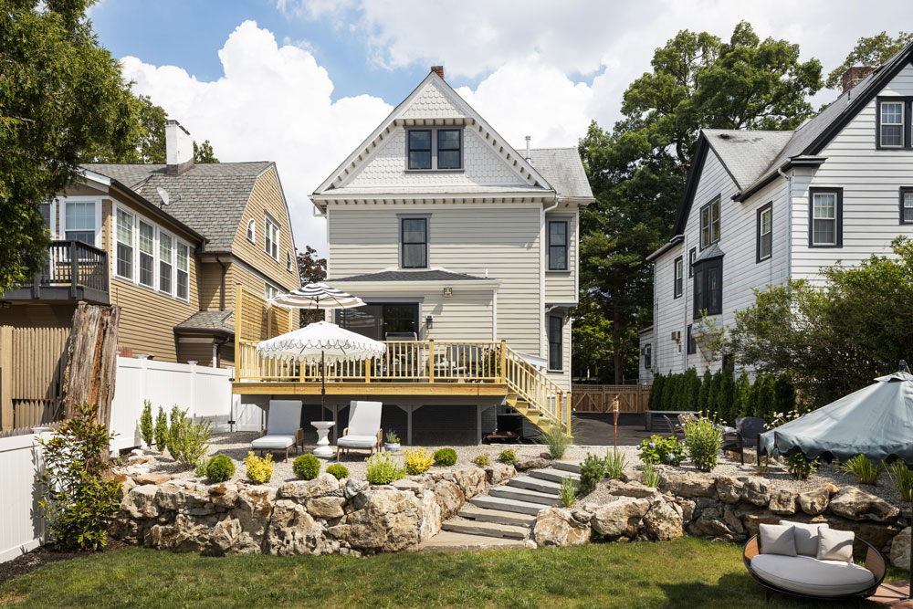
MEG: What was your game plan for the backyard makeover?
JACLYN: We’ve got a pretty big immediate family and a few dogs, so we knew we wanted multiple layers for entertaining and seating. The house is built up on a hill, so it was almost a necessity to build up to the home because the grading was so steep. We worked with Landscapes by Lou, which designed the entire front and back yard and built us our stone wall of gray boulders. My husband loves the low maintenance of pea gravel, especially for dogs, so that material made up the majority of the upper-level seating areas.
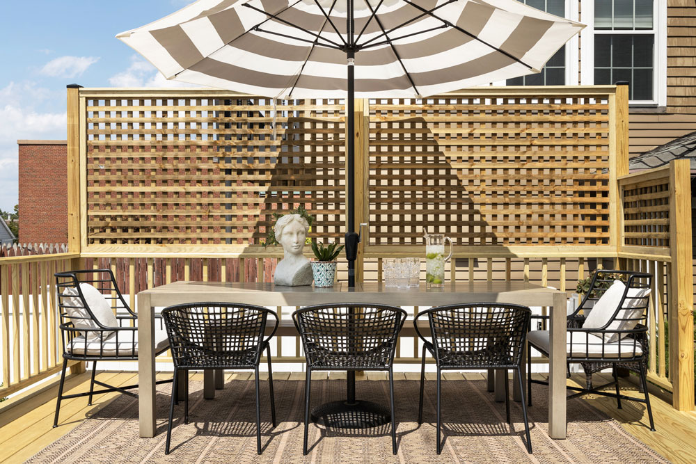
“My husband and a friend built the deck and the privacy screen themselves,” Isaac says. “From the back door you could see directly into the neighbor’s pool so, needless to say, privacy was a major priority. Eventually, the plan was to place planters on the wall à la Italian café style!
MEG: About two years after the renovation, you and Anthony made the decision to sell. Were you ready for another design challenge?
JACLYN: I always referred to Rutherford as my forever home and forever town, but the pandemic made us look at the space of the home and our location in relation to family with a microscope. As a designer with projects up and down the East Coast, I was not tied to one location, and my husband was no longer commuting to the city, so we were able to move closer to my family down the shore. We had the opportunity and took it! I don’t think we are ever ready for our next adventure, if I’m really honest.
MEG: Did you find a new old home to love?
JACLYN: Our newest home is historically designated in the heart of Shrewsbury with earliest documented origins as far back as 1848. This is definitely the oldest structure we have ever worked on and luckily — and unluckiIy — we make new discoveries daily. I joke with my husband that our homes keep getting older, bigger and more of a money pit! But I could never live in someone else’s update. That is the curse of being an interior designer with a love of old homes. You just can’t build this level of character anymore without spending an arm and a leg. So the easiest way is to buy and renovate!