
Tips from a Pro: How to Mix Patterns Like A Pro
Writer Meg Fox-
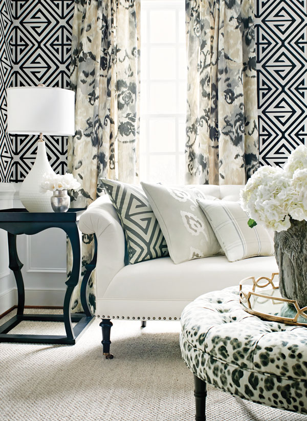
Thibaut combines a design-savvy mix of patterns, colors and textures for a living area rich in personality and style.
-

Stacy Senior Allan Thibaut Newark 800-223-0704 | thibautdesign.com
How to mix patterns like a pro.
Choosing patterns and colors that complement each other can be tricky. Experts warn that too many patterned prints can lead to design overload. However, too few color or fabric combinations may leave the room feeling bland or uninspired.
We asked Stacy Senior Allan, marketing director of Thibaut — the nation’s oldest continuously operating wallpaper firm and the maker of high-end designer fabrics and upholstery — for some tips and insights.
DNJ: This living area incorporates wallpaper and fabrics from Thibaut’s Bridgehampton Collection. What makes it work?
Allan: It’s an adventurous grouping of patterns — and you are making a bold statement — but it’s successful [and not overwhelming] because we stuck with one simple color palette: black, cream, beige and gray. There’s also a lot of contrast: a balance of soft and strong, warm tones mixed with cool tones.
DNJ: So the key was to stay within the same color family in this particular room design?
Allan: There are lots of ways to mix color and pattern. Mixing patterns in a similar color palette is a good way to start and puts you in the safe zone. You can be more expressive in your fabric choice when you stick with one color palette.
DNJ: Is there a general rule for how many patterns you can safely mix?
Allan: We used five [plus one solid]. Getting up to six or seven patterns may be overkill. Usually, people like to work in odd numbers. You could go with three.
DNJ: How did you achieve balance or prevent patterns from competing for attention? With one pattern dominating, allowing others to be secondary or even mini in scale?
Allan: Normally yes, but you can have a situation where a too-small pattern looks weak. In this case, we left the scale medium to large. There should also be an anchor or resting point for the eye. Here, it’s the raised panel wall, the plain white textured sofa and the sisal rug, which have no pattern to compete for attention.
DNJ: Looks like a variety of scale and texture play an important role.
Allan: Yes, we started with a floral fabric for the drapes because its watercolor-like moving shapes are fluid to contrast the strong large-scale geometric on the walls. The sofa is a soft, fine chenille; pillows feature a raised appliqué, embroidery with stitching (which gives it a little sheen) and a finely detailed woven plaid pattern.
DNJ: How about that animal print on the ottoman?
Allan: Animal prints are great for mixing patterns because of their organic shapes. They work with any type of design and blend with geometrics, florals, damasks…everything!
DNJ: Other thoughts to consider?
Allan: Even furniture and accents are part of the color story. Here, they repeat what is going on in the room. The vertical lines of the black table mimic the lines in the wallpaper, and the white ceramic lamp adds another layer of texture — both are also resting points for the eye.