
Personality & Panache
Writer Meg Fox | Photographer Justin Cole | Designer Libby Langdon | Architect John James Architect, AIA | Location Summit, NJ | Contractor Brinton Brosius | Custom Cabinetry Canterbury DesignsColor, pattern and originality inspire a home renovation in Summit
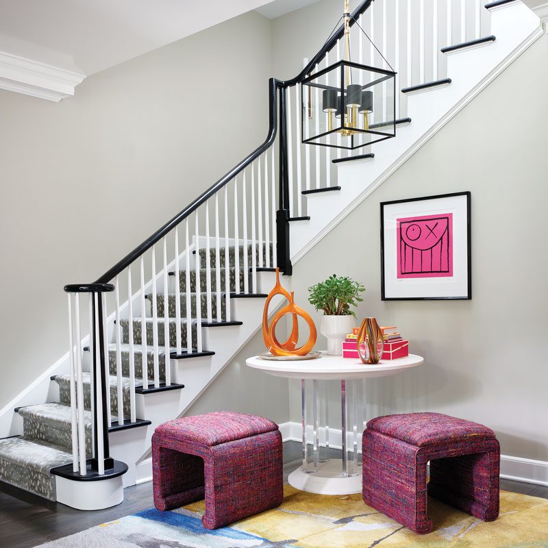
The foyer announces the clients’ love of color and pattern and says “Welcome, we have fun here!” designer Libby Langdon says. “Oftentimes, foyers are treated as a pass-through space or don’t get as much design love as living and dining rooms, but it’s the perfect way to kick off the dynamic design of your home.”
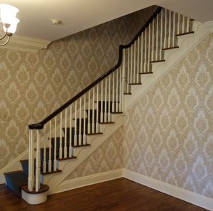
Before Foyer
When Daniel and Melissa Tassé purchased their traditional Colonial-style home in Summit, New Jersey, they recognized its potential and began to explore ways to change up the interior to get the look and functionality they needed — all with their own personal stamp.
After consulting with architect John James, AIA, principal of John James Architecture in Maplewood, they embarked on a gut renovation alongside interior and product designer Libby Langdon and other key contributors: contractor Brinton Brosius of Maplewood and kitchen and bath designer Melissa Seibold of Canterbury Designs in Morristown.
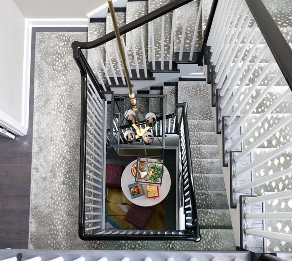
A custom 29-foot-long chandelier with lanterns on all three levels accentuates the open stairwell, flooded with natural light from the new skylights.
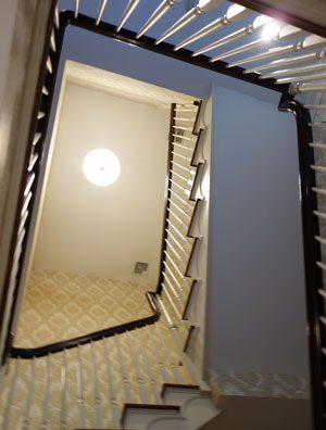
Before Foyer Stairwell
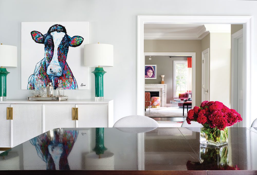
An existing cow painting adds a sense of whimsy to the dining room in hues that are highlighted throughout. “Sometimes, people take their dining rooms too seriously. You can still have absolutely stunning and important furniture in your dining room, but you can also have some fun with it!” Langdon says.
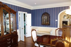
Before Dining Room
For Langdon, principal of New York City-based Libby Langdon Interiors, this would be her fourth design project with the “fun and fabulous” couple, who she says have become her friends. “I call Melissa the house whisperer because she knows how to make everything so incredibly functional and really thinks through what’s the best way to make things work for the way they live.”
Architectural plans called for a new kitchen, updated bathrooms and the conversion of an unfinished attic into a third-story office and bedroom — and so much more. “Because we were going for a sleeker design, curved archways from the foyer to all the rooms were squared off and made a little larger for a more open feel that was less traditional,” Langdon says.
Even though the exterior is a stately Colonial, “the interior is anything but,” Langdon says. “I had fun reimagining what a fresh, updated design could look like in the bones of a traditional home.” She and the owners “had a blast working together, taking design chances where bold color, patterns and wallpaper were incorporated in unexpected ways.
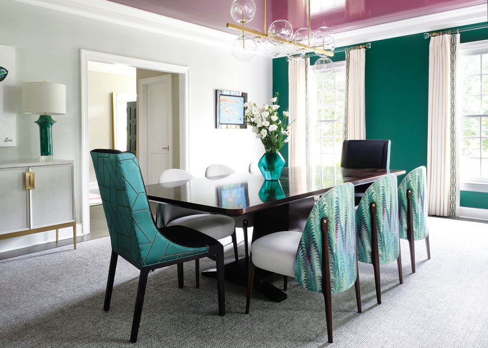
A multicolor chair pattern became the “connector” fabric that unites the different colors in the dining room: jewel tones such as the rich green accent wall, the high-gloss eggplant ceiling, and accents of black and gold.
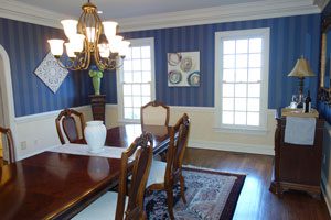
Before Dining Room
The couple’s existing artwork collection — especially those works with special meaning — influenced the color stories as they came to life. “If a room wasn’t being designed around a particular piece, I still had in the back of my mind where pieces might live when it came time to install.”
The foyer, which kicks off the home’s dynamic design scheme, “feels like one big, happy hug,” Langdon says. Using different colors with pink as the primary tone has an uplifting effect. “It says ‘Welcome, we have fun here!’” Two multicolored upholstered ottomans pair up with a bold abstract area rug and accessories with fun pops of color, including a favorite pink-hued painting.
Nearby, Langdon shook up the notion of a formal living room, she says, with upholstered ottomans in a soft gray, orange and hot pink pattern, colors that became the springboard for the room’s palette. Color-block drapes with pops of orange balance the richness of fuchsia swivel chairs while black accents — via the ceiling’s unexpected graphic black and white wallpaper pattern — tie in with the room’s black baby grand (not shown in photo).
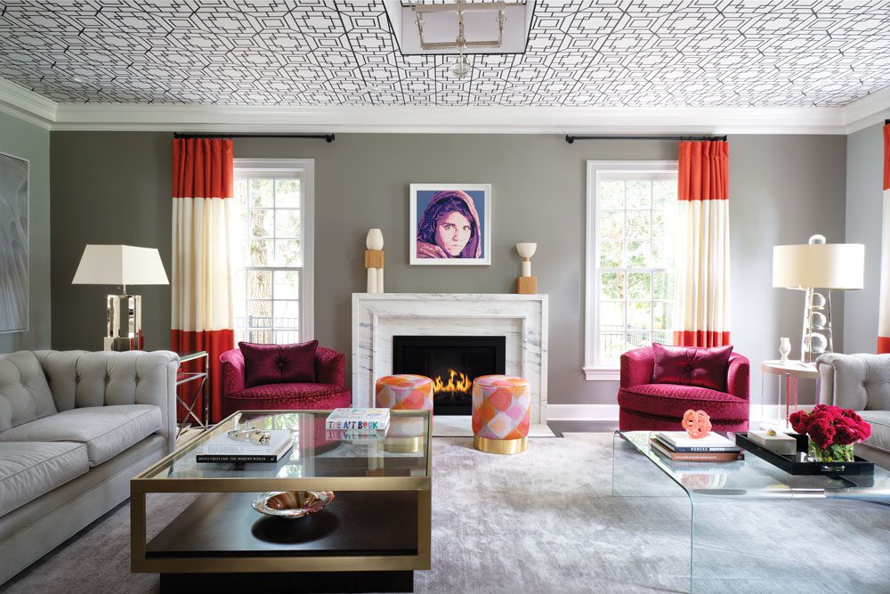
A soft gray, orange and hot pink fabric on the ottomans became the springboard for the living room’s color palette. The ceiling’s graphic black and white wallpaper introduces an unexpected and fun element that also complements a beautiful black baby grand piano (not shown).
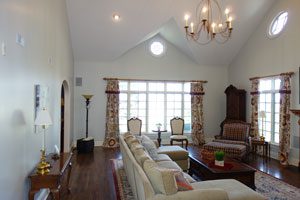
Before Living Room
In the dining room, a multicolor fabric the clients loved connects all the jewel tones in the room, including the hues in a whimsical cow painting, Langdon says. “If you build a room around a fabric you adore, you’re guaranteed to love the design when it’s complete.” Melissa “is a fabulous cook” and the couple love to entertain, Langdon says, so these factors were top of mind in the design process. In the kitchen, with cabinetry designed by Canterbury Designs, food prep areas, how cabinets were laid out and what was going to be in each cabinet were completely thought through, Langdon says. “Aesthetic was important but functionality was paramount.”
The kitchen is clean and sleek with just the right amount of contrast between the ecru cabinet tone and the rich stain of the island and butcher-block work surface, Langdon says. Veining in the Taj Mahal quartzite surfaces repeats the cabinetry’s warm ecru finish. Geometric wallpaper from Phillip Jeffries “is the perfect textural blend” of ecru and brown tones, she adds. In such a large kitchen with a small amount of wall space, “it could take the pattern without being overwhelming.”
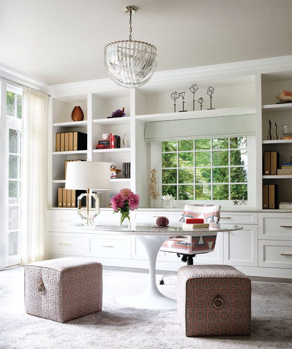
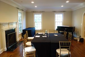
This light-filled home office designed for Melissa Tassé was formerly a dark wood-paneled billiard room. A fresh paint scheme, new built-ins and chic embroidered sheers capitalize on the room’s natural light. In lieu of a large angular desk, they opted for a sophisticated stone-top Saarinen table and other luxe, feminine-inspired elements.
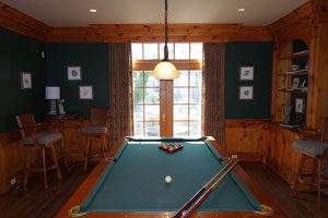
The home office was previously a dark billiard room.
Cool blue tones on the upholstered walnut-backed counter stools and the seats of the dining chairs offset the warmth of the cabinetry and coordinate with the new butler’s pantry — a smart addition created after a bay window along the back wall was converted to a door and floor-to-ceiling windows, which freed up space for the pantry.
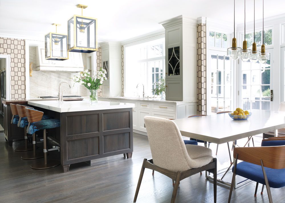
The kitchen’s ecru-toned cabinets, designed by Canterbury Designs, incorporate details such as glass doors with decorative wood inlays. Taj Mahal Quartzite used on the countertops and backsplash “has striking movement in the veining” and repeats the cabinetry’s warm ecru tone, Langdon says. The island’s dark stain and butcher-block work surface lend contrast.
Before Kitchen
“I wanted to bring in cool blue tones to play off the warmth of the main cabinetry and because it looks fantastic paired with the brown walnut colors,” Langdon says. It also repeats the blue tone from the adjacent butler’s pantry. A geometric wallpaper pattern from Phillip Jeffries “is the perfect textural blend” of the room’s ecru and brown hues, she adds. In a large kitchen with limited wall space, “it could take the pattern without being overwhelming.”
Before Kitchen Breakfast Area
The owners and architect reinvented the space in other ways as well. Lowering the formerly vaulted ceiling in the family room, for instance, provided additional square footage directly above it for a more spacious primary suite and walk-in closet. The family room’s new coffered ceiling “is such a wonderful architectural detail,” Langdon says. She highlighted that feature by painting the ceiling in a high-gloss mineral color. “The gloss finish bounces light around the room during the day and at night,” she says. “I love the reflective quality!”
By design, the family room is light, bright and user-friendly. “In a family room it’s important that everyone has the best seat in the house, a comfy spot to put your feet up and a place to put down a drink,” Langdon says. A combination of supple velvet fabrics, including the performance fabric on the cream sectionals, contributes to its soft and cozy feel.
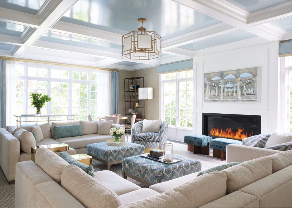
In the family room, “We landed on this soft mineral spa color paired with creams and tan and a few pops of teal,” Langdon says. Texture was important, the designer adds. She used a combination of velvet fabrics, including performance fabric on the cream sectionals, to ensure a soft and cozy feel. The new coffered ceiling was painted in a high-gloss mineral color that bounces light around the room day and night.
Before Family Room
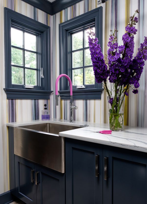
A mudroom/laundry area “should absolutely be a spot to take design chances and add elements that will make you smile,” Langdon says. “You’re in there doing laundry after all!” In this case, the clients chose a high-energy Knoll vinyl wallpaper and “super fun” gooseneck faucet by Hansgrohe in bright pink. Painting the trimwork in the same blue hue as the cabinetry also “makes a style statement in a small space.”
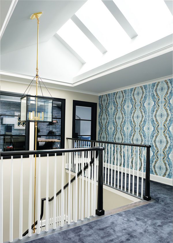
Converting an unfinished attic into an office and bedroom “was a brilliant use of space,” Langdon says. The hallway’s graphic wallpaper pattern “feels organic and showcases many different tones of blue,” she says. “It’s like artwork all on its own.”
Probably one of the most impactful changes involved the conversion of a dark attic into a usable third level, Langdon says. This process entailed adding skylights and opening the stairwell so natural light carries all the way down to the first floor. “Not only was it a huge shift in how the home feels, it brought so much light into the house as well as enough square footage for the husband’s office and son’s bedroom.”
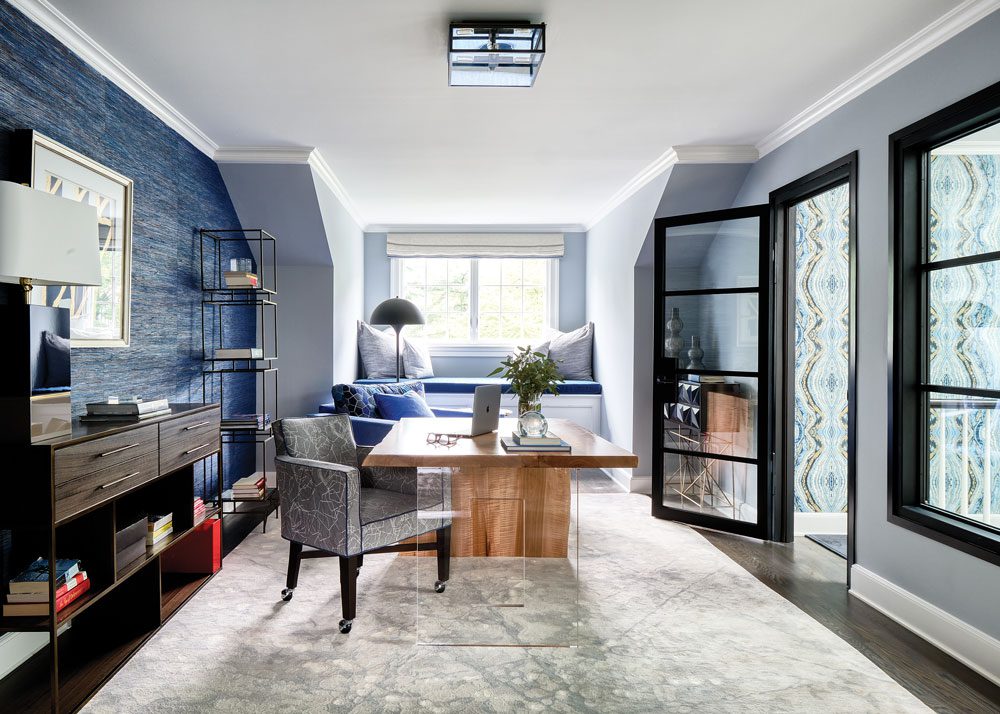
In the husband’s office (opposite), clean-lined furnishings mimic the straight lines of the glass door and windows, Langdon says. The live-edge desk has a waterfall detail on one side, plexiglass on the other.

Before Third Level Attic
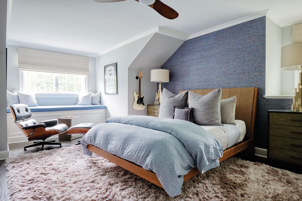
The son’s bedroom is its own appealing hideaway with its classic Eames chair and range of wood finishes and textures.
The result is a home that resonates with the owners’ sense of style and how they live. “I think they truly loved how everything came together and how their vision grew, morphed and eventually came to life,” Langdon says.
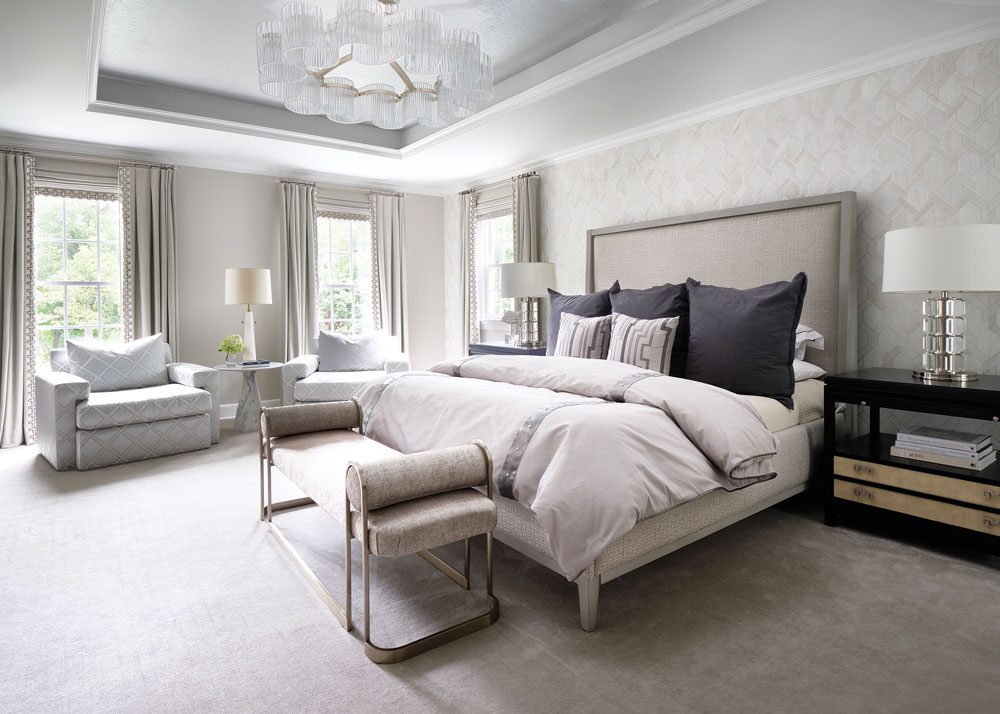
Serene and peaceful, the primary bedroom contains a hushed palette of pale gray, silver, cream and champagne tones. “I wanted to add some texture but in a soft way, so we did a wonderful putty-toned wood veneer wallpaper on the wall behind the bed for subtle dimension,” Langdon says. Flocked silverleaf wallpaper on the ceiling inset adds a touch of glam. “When the chandelier is lit, the ceiling reflects the most beautiful glow,” Langdon says.
Before Primary Bedroom
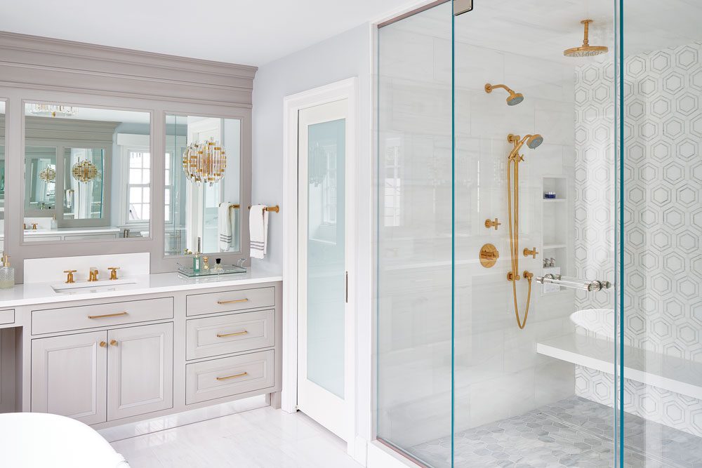
The primary bath’s bold stone pattern in the shower is tempered by its subtle colorway. “Brass hardware and fixtures add such a warmth to the bathroom space with all the pale gray in the stone and vanities,” Langdon says.
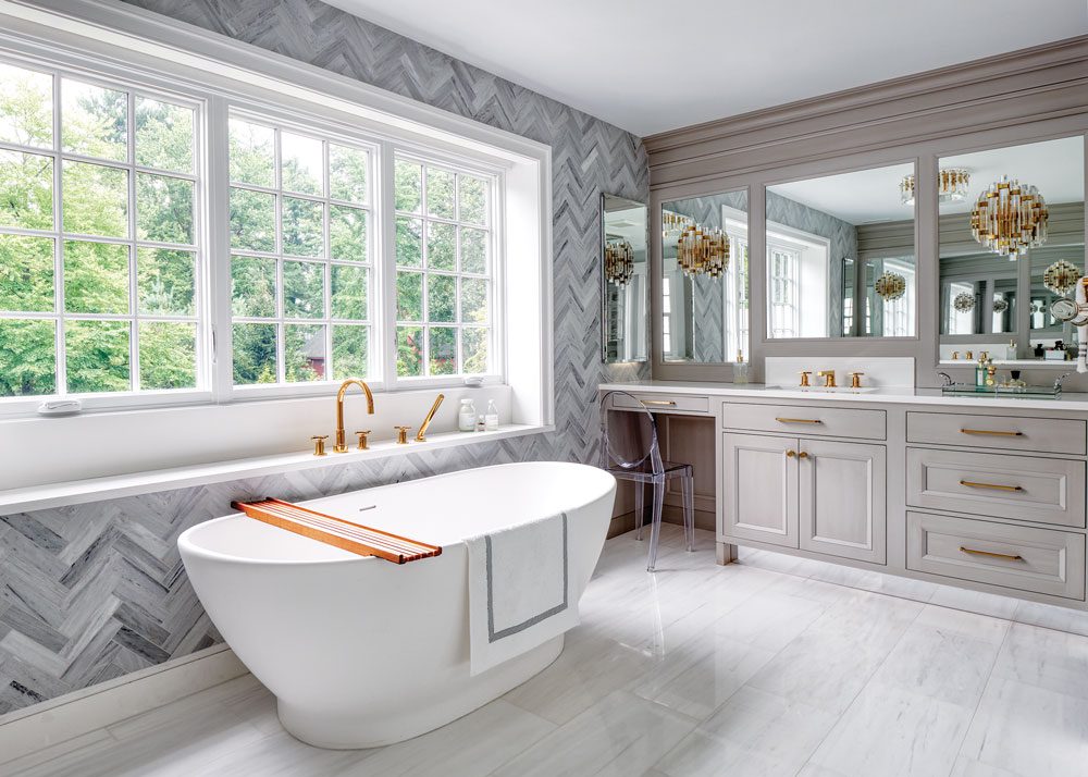
“I love the herringbone stone the clients chose for the window wall,” Langdon says. “It’s striking and such a beautiful backdrop for the tub.” Crystal rod sconces mounted directly on the mirrors “have just enough glitz and are reflective even if they are not turned on.”