
Nordic Nod
Writer Meg Fox | Photographer Christopher Delaney | Designer Alison Nifoussi, Tweak Interiors | Builder Andy Bilski | Location Little Silver, NJ | Tile Design Donna MartinForm, function and serenity drive the clean, uncluttered feel of a Little Silver remodel
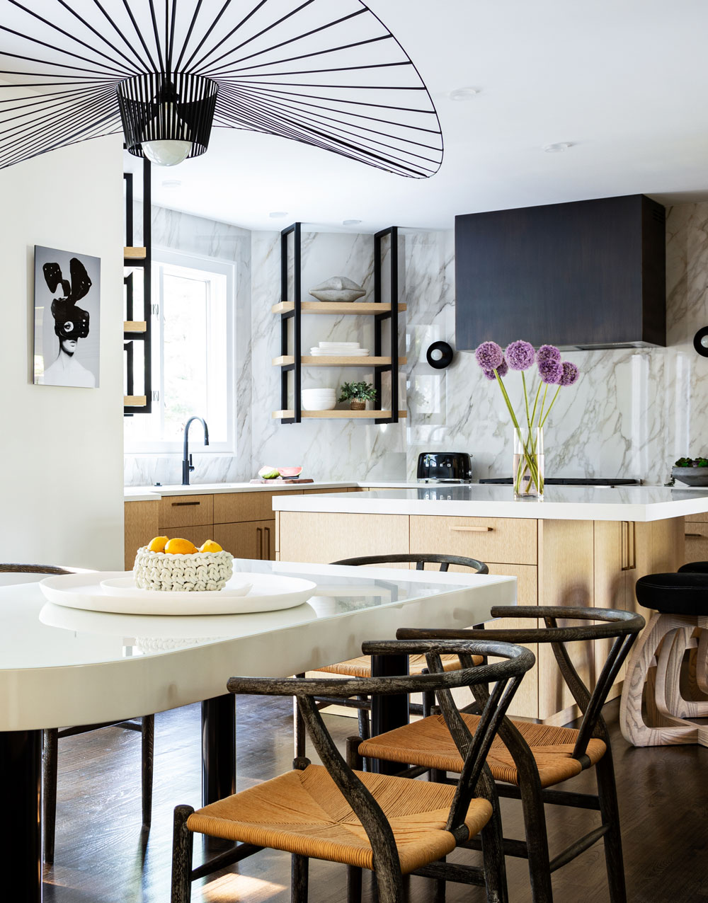
Clean lines and a restrained palette are captured in chic, high-contrast fashion. The Vertigo pendant from Petite Friture “blows in the breeze,” when the kitchen’s back double doors are open, designer Alison Nifoussi says. “The shadows it casts when illuminated are an added bonus!”
Inspiration comes in many forms. For this full-scale renovation in Little Silver, NJ, it was an “an eye-opening trip to Iceland” and the serenity of Scandinavian design that spurred its clean lines and timeless feel, says designer Alison Nifoussi of Tweak Interiors, also in Little Silver. “While I love an all-white kitchen, we were going for something more unique,” she says. “Less being more was our overall design concept.” The aesthetic embraces a limited palette and an “emphasis on texture to add interest without a cluster of details.”
Frameless slab cabinets have a Scandinavian influence, Nifoussi says. She opted for “wood veneer rather than solid wood so the white rift oak wood pattern and coloration would be consistent,” she says. The counter-to-ceiling-height backsplash — covered in creamy white, large-format, glossy porcelain Calacatta slabs — “was the driver in color selection,” Nifoussi says. Pearl-toned quartz countertops are an ideal complement. “My objective was to use only workhorse, man-made materials.”

Nifoussi redesigned a run of cabinetry next to the dining table as a “moody, sexy, home bar,” complete with features such as reeded cabinets and an antiqued mirrored backsplash. Lower cabinets—“constructed with touch-latch hardware to embrace minimalist design”—are painted in “Off Black” by Farrow & Ball.
Clean contrast was achieved through the mix of light and dark tones from the hanging white oak veneered shelves with powder-coated matte-black steel strapping to the ebony-stained floors and sexy home bar, painted in “Off Black” by Farrow & Ball. Design elements also reflect a simplicity in scale and shape. Hence the understated impact of the custom hood with its sleek modern box shape and smooth, dark antiqued brass patina.
A thorough search for the “perfect lighting” strikes the right balance of task, general and accent illumination. “I knew from the get-go,” Nifoussi says, “that I didn’t want the traditional two or three hanging pendants over the island to distract from the other cool elements in the room.” Circles — one of her favorite shapes to use in design — are used in varying scales, such as on the chandelier above the dining table and sconces near the range, “to create a rhythm and harmony in the space.”
Behind the Seams
Working with six large-format 48-by-96-inch porcelain slabs for the backsplash was “very technical” from a layout and installation standpoint, designer Alison Nifoussi says. Finding installers to work with the material increased the challenge. “The sheets have to be handled like glass … if one should break you can’t just dispose of it like you would a small tile.”
Collaborator Donna Martin, owner/designer of Tiled Interiors in Red Bank, attests to the intricacy of linking the veining, which is critical to the design. “To ensure the veining worked from one piece to another, the installer [Anthony R. Linke Tile and Stone] and I photographed each piece and flipped and turned them as needed, producing a layout that moves beautifully throughout the kitchen,” Martin recalls.
Designer Insights from Alison Nifoussi
Problems & Solutions
Before the renovation, the center island was too far away from the sink, so the objective was to bring the island closer and make the kitchen work triangle more efficient. A dated cooktop — situated at the center of the island — cluttered up the space, and didn’t allow for a statement hood, which was essential to the new design. There were also many neo angles, which dated the space. Overall, the plan was to square off the kitchen, which was accomplished by moving and reshaping the island and relocating the cooktop to a wall.
Workhorse Features
Free of its cooktop, the island is brimming with space. Rollout shelves behind doors and drawers are found on two sides of the island while the third — behind the counter stools — houses items that are not needed every day. My favorite drawer has a small cutout to easily access paper towels. Along with the paper towel roll, a microwave is also neatly tucked in the island.
Mixing Metals
I love mixing metals — in particular, brass and matte black are a unique combination. While I’m all in on the brass trend, I do think it’s vital to use it in small doses. An abundance of brass can tend to be too loud, so restraint is key. I was adamant about having a faucet at the bar in a living brass finish and could not resist the patina of the brass giving me vibes of an old drinking hole.
All in the Details
• Upper shelving in the bar is cut and mitered in a chevron pattern to add visual interest to the 12-foot run of cabinets. The antiqued-mirrored backsplash is lit with WAC LED tape lighting for dramatic effect.
• Hanging white oak veneered shelves flanking the sink took up much of the negative space; I wanted the eye to be drawn to them. Each shelf has WAC LED tape lighting housed in aluminum channels routed into the shelves to soften the diodes. They offer a soft glow of light that serves as task lighting as well as visual interest.