
Midcentury Spirit at a Morristown Home
Writer Marirose Krall | Photographer Peter Kubilus | Location Morristown, NJ | Architecture and Design Gary RosardNew owners bring in architect Gary Rosard to refurbish and breathe new life into their 1950s-era home
CLICK HERE TO SIGN UP FOR OUR DESIGN DIGEST NEWSLETTER
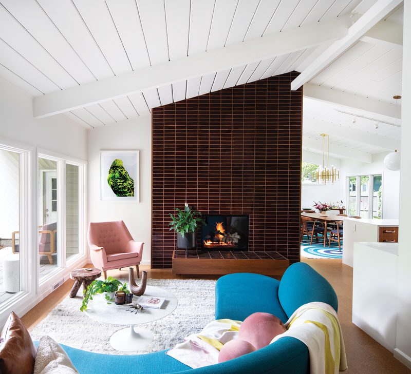
The living room is furnished in an assortment of fun colors that offer a playful aesthetic against the drama of the floor-to-ceiling fireplace surround.
When Amanda Goodwin and Keith Survell were searching for their first home as a couple, this Morristown, New Jersey, residence — part of an early 1950s development of Midcentury homes — caught their eye. For Goodwin, it was the expansive style that was appealing. “I’m from Australia and I’m used to a more open-plan design. The minute I walked into this house — where the kitchen, dining room and lounge area were all open — it struck me immediately.”
But the owners were also struck by the less-than-stellar state of the renovated interiors. “It very much had the appearance of something done in the early 2000s,” Survell says. “It was textbook — any new construction would have looked very similar.”
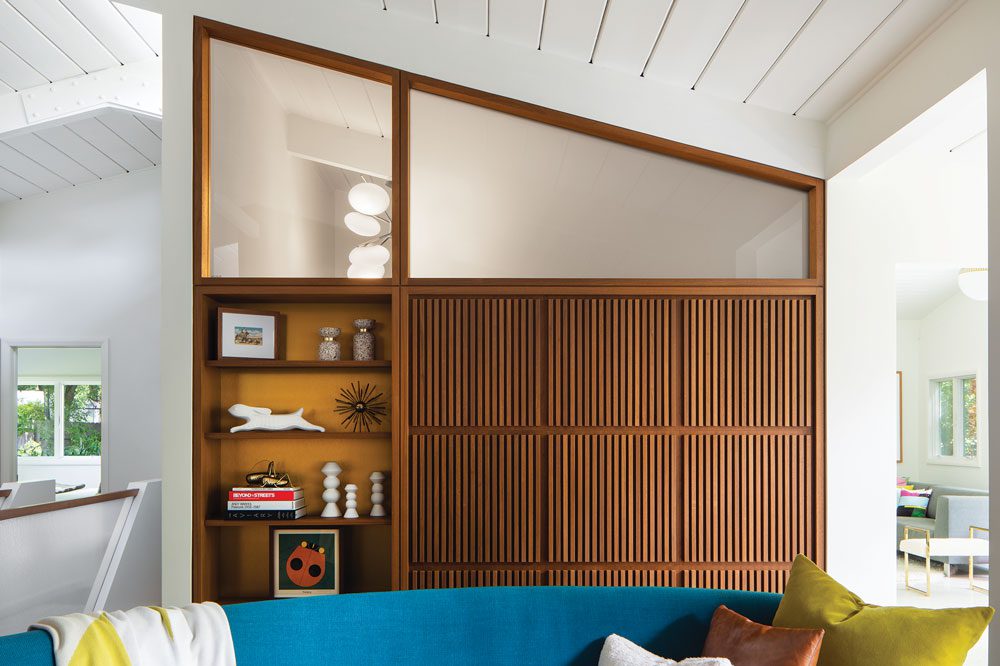
The top of the built-in cabinetry features one clear and one frosted window. According to architect and designer Gary Rosard, “It was a deliberate design decision to create an overall composition with the wood panels, seeing through clear glass to the chandelier, then to have the softer lighting through the frosted glass.”
To refurbish the interior spaces, the couple brought in Gary Rosard, who acted as both architect and interior designer for the project. Rosard, of Philadelphia-based Gary Rosard Architect, describes the scope of the project. “There were no big structural changes. The clients bought the house because they loved the Midcentury style and they wanted the design to reflect that, but not be slavishly ‘period.’” Goodwin knew the place just needed a little TLC. “The house had great bones. We wanted to breathe new life into it. We really wanted to have this house reflect what it was truly meant to be.”
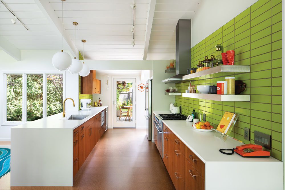
The kitchen features a chartreuse backsplash and walnut cabinetry. “The open shelving really calls attention to the tiles,” homeowner Amanda Goodwin says.
And what the residence was meant to be, the homeowners say, is bright. “It’s interesting how all the homes in the neighborhood were positioned on lots at specific angles to take advantage of the sun,” Goodwin notes. Survell explains, “They were situated in such a way that the big bank of windows that every house has would have lots of light in winter, but less in the summer.” Goodwin appreciates that thoughtful design element, particularly in the colder months. “I don’t notice as much in the summer, but in winter this house feels like summer in terms of the sunlight and warmth that comes in. That’s what I love about that era of design; everything was so intentional.”
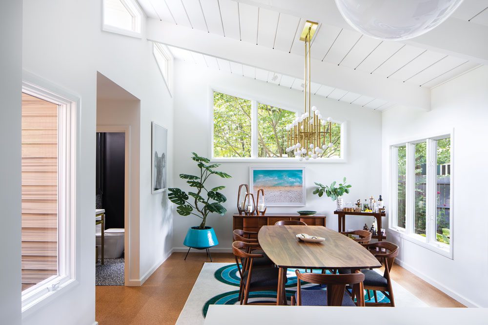
The kitchen, dining room and living room feature new cork flooring to replace the original worn cork. The vintage credenza is from Habitat for Humanity. “It’s in such great condition, we wanted to hang onto it,” homeowner Amanda Goodwin notes.
The living room’s built-in shelving, for example, was purposefully designed to create a stylish display space while ensuring light distribution between rooms, thanks to glass panels along the top that align with the slant of the ceiling. Goodwin is particularly fond of this design feature, though it required a revamp. “That’s my favorite wall. It was original to the house, but it had been covered up with mirrors by a previous owner. The windows across the top had been covered with drywall that led to the house being very dark.” The new homeowners consulted with Rosard, who redesigned the millwork, adding grooved walnut panels on the right.
Rosard also opened up the wall between the family room and the sunroom to create one large, light-filled space. The flooring is period-appropriate terrazzo — with a special accent. “We didn’t want to do a standard inlay,” Goodwin says. “We wanted something a little bit different, so we came up with the circles, which Gary designed.” Rosard describes the look: “It’s an interesting pattern with inlaid brass — that detail is a little more Art Deco than Midcentury.” The flooring is a visitor favorite, according to Survell. “People comment on it all the time,” he says.
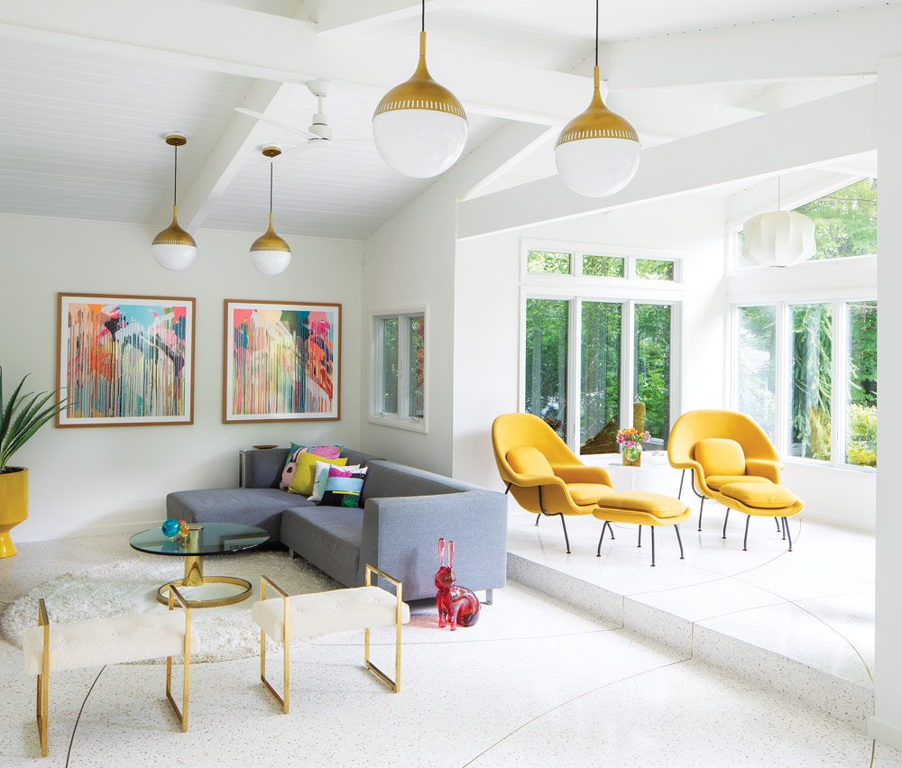
Rosard widened the wall between the family room and the sunroom to create one large space. The cantilevered brass coffee table is vintage.
The room is accessorized with bright accents. Yellow armchairs, lively patterned throw pillows and striking abstract art in primary colors pop against the neutral flooring. Vibrant color like this is a hallmark of Midcentury design and can be found throughout the home. It’s particularly notable in the kitchen, where chartreuse, hand-glazed backsplash tiles take center stage. It was an unusual choice, but one the homeowners were confident with. “I wanted chartreuse somewhere,” Goodwin says. “I’ve always loved it.”
Rosard agreed and said he wanted to make a big statement with it. “I proposed to do it on the kitchen backsplash,” he says. “This was a way to pick up the colorful aspect of some Midcentury houses but to do it in a bold way.” The tile creates a sharp contrast with the walnut cabinets and white countertops. “It felt natural. I knew that it would all work together,” Rosard notes.
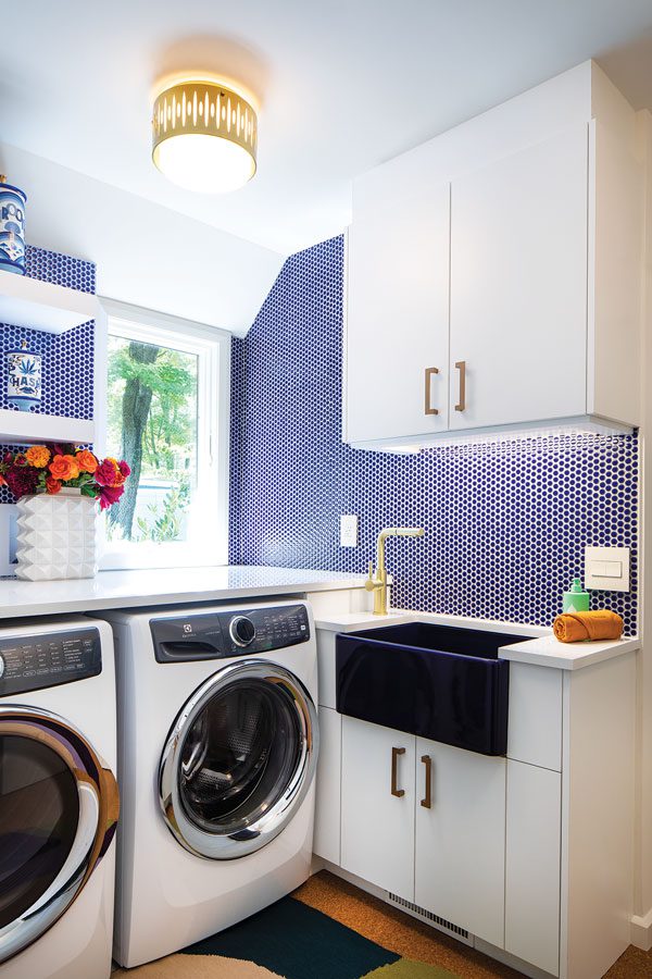
The cheerful laundry room features blue penny tile and a cobalt farmhouse sink.
The laundry room is infused with cheerful color in the form of a blue backsplash and a rich blue farm sink, though the homeowners had less input on this decision. “That was all Gary,” Goodwin says. “I asked him to surprise me. I wanted to relinquish control. He picked the beautiful cobalt blue sink and tile and the open shelving. It’s perfect.” Rosard agrees. “I really like the penny tile — it’s a nice Midcentury style. The laundry room is a good place to bring in color. It’s a tiny little room and we wanted to give it some pizzazz.”
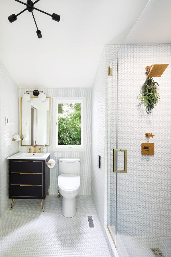
White penny tiles cover the walls and floor in the primary bathroom. “The chandelier is like a toned-down version of a Sputnik-themed fixture,” Rosard says.
“Pizzazz” is a perfect way to describe the aesthetic in this home. “Our intent was to reflect the joy and exuberance of a Midcentury house without being literal about the exact style and features,” Goodwin says. Rosard achieved that goal, she adds. “Everything he did was intentional; he ‘got’ the house straightaway.”
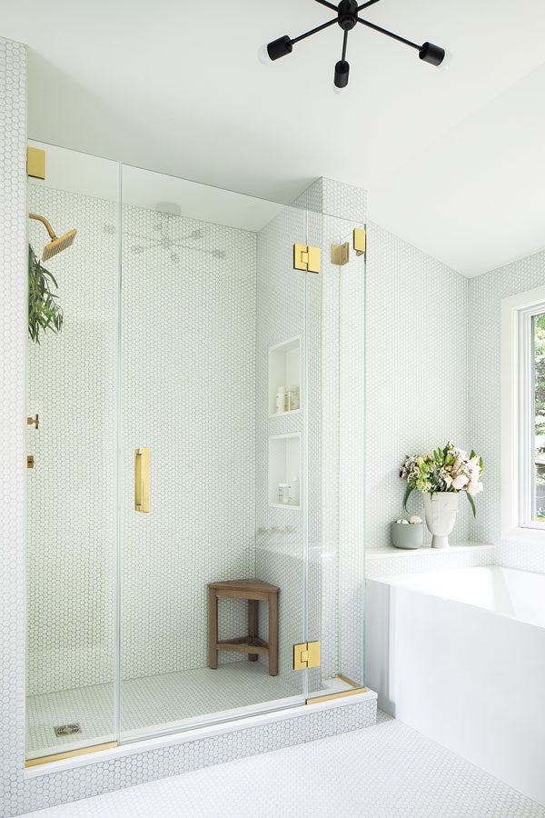
“It was a tight space but the clients really wanted a tub and a decent size shower,” Rosard says of the primary bathroom. “So they compromised. The sink is really small, but they were okay with that as long as they could get their tub and shower.”
Editor’s Note: To see how Gary Rosard updated a typical split-level home, see “Surmounting the Stereotype.”