
Less Is More
Writer Marirose Krall | Photographer Peter Kubilus | Designer Gary Rosard | Architect Gary Rosard | Location Verona, NJModern minimalism is the hallmark of a duplex renovation in Verona, NJ
“I call it ‘luxurious minimalism,’” architect Gary Rosard says of the duplex condominium’s style. “It’s very spare.”

Gary Rosard | Gary Rosard Architect, PC | Millburn, NJ | 973-218-6656 | GaryRosard.com
Marilee and Lou Ferone were ready for a change when they relocated from a suburban Colonial-style home to a duplex condominium in Verona, New Jersey. For the homeowners, the move involved more than just a shift from a single-family residence to a high-rise; it also included a major renovation. “The building was built in the early 1970s,” says Gary Rosard, a Millburn, NJ-based architect. The original apartment, other than the double-height living room, was “fairly standard and hadn’t really been updated.” His clients sought a drastic overhaul of the space. “They wanted to gut the place and create a minimalist, spare interior,” explains Rosard, who handled both the architectural and the interior design aspects of the project. “There were no qualms about ripping everything out.”
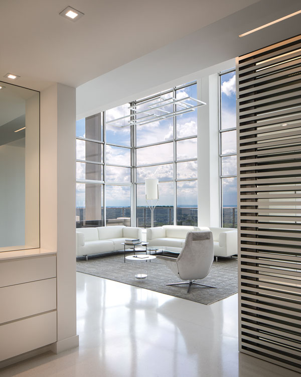
A screen (at right) in the foyer provides a visual pause before entering the double-height living room. “A mirrored wall behind the screen adds depth and mystery to this element,” Rosard says.
Design NJ: What were the drawbacks of the apartment’s original layout?
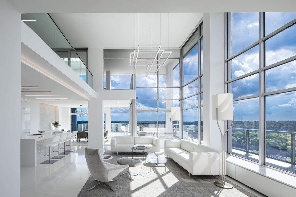
Gary Rosard: The building is high up on a hill, so it’s got amazing views all around. The original space didn’t take advantage of the expansiveness of the view. The large, double-height living room was there originally, but it didn’t open into the dining room, and all of the rooms were separated. The kitchen was fully enclosed, with one door to the foyer and one door to the dining room. You couldn’t see out to the windows from the kitchen. It was dark and closed off from the rest of the space. The stairway was in bad condition and awkwardly positioned. On the second floor, nothing was opened up to the double-height space except for one little cutout in the hallway overlooking the living room.
DNJ: What was the architectural/construction scope of the project?
Rosard: We removed walls in the kitchen and dining room, so those rooms now open to the living room. On the second floor, the office wall was removed and a glass railing was installed to open the room to the living area below. Conversely, we created a foyer by partially closing up the space. We positioned a screen opposite the entry doors. When you have big, open spaces like these, you want to create a sense of entry. It gives your eye a place to stop when you walk in the door.
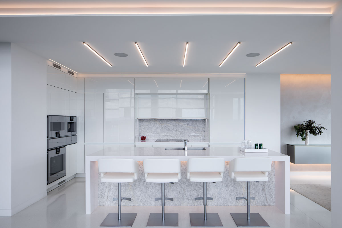
The smooth, white planes of the unadorned kitchen cabinetry blend into the wall. The renovation involved removing walls between the kitchen, living room and dining room.
DNJ: You reoriented the stairwell. Why?
Rosard: The existing stairwell faced in the wrong direction. Exiting the stairs at both the top and the bottom, you would walk right into a wall. We turned it 90 degrees so it becomes a focal point in the foyer and provides a better flow at top and bottom.
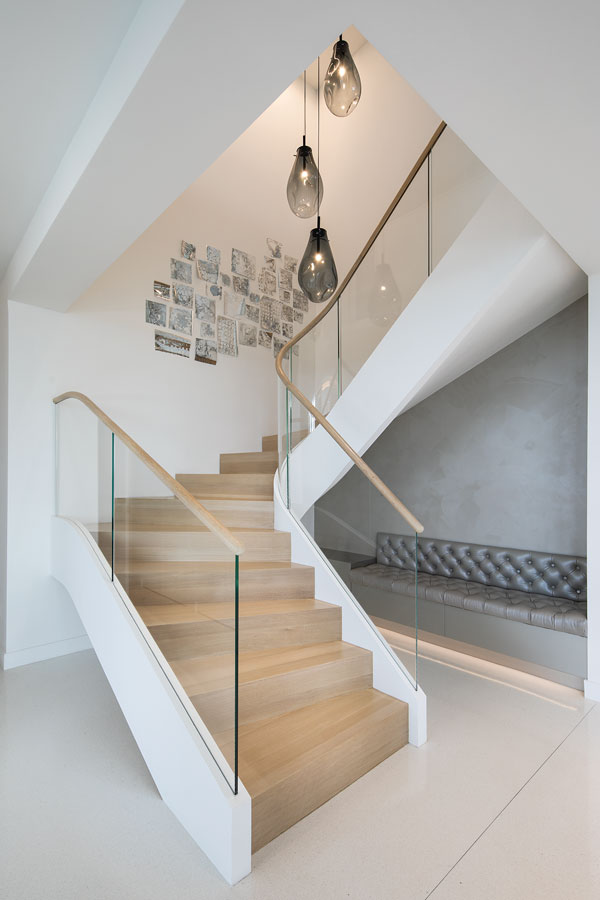
Rosard rotated the staircase 90 degrees to make it a focal point in the entry.
DNJ: What was involved in the interior design portion of the project?
Rosard:: We started at square one. The homeowners didn’t bring anything from their previous residence. They were very specific: they wanted the interiors to be sleek and minimal. They love white and they wanted nothing froufrou. They wanted no loose pillows; everything we did had to be tightly upholstered. It was liberating in a way.

In the dining room, “delicate chandeliers add contrast to the hard edges of the architecture,” Rosard says.
DNJ: The lighting in these spaces is quite remarkable. Why did you choose it?
Rosard: When you’re doing something this minimalist, the lighting becomes really important as an accent. The homeowners didn’t want a lot of fixtures so, to accentuate the architectural lines, we used linear strips in several spaces. In most rooms, we chose very thin LED strips installed flush with the ceiling. However, in the kitchen, where we wanted more illumination, we selected light strips that hang down one inch from the ceiling. A diffuser wraps around three sides, sending light out in all directions. It really brightens the kitchen. The master bathroom features both a thin strip of light and recessed lights. We also used a lot of cove lighting built into ledges and recesses.
In the dining room we did something different. The two light fixtures over the table feature spokes with LED bulbs and stylized “leaf” elements that shield the bulbs. It’s the one delicate touch in this hard-edged environment. It’s very effective.
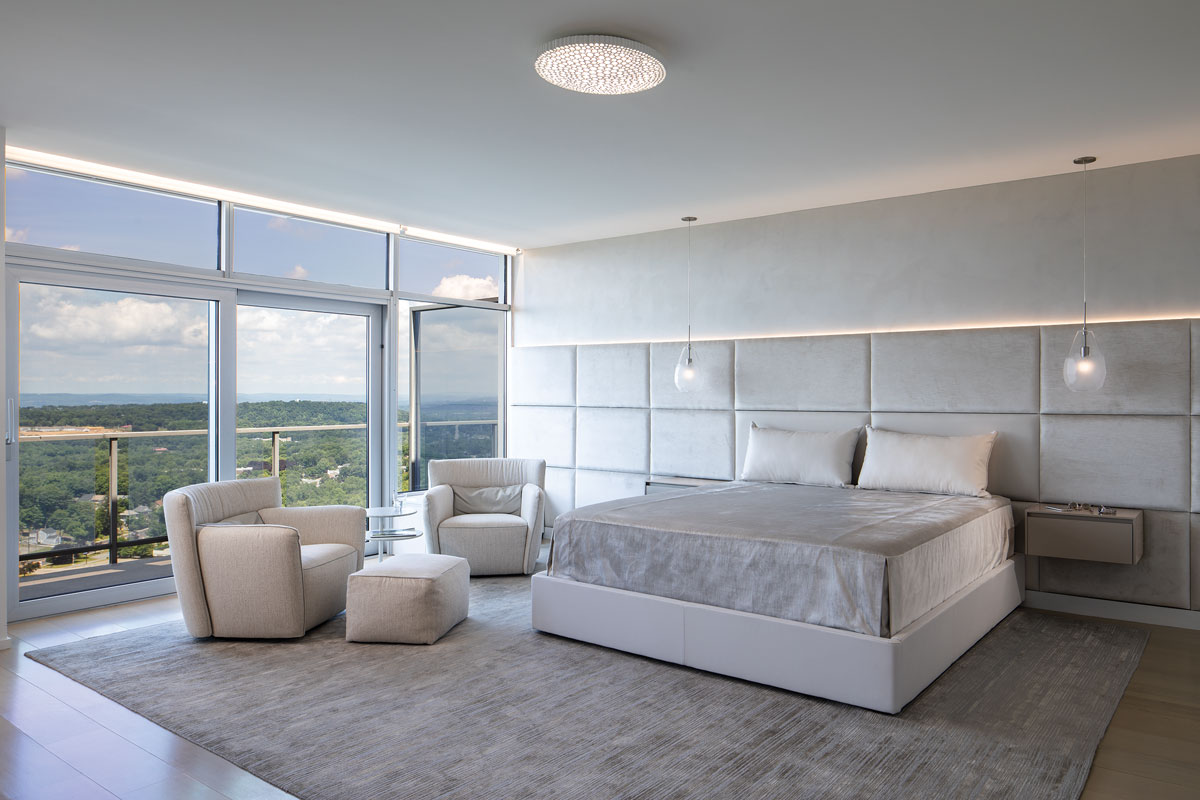
In the master bedroom, the wall behind the bed features panels upholstered in velvet, except for the two behind the pillows, which are crafted from faux leather for increased durability. Because the homeowners favor a tailored look, “the custom bedspread is designed to lie flat,” Rosard notes. “It’s seamed and piped to fit perfectly.”
This was such a great project. The homeowners were fun to work with and totally committed to this vision of a very minimalist white box. We wanted to take this space and make something really special out of it. It was great to get to work on a space like this. It was like a dream.
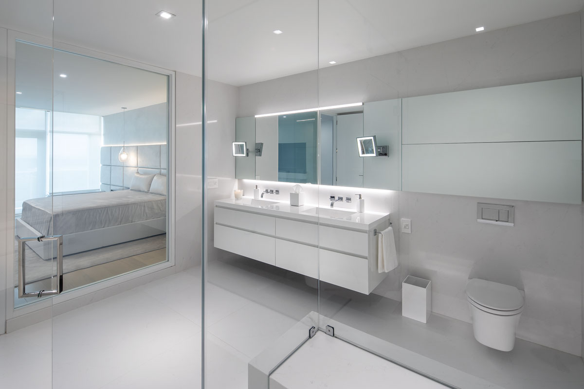
The glass wall between the master bathroom and the bedroom converts to opaque with the flick of a switch.