
Designing with Color
Writer Meg Fox | Photographer Christian Garibaldi | Designer Karen B. Wolf-

LIVING ROOM | The bold painting in this living room inspired the clean, crisp, classic color combination Wolf describes as “New Preppy: a dial-downed color punch for the modern Lilly Pulitzer lover.”
-
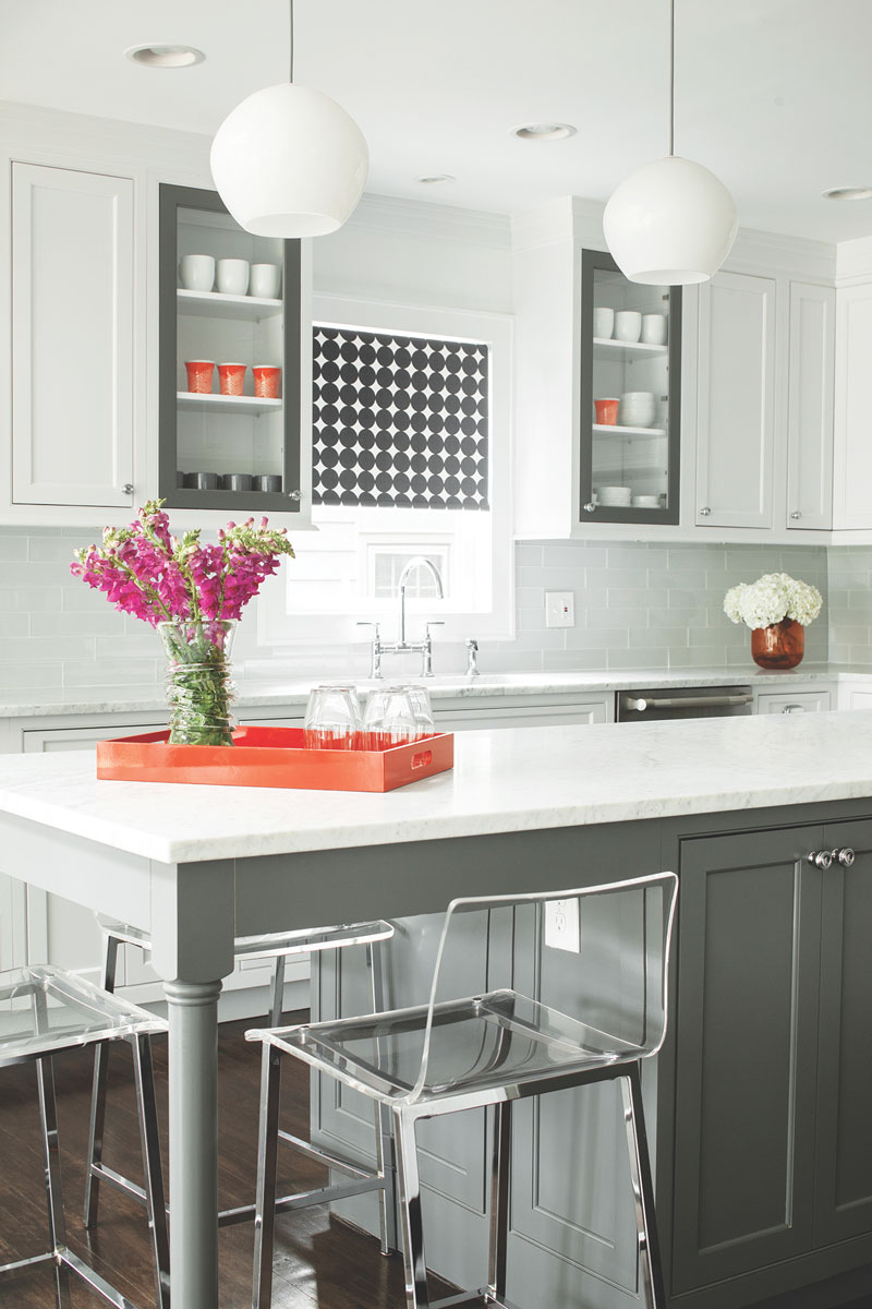
KITCHEN | Framing two glass cabinets in a contrasting gray tone brings focal-point status to a wall of white cabinetry. A small, but impactful dose of orange adds another color boost.
-
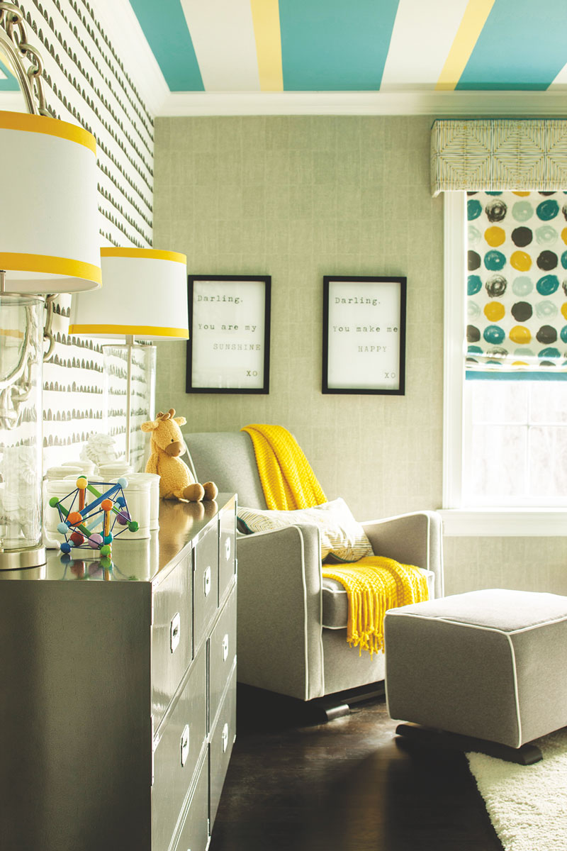
With gray as a neutral base in a child’s room, Wolf employed the 60-30-10 rule of thumb to strike the right color balance using aqua and yellow accents.
-
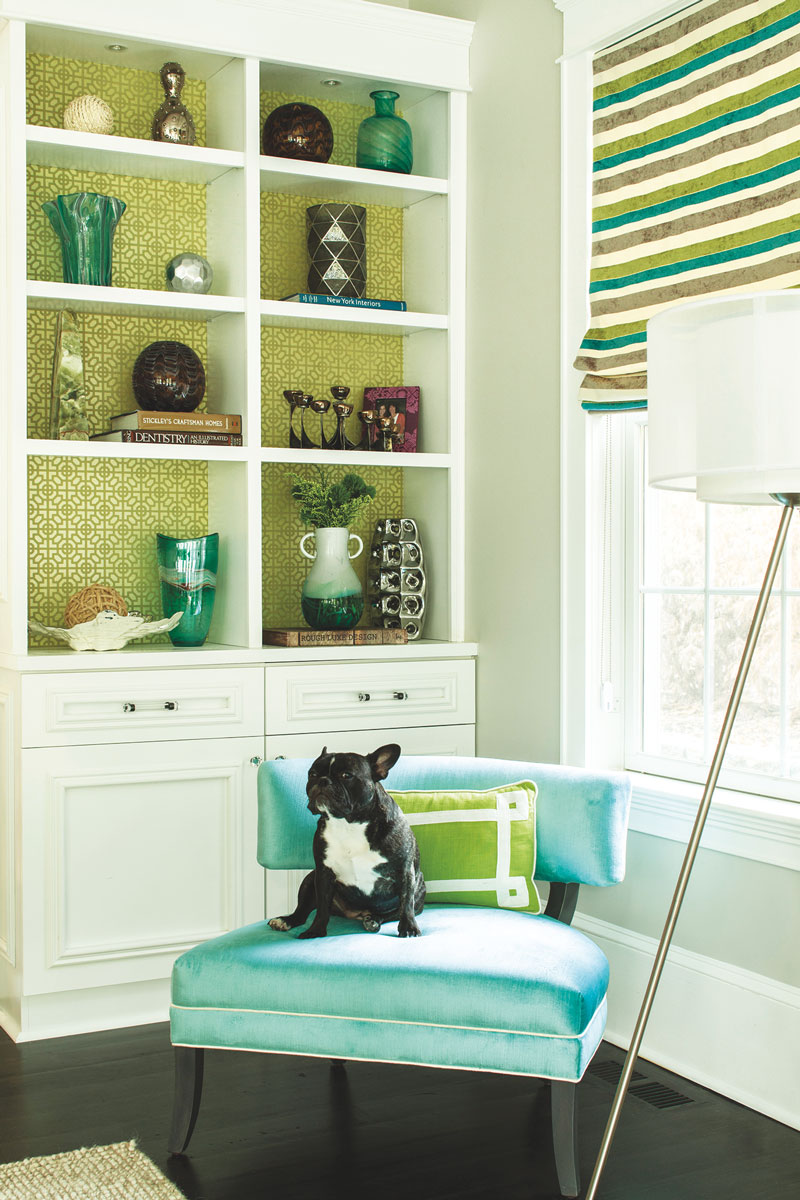
Graphic wallpaper revs up a white bookcase and picks up the sophisticated mix of spring green tones.

Karen Wolf
Karen B Wolf Interiors
South Orange, NJ
kbwinteriors.com
973-220-2171
Color exerts a powerful influence. The ability to set a mood, jumpstart a decorating scheme, reduce or enlarge a sense of space. With infinite options, choosing the right color can be a tricky and intimidating process — especially for the color-shy. Too little could be bland, too much, visually jarring. Interior designer Karen Wolf — principal and owner of Karen B Wolf Interiors in South Orange, New Jersey — joins the color conversation and guides us through the process.
“Color is making a comeback,” Wolf says. After years of cool-gray domination followed by the white palettes seen all over Pinterest and Instagram feeds, “gray is warming and designers and consumers could not be more cautiously optimistic.” Bolder, deeper, warmer, more jubilant hues reflect a growing appetite for flexibility in color expression, she says. Still, many consumers remain bashful about how, when and where to use it. Says Wolf: “As a designer who uses color daringly but sparingly, I have learned over the years how to create the balance between color crush and color crash.”
Design NJ: Speaking of color crush, how much weight should we give to the myriad “Color of the Year” pronouncements from paint and color forecasting companies when updating our homes?
Karen Wolf: While color predictions influence the décor accessory market, I do not recommend choosing a paint palette for your home based on annual color predictions. Color needs to be livable, and what is livable for one person might be different for someone else. Your home should evoke your mood, and the colors used throughout the space should back up this color story in a harmonious way. Sometimes clients are predisposed to certain colors based on historical reference. I came of age with Pottery Barn Red walls, for example, and will never forget the dining room red rage. Since then, I have avoided red in my own spaces. Most people have a color reaction associated to a memory that they either embrace or reject. That’s okay. Color is about you and how it makes you feel.
DNJ: Whether we opt to be conservative with color or want to spread it around in a big way, where do we look for inspiration?
Wolf: After defining the feel of the space you wish to create—active fresh, crisp, relaxing, fashionable, seductive, peaceful, cheerful, glamorous, etc.—I suggest starting with a fabric pattern, rug, art, wallpaper or even a set of dishes to pull a palette from.
DNJ: How do we strike the balance between too little, too much or the right ratio of colors in a room?
Wolf: A great rule of thumb is the 60-30-10 approach. A balanced color scheme has three colors: a base (60%), which is usually neutral and sets the tone; a contrast color (30%), which can be darker to create depth or lighter to create airiness; and an accent color (10%), which pulls everything together to add life. The accent color is a great way to incorporate a color trend if you are attracted to it and if it works with your color story, or to incorporate an unexpected or bolder color that you may be afraid to commit to in a big way.
DNJ: Should the color pop be a contrasting hue?
Wolf: Your color pop does not have to follow a contrasting theme. It can be analogous or monochromatic to be dramatic and harmonious. Imagine a blue monochromatic color scheme with 60% shades of light blue, 20% shades of white with blue, and then 10% in a deeper, brighter, blue. This approach is very safe for the color-shy.
DNJ: What are other ways we can pack a visual punch without a serious commitment or investment?
Wolf: Use of strong color does not have to be a color circus. If you are timid about using a color, then start small but stay focal. Try your accent pop on moldings, mantels, backs of bookshelves, small hallways, interior or exterior doors. Or bring in boldly colored accessories. These are all low-risk, non-permanent color investments with large payback.
DNJ: Once we choose a palette, should we stay within the same color family in adjacent rooms?
Wolf: I recommend weaving a color throughout a home. Proper color flow is like proper entertaining flow. It moves seamlessly from one room to the next in a circle and ends up at the front door right where it started.
Additional Color Strategies
Take it down a notch. When using a fabric, rug, art or wallpaper to match colors to, don’t exactly match what you are selecting as your accent color. Bring it down a notch in value. Also, when matching to a pattern, remember that your match should sink into the design, not jump out at you. I usually like to work with a less dominant color in the design as my accent color to make the room more interesting.
Lighting impact. If using a strong, deep color, it will appear even more vibrant in a space with an abundance of natural sunlight. Artificial lighting will dull it. I try to use halogen lighting for a more consistent and natural form of lighting. This will help to regulate your color choices overall.
Neutral nuance. Remember to use a neutral to let a bolder color breathe, even when you are incorporating a two-color complementary color palette. Without the neutral, your bold color will compete with the other color.
Paint Do’s & Don’ts
• Never let your painter copy a paint formula from one paint store to another. Each paint brand has a different texture that enhances its color formula. For example, Sherwin-Williams colors tend to have a slight sheen and reflect more light while Benjamin Moore colors are more saturated and read beautifully flat or matte.
• Always view your paint swatches on white primed walls with at least two inches of white space around them.
• Swatch your color selections in two to three locations in the room and view them at least two to three times a day as natural light changes.