
Designing Cape May
Writer Marirose Krall | Photographer John Armich | Location Cape May, NJ
The John P. Forsythe House
Show House Transforms One of This Shore Destination’s Historic Homes
The John P. Forsythe House was one of the largest homes in Cape May, New Jersey at the time it was built in 1911. More than a century later, this classic shingle-style seashore residence became the site of the 2018 Cape May Designer Show House. Designers from throughout the region showed off their talents to benefit the Mid-Atlantic Center for the Arts & Humanities programs.
Foyer and Living Room
Mary Jo Gallagher – Greystone Interiors LLC, Haddonfield, New Jersey
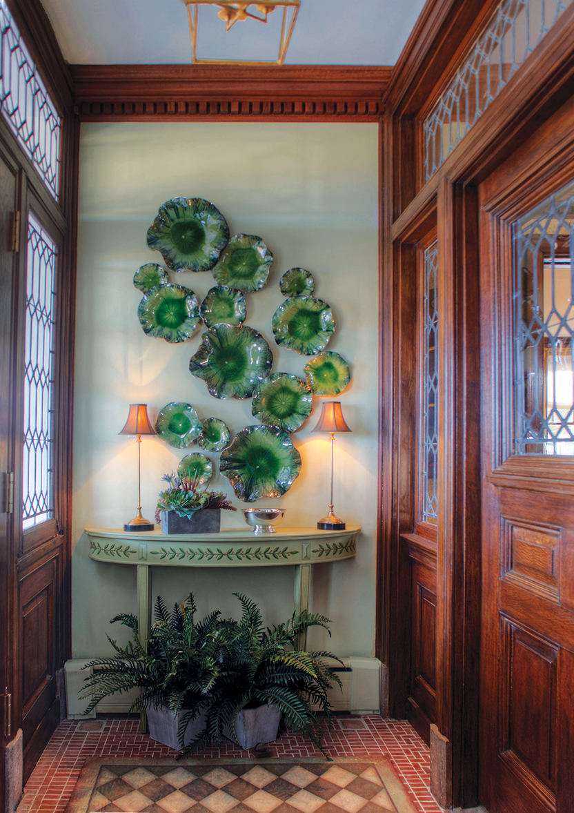
FOYER | The decorative accessories in the entry vestibule gently accentuate the ornate millwork and leaded glass. The light fixture was selected specifically for the home’s seashore locale. “There’s no glass in it,” designer Mary Jo Gallagher notes, “because you don’t want maintenance of glass at a seaside house.”
FOYER | Mary Jo Gallagher chose an understated atmosphere with a nod to natural elements for the entryway. “I wanted it to have an organic feeling,” she says. To achieve that look, the designer included foliage in various forms. A succulent on the console reflects the same green tones as the restrained yet exuberant ceramic lily pads on the wall above it. The handmade glazed pieces are “placed in an upward burst” drifting toward the ceiling, Gallagher notes.
The choice to incorporate greenery was practical as well as aesthetic. The ferns on the floor contribute to the natural vibe, but they also help to conceal a baseboard radiator. That radiator required additional accommodations. Because of space constraints, the console had to be positioned as snugly as possible against the wall; “we had the back legs removed so we could position it closer,” the designer explains.
Gallagher’s design underscores the beautiful period elements in this small space. The subdued decorative accessories allow the intricacies of the early-20th-century millwork and the leaded-glass windows and transoms to stand out.
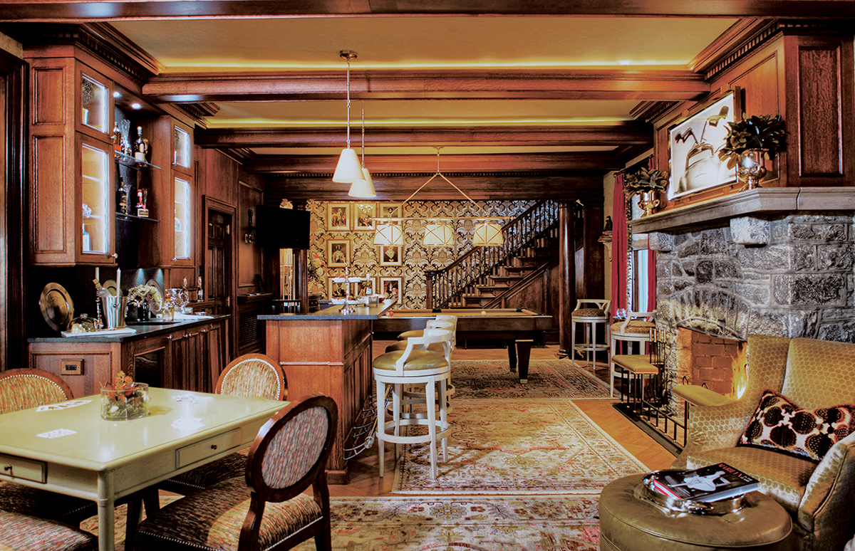
LIVING ROOM | Gallagher feels that “lighting is key to any room” and had lights integrated into the ceiling beams and the interior of the cabinets. The art over the fireplace has special meaning to the husband. “This is his space. He loves cars.”
LIVING ROOM | The home’s “parlor,” as such rooms were called at the turn of the 20th century, is not a traditional living room. The homeowners wanted a space that was reminiscent of a hotel lobby. And lobby-like it is, featuring a fireplace, sitting area, bar and pool table. Gallagher commissioned the woodwork, taking inspiration from an elaborate original beam between the stairway and the parlor. Jay Taylor of Taylor Made Custom Cabinetry & Design in Pennsauken, New Jersey fabricated the millwork. Taylor created the cabinetry, beams and wall panels from raw red oak, matching the wood found elsewhere in the show house. To offset the darkness of the wood, the ceiling beams were constructed as “boxes that house recessed LED soft lighting,” Gallagher notes. “It warms up the entire room and gives it a presence it didn’t have before.”
Though the millwork is a focal point, the subtle use of color adds a visual layer. The carpets feature “vibrant citrus and blue with a touch of raspberry,” the designer says, to create a counterpoint to all the brown in the room. The attention to detail is apparent throughout the space. The pool table is made from raw walnut with brushed stainless steel and inlays of mother of pearl. “It’s beautifully done,” Gallagher says. “It’s actually a work of art.”
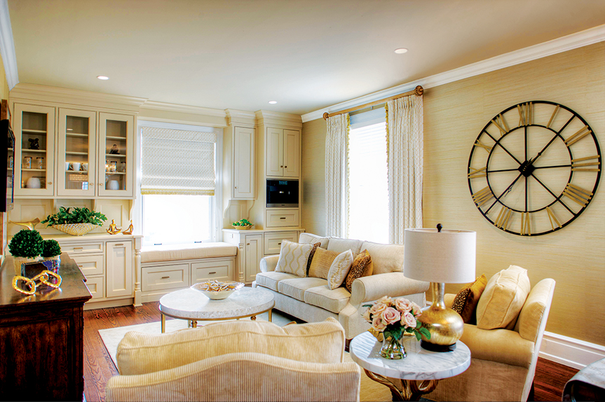
Family Room and Pink Bedroom
Victor J. Dompierre and Jack Griffin – Dompierre LLC, Marmora, New Jersey
Using plum as an accent, the designers outfitted the space with a foundation of gold.
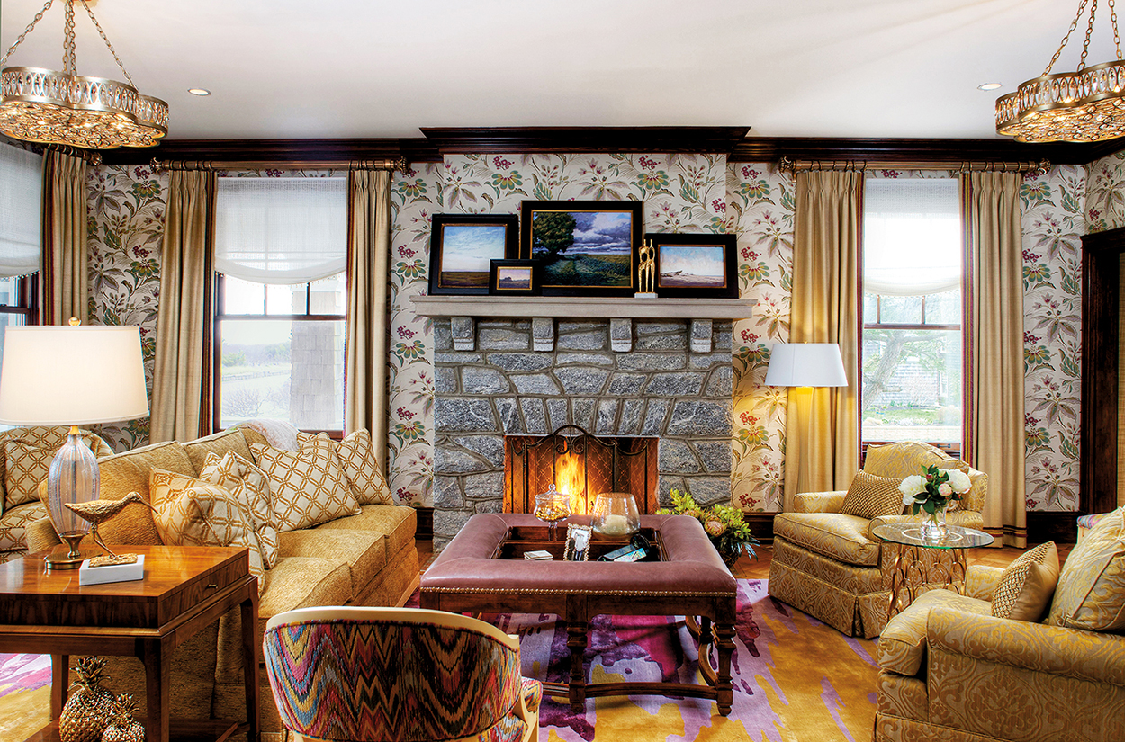
FAMILY ROOM | Victor Dompierre and Jack Griffin saw the family room, the largest common space in the house, as a “terrific opportunity.” It was also a bit of a challenge. “We had to take into consideration the colorways and design concepts in the surrounding spaces and create a continuity that made sense with what was already under way,” Griffin says.
The designers worked closely with the homeowners to choose the colors. “They did not want to use any blues or teals, but they did want to use gold,” he adds. With that in mind, the designers included a variety of elements in various golden shades.
With gold as the predominant color, the designers sought to create a space with “livable elegance that is welcoming, bright and truly a ‘family room,’” Griffin says. Against the original limestone fireplace, the space’s transitional design includes “Elizabethan-style floral wallpaper given a contemporary treatment, a graphic design on the custom rug, contemporary artwork, an overstuffed sofa and chairs, and subtly beaded and relaxed window treatments.
“We really wanted to elevate the room and create a liveliness,” Griffin says. “We brought together traditional and contemporary furniture, finishes, accessories, textiles, treatments and fabrics that resulted in a classic and timeless design.”
To use what might have been an awkward, wasted space, the designers created a window seat in a nook between walls.
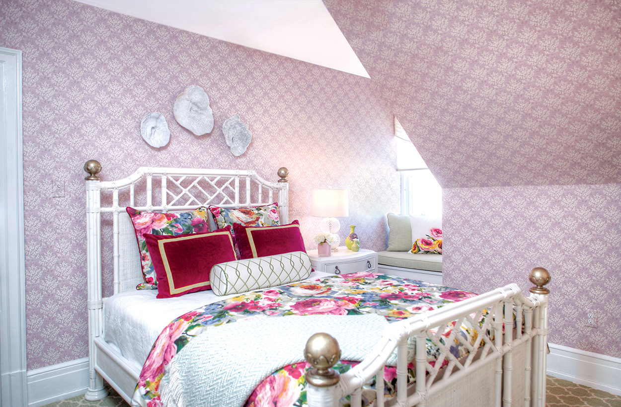
PINK BEDROOM | The sloping ceiling played a major role in the design of this room, Griffin says. “This wonderful 20th-century house has interesting architectural angles. We really enjoyed playing with that element.” To accentuate the roofline, the designers covered the walls with a muted pink and lavender wall covering that emphasizes the architectural intrigue without overwhelming the space. “The color choice softens the angles,” he says.
The designers went bolder with the bedding, incorporating a lively floral print comforter and shams. A pair of ruby red shams placed atop the floral foundation brings the color up a notch. The look is moderated by a neutral white bed frame and sheets. A light green and white carpet coordinates with a bolster on the bed and the light green of the window seat. Taken as a whole, the room reflects the brilliance of summer at the shore. “The light and airy feel of the white furniture captures the ‘day at the beach’ vibe,” Griffin says. “The delicious colors bring thoughts of summer sunsets to mind.”
Kitchen and Breakfast Area
Allison Morgan and Kate Conaboy – The Summer House Design Group, Stone Harbor, New Jersey
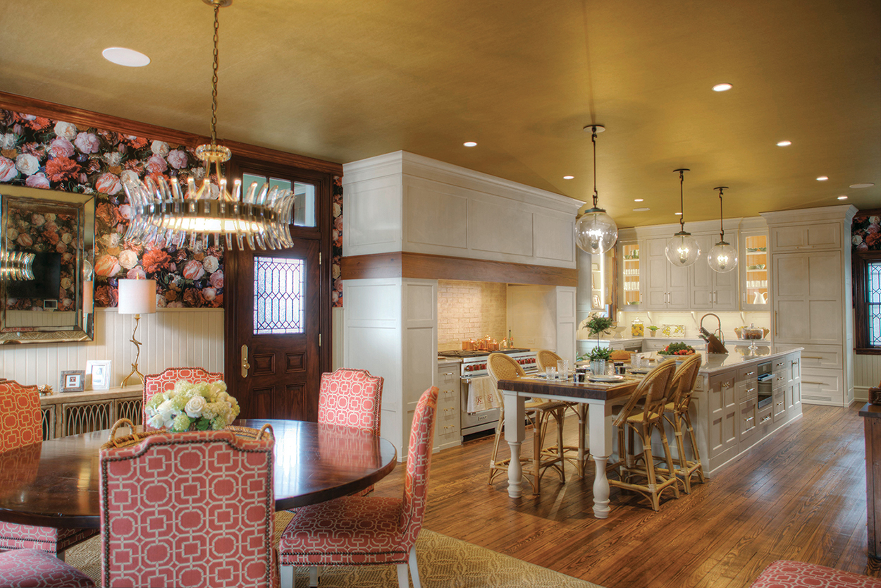
The cabinetry and millwork—original to the home—reflect the era in which it was built. New appliances and lighting update the space for modern living.
The team at The Summer House Design Group wanted to be sure their vision for the show house kitchen reflected the home’s early-20th-century roots. The home’s pedigree—and the overall vibe of historical homes in Cape May, NJ—helped pave the way for the design, Allison Morgan and Kate Conaboy say. The designers wanted the atmosphere to acknowledge the home’s past. To that end, they worked with many of the existing elements, including refinishing the pine cabinetry and hardware.
While the designers looked to the home’s storied past for inspiration, they also wanted to welcome the present and provide comfort and usability for the future. They aimed to make the space feel bright and lively, incorporating different textures and using dynamic colors and patterns to make aspects of both rooms pop all year round.
The newly refinished cabinetry brought some of that brilliance, as did the wall covering. Bright floral wallpaper creates a cheerful atmosphere and contributes a sophisticated, colorful vibe. Dining chairs featuring beige and burgundy/red fabric bring additional color. In addition, Morgan and Conaboy infused the space with a wide variety of textures and materials, including sisal, rattan, Lucite and metals in addition to the existing cabinetry and hardware.
Master Bedroom and Sitting Area
Janis A. Schmidt, IDS – Dragonfly Interiors LLC, Cape May, New Jersey
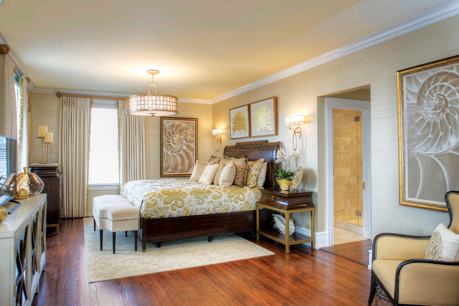
BEDROOM | The subdued palette helps make the master bedroom a quiet retreat. Artwork depicting symbols of the seashore are a nod to the home’s beach locale.
In the master suite, the mood is sophisticated, at the request of the homeowners. “They often stay at the Waldorf Astoria in Manhattan,” designer Janis Schmidt says. “The wife likes the feel of that—very elegant and very formal.” While Schmidt was happy to comply, “I said that we can certainly head in that direction, but realizing this isn’t the Waldorf, it’s a house on the beach.” To create a harmonious combination of sophisticated and “beachy,” Schmidt began with a neutral foundation. “We made the whole palette very soothing,” she says. “The hallway outside of the bedroom is very ornate and very complicated in terms of patterns. So I went with this very calm palette.”
Schmidt chose refined fabrics and finishes, but added a few nautical pieces as a nod to the home’s location. The artwork in the room, for example, portrays coral and nautilus shells. “It’s not kitschy, but elegant. I included it as a reminder that this house is at the beach.”
SITTING AREA | Schmidt used elegant fabrics and finishes, which the homeowners love. The neutral color scheme is relaxing, ideal for a beachside retreat.
The seating area was originally a separate room. “This house is very old, and many of the rooms were chopped up,” she says. The wall between the seating area and the bedroom was removed to make the suite more conducive to modern living. The soothing surroundings create a “suite that will be very quiet and private when they have a house full of company.”
Wife’s Bathroom and Blue Bedroom
Janis A. Schmidt, IDS – Dragonfly Interiors LLC, Cape May, New Jersey
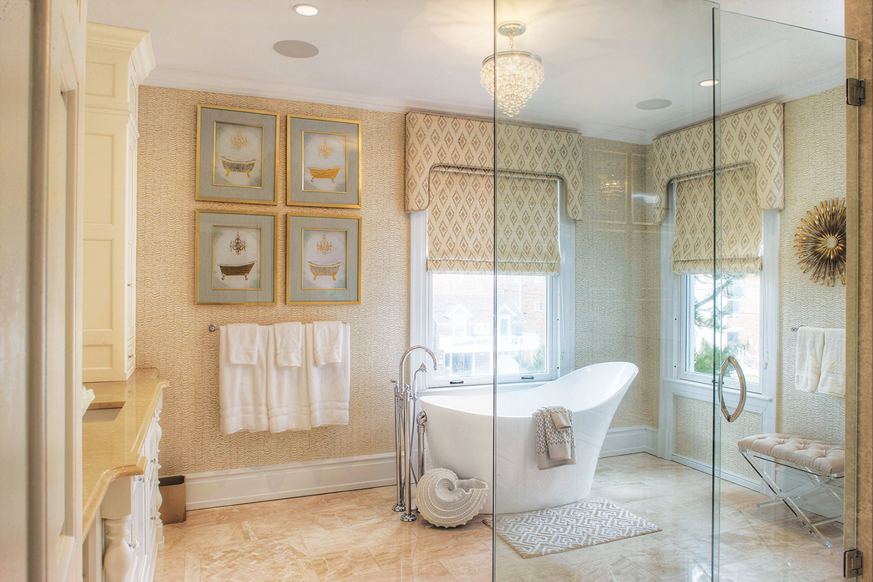
The wife’s bathroom is serene yet sophisticated.
BATHROOM | The five-star hotel vibe continues in the wife’s bathroom. “She really wanted a big bathroom,” Schmidt says. The expansive space includes a freestanding tub aligned to take advantage of the view. “If you’re resting in that tub and looking out the window, you can see the beach and the ocean,” Schmidt notes. The designer carried the master bedroom’s neutral color scheme to this bathroom. “I kept the color palette—the monochromatic calm color—the same just for continuity and that feeling of tranquility.”
The room is serene, but not boring, thanks to an assortment of patterns and textures. Geometric diamond patterns on the window treatments, towels and floor mat are juxtaposed with the more subtle, wavy design of the wall covering. Marble floor tile contributes to the elegant atmosphere, while a stylized nautilus shell next to the tub brings seashore style.
Just the right amount of bold color makes this space lively, but not overwhelming.
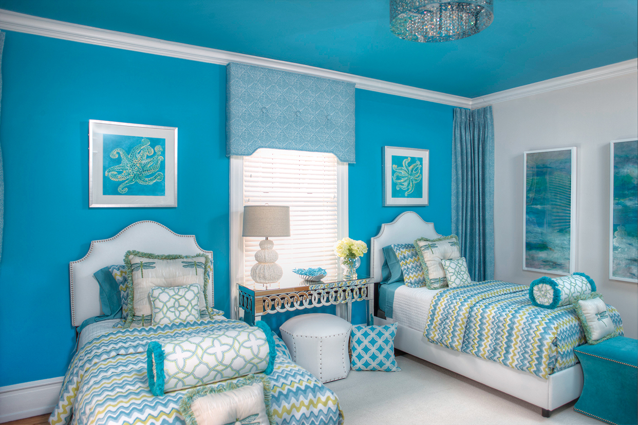
BLUE BEDROOM | In this guest bedroom, Schmidt “wanted to do something a little more fun. After all, it is a beach house.” The designer chose a cheerful, bold turquoise for a wall and the ceiling. “Any time I’ve used that color in any of my designs, anyone—male, female, kids—they have a real reaction to it. It evokes a happy response.” The blue is evocative of the sea and is used in measured amounts. “When you use a color like that, you don’t want to overdo it, so we just did the accent wall and the ceiling.” Bedding in shades of blue, green and white acts as a perfect foil to the dramatic expanses of color.
Also complementing the wall is the drapery, which Schmidt added in an unusual spot. “I trimmed the corners of the wall where the turquoise meets the white. I wanted to break up the delineation between the two colors,” she says. “It also seemed like such a big void. I got the idea of draping those corners, and people really responded to it.”
The company’s namesake dragonfly appears on the shams and is particularly appropriate here since dragonflies are pervasive in Cape May. It’s a custom that people have come to expect from Schmidt. “When we do show houses, especially, if I don’t put a dragonfly somewhere in the project, people ask about it. They actually look for it.”
Taupe Bedroom and Blue Bedroom
Nancy Burton – Harvey-Burton Interiors, Bridgeton, New Jersey
Designer Nancy Burton re-created the elegance of a bygone era in this guest room.
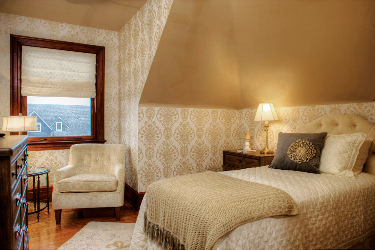
TAUPE BEDROOM | Nancy Burton’s plan for this guestroom, called “Time to Renew,” was to “create a relaxing and inviting space.” She achieved that objective: the gentle, monochromatic palette is calming and restful. But the designer had another goal as well: “I didn’t want to ignore the era of the house.” To pay homage to the home’s pedigree, she sought to re-create the more formal decorative style common to grand residences of the early 20th century. “I wanted a little bit of that elegant feel you’d find in that time,” she says.
Burton chose a palette of golds and creams “because it’s a sophisticated color combination.” She covered the walls with an updated damask paper. “It has a classic feel, but the pattern is a little more modern,” she explains. On the ceiling, which angles sharply, she used a taupe/gold color aptly named “Beach House.” The bedding, which stands out—albeit subtly—in a light cream, features a structured bedspread rather than a more casual comforter. A throw blanket, placed at the foot of the bed, is a relaxed and practical addition.
To ensure she used every bit of the modest space’s square footage, Burton created a small reading space in an alcove next to the window. A simple window shade works well against the stained wood of the frame and the intricate pattern on the wall covering. Though there are many different patterns and textures in this space, the gentle color scheme keeps the feeling peaceful.
Deep tones bring warmth to a guest room.
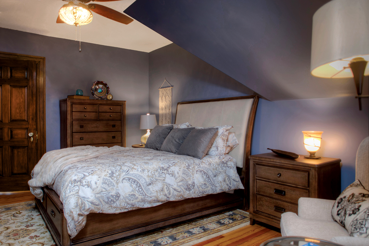
BLUE BEDROOM | Burton chose deep tones for this guest room, called “You Are Cordially Invited,” to create a warm, inviting haven. “I kept it cozy and understated,” she says. “I used blue, and the room feels a bit more masculine.” The dark wood dresser, night table and bed frame have a linear quality, which adds to the masculine vibe. The bedding features accent colors in shades of blue, gray, beige and white, which complement the moody blue of the walls. “It feels like you’re underwater,” the designer says.
The carpet adds a few more colors to the mix as well as a bit of softness. Its floral design in shades of blue, gold and scarlet features swirls and curves. The carpet’s border, composed of straight lines, mimics the lines elsewhere in the space.
Daughter’s Bedroom
Nina Green – NGD Interiors, Churchville, Pennsylvania
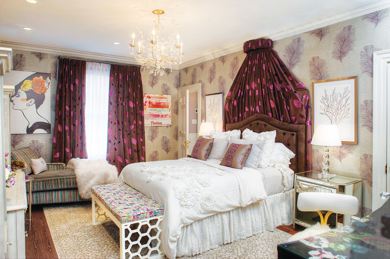
The focal points of the daughter’s room include the window treatments and the canopy, made from rich taffeta overlaid with embroidered appliqué and cut velvet to create an iridescent finish.
This bedroom, called “Mermaid,” was designed for the homeowners’ ‘tween daughter, designer Nina Green says. “Overall, the owners wanted something that was going to be sophisticated, but that also incorporated the lavender and glam look the daughter wanted.” The owners also wanted to make sure the furniture and finishes would grow with the daughter, without it being a “child’s room,” Green says.
Green looked at the space and a design strategy immediately presented itself. “I knew instantly from the ceiling height that I wanted to create a dramatic bed, starting with the canopy.” She also wanted to honor the daughter’s request that her favorite color, purple, be incorporated into the design. “This fabric (from the Thunder Bay Collection at French fabric house, Casamance) had the perfect shade of lavender that wasn’t grape purple. It was a perfect way to infuse traditional florals with a sophisticated, modern look.”
The designer chose earth tones for the wall covering so the canopy and window treatment fabric would stand out. Though the wallpaper may be neutral, it holds its own. “I am a fan of beautiful wallpaper and how it can bring sophistication, pattern and texture to a room that a plain, painted wall cannot bring.”
Sitting Area/Office/Gym
Vera Bahou Akruk, Allied ASID – DesignHaus Interiors, Holland, Pennsylvania
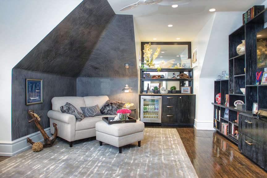
SITTING AREA | The sitting area offers comfortable cushions, ample storage and a beverage cooler.
In a space that would have many uses, designer Vera Bahou Akruk wanted to “offer a different type of atmosphere from the rest of the house.” The gray-and-white color scheme is complemented by the custom cabinetry, which fits snugly into the nooks and crannies under the eaves. The finish of the cabinets was created using “a combination of lacquered black and a satin sheen finish with white paint rubbed into the finish. The look is finalized with a wax application.” The multistep process resulted in sleek yet textured cabinets that bring an additional layer of interest to the space.
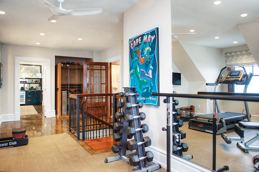
GYM | A Cape May poster in the gym “connects the interior of the space to its location at the beach,” designer Vera Bahou Akruk says.
The gym received a lighter treatment with a layout that “encourages energy and promotes focus,” the designer says. A treadmill situated next to a window offers a beautiful view while exercising. Specialized tile in the workout zone is easy on the joints and stands up to the punishment of weights and other exercise equipment.
Bathroom
Vera Bahou Akruk, Allied ASID – Designhaus Interiors, Holland, Pennsylvania
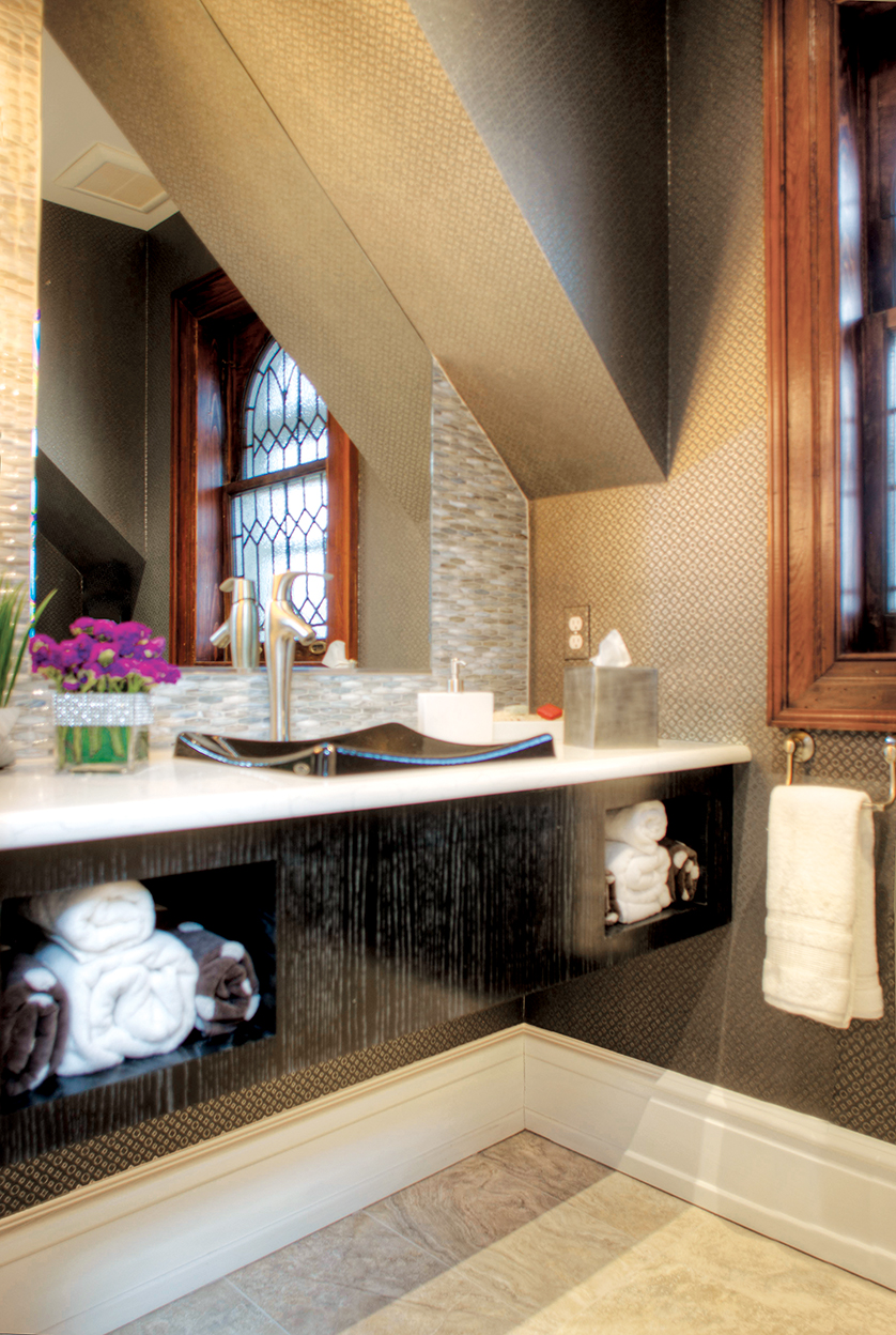
A spa-like bathroom is awash in gray tones.
In the small space occupied by this bathroom, designer Vera Bahou Akruk wanted a streamlined look. In tones of silver, gray and white, the space is spa-like in its well-ordered, yet sophisticated style. The wall covering features a dark gray background topped with a silver tone in a small geometric design. The eye-catching sink is glossy black with curved sides that add dimension to the light-colored vanity top. The backsplash tile, in gray and white, coordinates with the wall covering.
The vanity is finished using the same multistep process as the cabinetry in the office/sitting area. Its dark tones with light striations bring depth to the space. By “floating” the vanity, the designer created an illusion of a larger space while providing needed storage.