
A Sea of Tranquility
Writer Marirose Krall | Designer Kelly Mericle | Architect Fenwick Architects | Builder Van Duyne BuildersA Longport, New Jersey, home features peaceful interiors with subtle nods to its beachfront locale
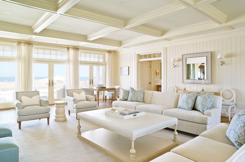
The living room is primarily white, allowing the ocean view to take center stage. Transom windows over the doorway and the French doors add character to the newly built home.
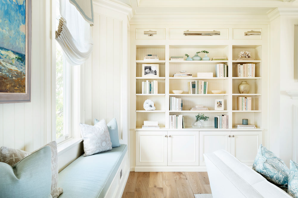
The built-in shelving is accessorized with books and objects that repeat the soft colors of the room.
This vacation home was meant to be a haven, a place where the owners could unwind just steps from the ocean waves. Kelly Mericle describes the goal for the interiors: “Our team was asked to create a restful atmosphere with a classic ‘beachy’ feel.” Mericle, of Philadelphia-based Kelly Mericle Design, says the project was inspired by traditional beach houses on the Northeast coast.
To create the peaceful environment the clients sought, Mericle infused the interiors with neutral tones accompanied by the barest hint of color. “We used an overall palette that is light and airy, incorporating seafoam green and soft blues.” Those hues are fitting, Mericle says. “These are the colors of the beach, and they informed the fabrics and finishes we used.”
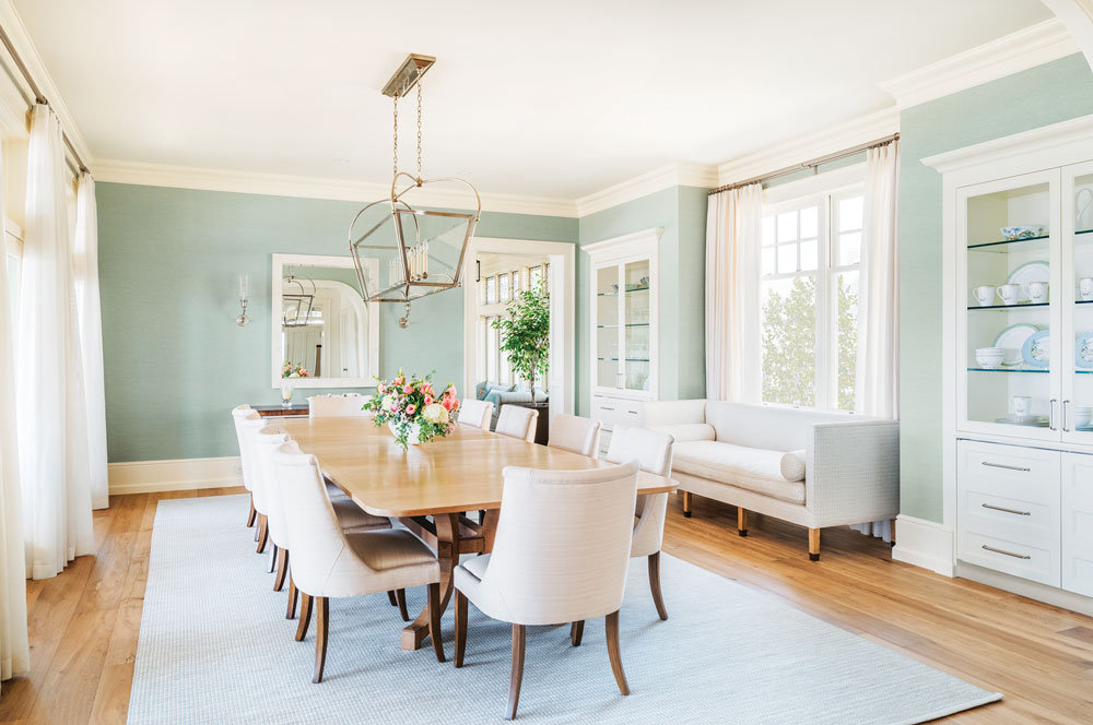
The family entertains often, so the long dining room table gets plenty of use. The light blue/green tone of the Phillip Jeffries wall covering complements the muted colors found elsewhere in the home.
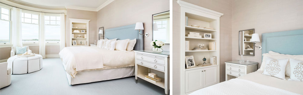
In the spacious living room, for example, a white foundation — including the sofa, carpet and walls — is accessorized with pale blue and cream elements that add splashes of soft color without disrupting the placid ambience or pulling focus from the expansive view of the coastline. Similarly, the primary bedroom, which also overlooks the beach, features soothing neutrals. The monochromatic palette is gently broken by a striped blue-and-white headboard.
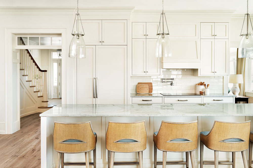
Neutral tones carry over into the kitchen, where the only pop of color comes from the light blue cushions on the stools at the island.
The kitchen is even more reserved, with white Shaker-style cabinetry accented with quartzite countertops in soft green and beige. The lighting is inconspicuous; three clear pendants above the island seem to disappear beneath their delicate silver chains. A quick dash of color comes from the light blue seat cushions on the stools at the island.
The muted colors of sea, sand and sky are meant as a subtle homage to the home’s location. However, the theme is used with restraint: a coral sculpture on a shelf or a beach-themed painting on a wall. One of the only literal nods to sea life is the wallpaper in the bathroom off the study, which features whales swimming in a frothy sea. Even that allusion to the ocean is understated in muted shades of gray and white. “We wanted to go for a beach aesthetic without being too obvious or kitschy,” Mericle explains.
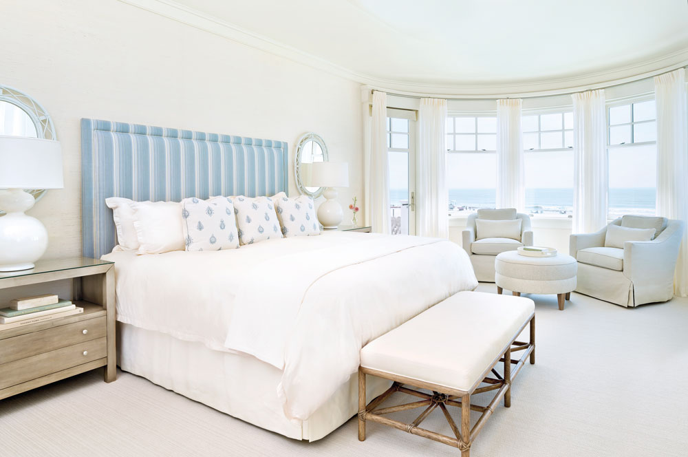
Transom-topped windows repeat the theme incorporated throughout the house. The soft blue and white headboard provides a bit of color.
A glorious view of the ocean takes center stage in the neutral space.
Left | A rounded wall of windows in the main-level guest room/secondary primary bedroom ensures ample natural light and stunning views. Right | A coral sculpture on the built-in shelves in the main level guest bedroom is a subtle homage to the home’s seashore locale.

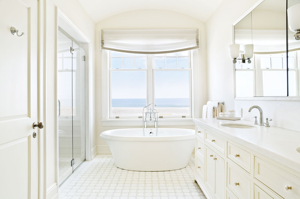
“The guest bathroom is quite large but purposefully so,” Mericle says. “It’s designed to be accessible for elderly visitors.”
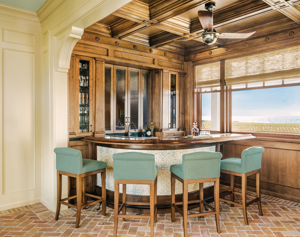
There are some notable exceptions to the pale palette. The bar room is a case in point. “This space was inspired by a dark-paneled bar in the Caribbean,” the designer says. Its rich tones and textures begin with the flooring. Composed of sliced bricks that were reclaimed from a Chicago building, the floor is laid in a herringbone pattern with a straight border. The curved bar is backed by built-in cabinets coated with a custom stain. The look is topped off with an unusual ceiling fan. “It’s originally from Italy and had to be rewired to work in this home. It’s a neat antique.”
The bar room’s coffered ceiling mimics that of the adjacent living room, but it’s adjusted for the size of the space. “We changed the scale so it would be more appropriate for the smaller space,” Mericle says. Barstools in light green coordinate with the color palette of the adjoining rooms.
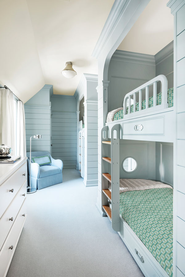
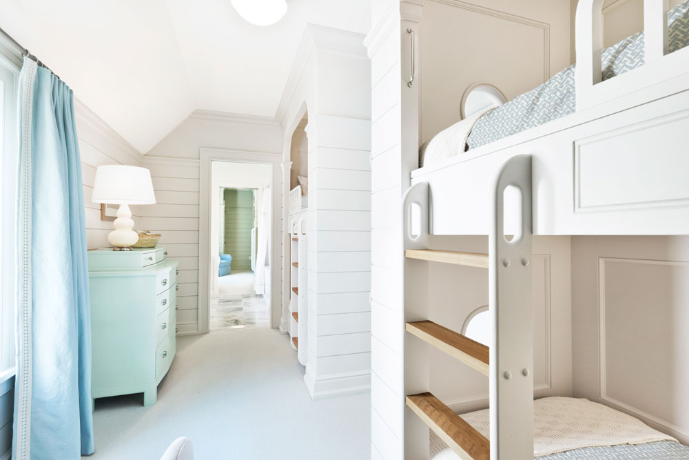
The bar room is one of Mericle’s favorite spaces, and so are the two bunk rooms, each of which consists of four twin beds. “They’re fully custom. Van Duyne Builders did a great job fabricating the built-ins. They’re so neat, but they’re also so functional. It’s quite a bit of extra sleeping space. They turned out to be awesome.”
That adjective can be applied to the entire home, which is both breathtaking and relaxing. Mericle adds, “It provides the family with a tranquil atmosphere and a comfortable backdrop.”
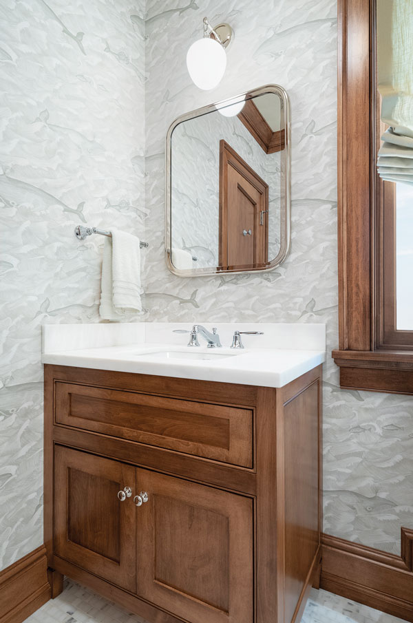
One of the only literal coastal references in the house is found in this bathroom’s whale-inspired wallpaper.
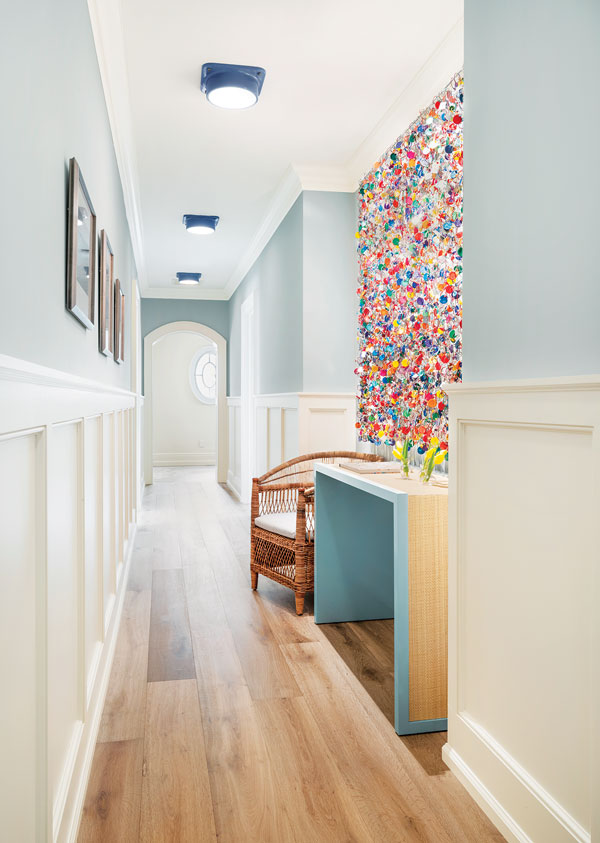
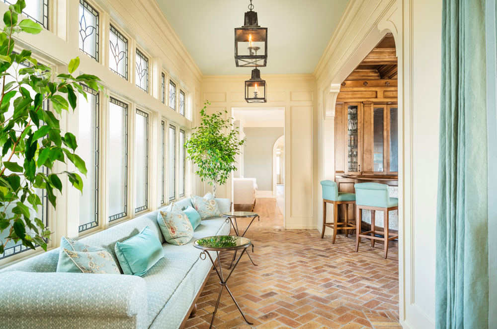
Artwork in a corridor features a riot of bold colors. “We wanted to break up the long hallway,” Mericle says, “to create a moment to pause and have something fun to look at.” The boldly hued pieces hanging from metal links are reminiscent of beach tags.”
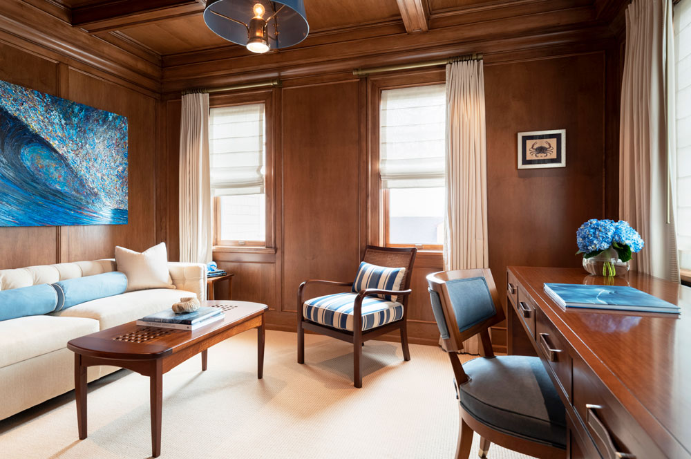
The dark paneled study is available for anyone who needs a quiet space to work. “It’s well insulated, so it does feel like a nice retreat from the rest of the house, Mericle says. “The dark veneer was a specific client request. It feels like the interior of an old-fashioned wooden ship.”
Editor’s Note: The exterior of this home was featured in the August/September 2021 issue of Design NJ (“Block Party,” page 24.) You can read it also by going to www.designnewjersey.com and searching for “Block Party.”