
Designers’ Favorite – Beautiful & Unexpected Color Combinations
Can you suggest some color combinations that are both beautiful and unexpected?
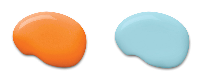

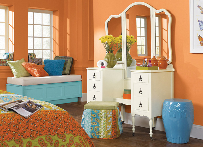
Sherwin-Williams “Liquid Blue” & “Knockout Orange”
“’Liquid Blue’ and ‘Knockout Orange’ paint colors by Sherwin-Williams are tertiary hues that are striking individually and dramatic together. Pairing the colors, in small or large doses, can add a unique and memorable twist to a classic design.”
Sheila Rich, CID, IIDA | Sheila Rich Interiors LLC | Monmouth Beach, NJ | 732-870-3012 | sheilarichinteriors.com
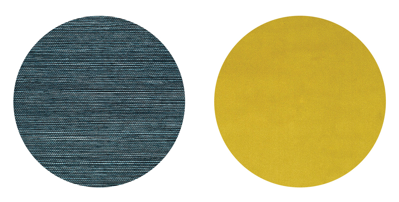
Schumacher “Haruki Sisal” in Peacock & Robert Allen/Beacon Hill “Torino Velvet” in Chartreuse
“We love the unexpected combination of cool peacock blue with a jolt of chartreuse. This formula is a fresh and sophisticated twist on the classic navy and orange or yellow pairing. The complementary hues bring an immediate sense of style to a space and can work in both modern and traditional décor. However, you would not want to use these colors in equal amounts, but perhaps 90% peacock blue and 10% chartreuse.
For example, in a recent dining room project, we paired a peacock blue grass cloth (like this one by Schumacher) on the walls and a banquette upholstered with peacock blue velvet and a chartreuse contrasting welt (like this velvet by Robert Allen). Using the same color on the walls and banquette made the room feel larger, and the piping detail around the banquette’s base provided a chic bespoke element.”
Kerri Pilchik/Kristina Phillips | K+K Interior Design | Ridgewood, NJ | 201-644-5118 | kandkinteriordesign.com
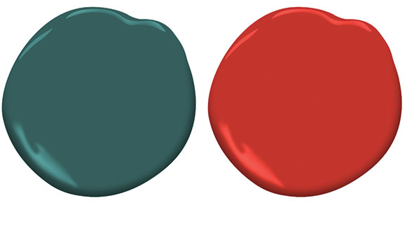

Benjamin Moore “Dollar Bill Green” & “Million Dollar Red”
“It’s a funny coincidence that both paint colors have “money” names, although red is the color of good fortune in Chinese culture. I see them in a room painted this gorgeous deep spruce green with just a touch of the Chinese lacquer red in a side chair or pillows. Forest greens have just a touch of a blue undertone, which makes them really work with the red. Red and teal are a more familiar combination, but using the forest green tweaks it to be a little bit more offbeat. Just be sure to keep the proportions right or it may become a little holiday looking!”
Mary Fran Brassard | Brassard Design Interiors | Rumson, NJ | 732-741-3773 | brassarddesigns.com