Designer Viewpoint: Wallpaper Tips & Trends

Nicola Callaghan | Nicola Jane Interiors in Sparta | 201.805.2069 | www.nicolajaneinteriors.com
“Wallpaper has seen a resurgence over the past few years and the demand for expensive hand-painted wallpapers are on the rise,” says interior designer Nicola Callaghan, Creative Director of Nicola Jane Interiors in Sparta. “You only have to browse the collections by Gracie to appreciate why,” she adds. “Each design is hand-painted, custom, a complete one of a kind, making each room its own work of art.”

According to Callaghan, “the overuse of wallpapers in the 1950’s through early 1980’s has left 2019 design clients a bit divided. While many embrace a wallpaper revival, the other half are still very much against or, at least, anxious and not certain how to use it to its advantage.”
Callaghan presents these wallpaper application design tips for the timid — to the brave.
– Meg Fox
Molding applications and small spaces
If you are uncertain about wall coverings, there are a few simple tricks to ease you in. Consider layering patterns and textures on a wall, framing it with panel molding just like a piece of art. This is an application I use in my own studio and for very good reason. Each season when new styles are released, I simply switch out the panel with a few rolls of emerging trends. In addition, because you are not taking on an entire wall, you don’t have to be as concerned about the price or number of rolls. Elli Popp executes this perfectly with her Baudelaire’s Dream.
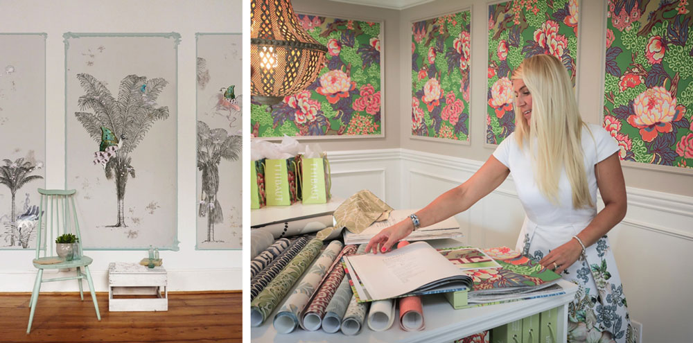
Left: Elli Popp | Right: Callaghan in her Sparta studio. Wall panels are switched out by the season. Design by Thibaut.
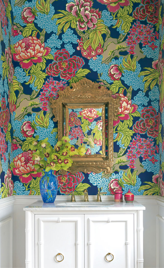
If you are feeling a little more experimental, then powder rooms are an ideal space where you can try out that luxurious hotel feel. Thibaut has been one of my favorite sources of wallpaper for their bold, fresh and playful patterns. They have a great selection of floral prints especially the Honshu wallpaper, which comes in a variety of colors from a bold navy to a soft robins egg blue.
Making a statement
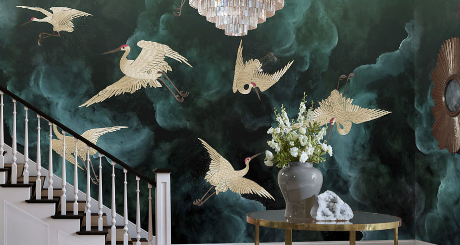
For those with a little more conviction, feature walls and wall murals, if done well, are transformational and indulgent. They take a little more thought and vision and of course the right pattern. Phillip Jeffries has gone bold with their deep dramatic tones and contrasting metallics in their new spring 2019 ‘Welcome to Shangri-La’ design. This new collection merges traditional decorative Eastern fashions with classic Western patterns. Here it adds a moodiness and depth to this open staircase. Shown in emerald green but also available in a variety of other colors including Pantone’s 2019 Color of the Year: Living Coral.
Try something different
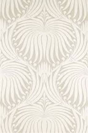
Decorative ceilings date to the early 19th century where paper designs imitating plasterwork medallions were common practice. More recently, tradition dictates that ceilings should be laid bare, a blank 5th wall typically in ‘flat white’ or similar color to avoid making the height feel less than it really is. But a neat application employed by designers to elevate a room — but not always considered by the typical client — is wallpaper for your ceiling! The term ‘statement ceiling’ is given to this method of transforming a space that is normally forgotten. Large floral patterns in a subtle shade, such as the Lotus design from Farrow & Ball are great for ceilings. Whereas most wallpapers are usually made with ink, Farrow & Ball use their own richly pigmented paint, which removes the guesswork when color matching the paint for your walls.