October 19, 2017
— By Meg Fox
Color Crush: Blush
Softer than bubble gum and bolder than pastel, blush — as well as other pink tones — shows no sign of slowing down appearing on everything from apparel to home fashions.
Carlstadt-based, Pantone — the global authority on color — first called pink “the color to watch in 2016” when they named Rose Quartz the Color of the Year along with Serenity Blue.
Since dubbed “Millennial Pink” after the 79 million-strong generation that has embraced it, the soft pink shade caught the eye of designers last year at High Point Market on furniture, finishes, fabrics, lamps, artwork and wallpaper. Just when you think shades of pink would hit its peak or be on the wane, it appeared again in new introductions at the Fall, 2017 High Point Market and at this week’s New York Tabletop Show where brands like Kate Spade for Lenox, L’Objet, Vietri, Villeroy & Boch and Wedgwood debuted their newest collections for 2018.
At Maison & Objet, Paris’ major décor show held last month, “Millennial Pink transitioned into a neutral,” says Michelle Lamb, editorial director of the Trend Curve™ the international authority on trends for the home fashions industry. Lamb reported similar findings at the conclusion of this week’s Fall High Point Market. “Pink was everywhere.”
Pundits say not to expect blush or “Millennial Pink” to fade in popularity anytime soon. Whether as a headlining hue or calming neutral backdrop, pink serves as a perfect complement to shades of gray, black, ivory, taupe, green or gold. Designers are also pairing it with copper, teal, blue or lively chartreuse.
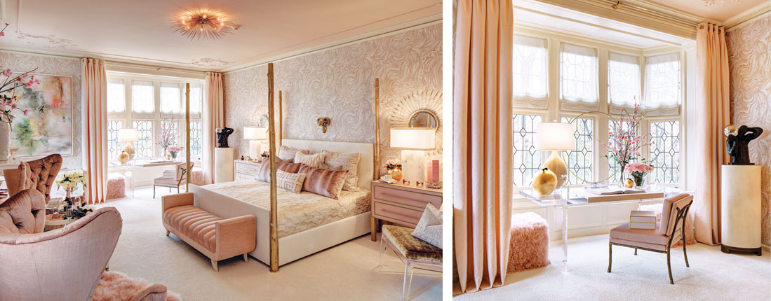
This month in “Pink” October, we honor Breast Cancer Awareness, and the work of Millburn-based designer Samuel Ciardi whose blush-toned bedroom at the Mansion in May held in Morris Township graces our October-November cover. Take a peek into L’Abbey En Rose and some of the newest paints and products that have the design world blushing.

We’ve had our pulse on pink tones for a while now,” says Sue Wadden director of color marketing at Sherwin-Williams. Newer shades are lighter, sandier and ultimately — more neutral in nature. “These factors make it no surprise that pink is growing in popularity. It can be an easy addition to a living space, and it’s a beautiful complement to gray.”
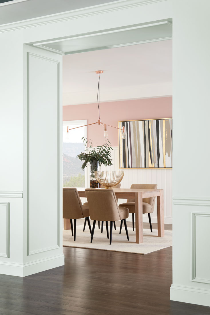
Wall color: Sand from Sherwin-Williams

Designed with a modern sensibility, blush tones feel light, airy and sophisticated in Mansion in May’s L’Abbey En Rose room.
Photo: Wing Wong/Design NJ/Oct./Nov. 2017/Design: Samuel Ciardi

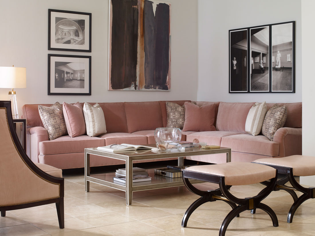
Century Furniture’s blush-toned, plush velvet sectional reads as a neutral in the company’s High Point showroom.

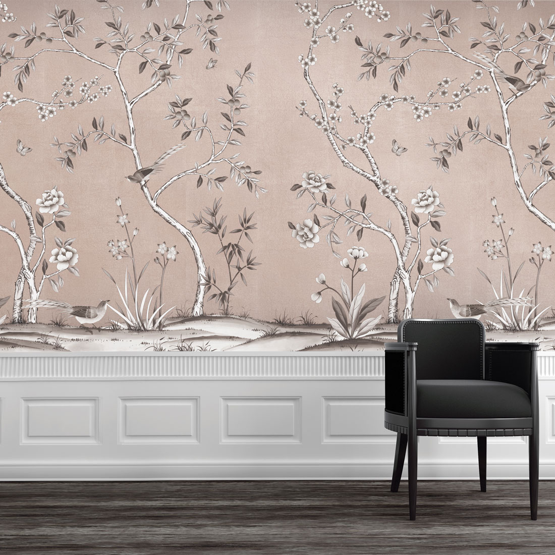
“Millennial pink is a timeless yet trendy range of color that has everyone talking,” says the design team from Tempaper, based in Brick. “From a touch of blush to vibrant salmon hues, millennial pink is taking the home décor, fashion and lifestyle markets by storm.”
Garden Metallic self-adhesive wallpaper from Tempaper

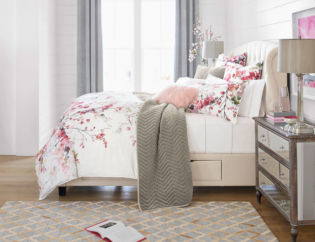
Romantic and pretty, the reversible Autumn Blossom Duvet features a vibrant watercolor floral-and-branch pattern in a mixture of hues. From Grandinroad.

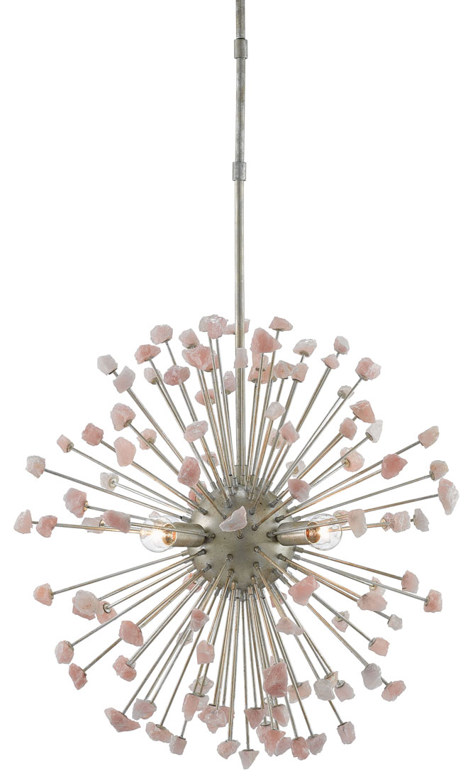
The Quartz Moon Chandelier by Currey & Company bursts overhead with rose quartz ray-like stems in varying lengths and an alluring silver finish.

CCB_7.
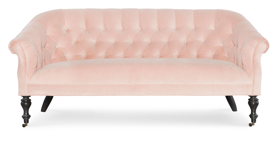
Lulu Blush velvet updates a timeless button tufting design on CR Laine’s Darby Settee.

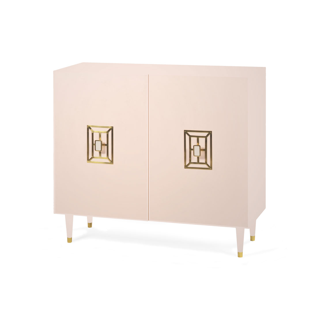
Brass jewelry-like hardware accentuates the soft blush tones of Alden Parkes aptly named Demure Cabinet

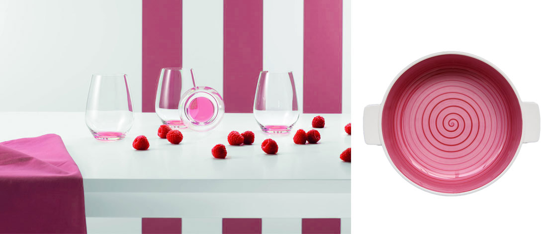
Left: Villeroy & Boch’s new Colorful Life crystal glassware features six eye-catching colors (shown is Berry Fantasy) at the bottom of each glass that appear to glow with color when filled with water.
Right: Move over white. Baking dishes from Villeroy & Boch’s Clever Cooking Collection now come in a kaleidoscope of colors — including pink.

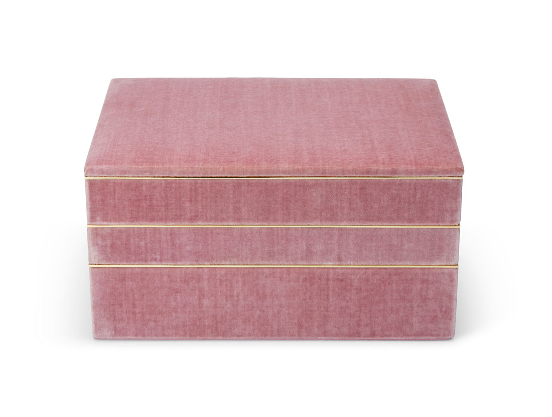
Aerin’s Valentina Velvet Stacked Jewelry Box with brass edging adds vanity flair.

