
Meet the Artist – Kathleen Palmeri
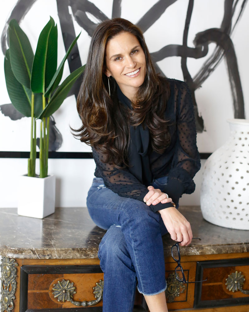
Kathleen Palmeri/K Palm Fine Art in Rumson/732-500-6203; www.kpalmfineart.com | Photo by Stacy Lyle Photography
Artwork. It can make or break a space. Launch a design scheme or be just the right finishing touch. “Art is what makes a house feel like a home,” says artist Kathleen Palmeri, mother of five and founder of K Palm Fine Art in Rumson. “It connects people and their personalities to the space in which they live.” Here Palmeri gives us a behind-the-scenes view of the creative process, sharing some of her favorite materials and techniques, tips for homeowners to consider and more.
DNJ: How did your passion for art begin and how did it evolve?
Kathleen Palmeri: For as long as I can remember I’ve expressed myself through art. As a child, I was quite shy. Painting and drawing were my way of working out what was going on inside, a way to get my thoughts and emotions out and make sense of my world. My paintings convey a story in which my own experiences and feelings are intertwined. Inevitably, whatever is happening inside is transferred onto the painting I create.
After attending Mason Gross School of Art and graduating from Rutgers College I received a Masters in Counseling from NYU. My counseling skills most definitely come into play while meeting with clients and designers. During those meetings I uncover what types of art will infuse the unique passions and personalities of the homeowner into their space.
DNJ: What inspires you or motivates your work?
KP: People, beautiful spaces, fashion and travel — most recently a family trip to Italy visiting Rome, Florence and Argentario. I’m constantly inspired by the beauty I see everyday, whether it is the perfect pink peony at the grocery store or a striped umbrella propped just right on the beaches of Sea Bright. I get that feeling that I just have to paint it. People are also an endless source of inspiration: trendsetters, local people doing good work in our community, treasured friends and most often strong women who are making a difference in the world.
DNJ: What type of materials or techniques do you use?
KP: I work mostly with oil paint and palette knives. The textured effect that the knives provide is beautiful. I often carve shapes into my canvases with my palette knives. I’m also a fan of giant paintbrushes, India ink, acrylic and gouache paint, markers, oil sticks and graphite pencils. Paintings consisting of mixed media are some of my favorite to create because they have so much dimension and so many layers to them.
Left: “Happiness,” (58″ x 58″) Oil on Linen by Kathleen Palmeri; interior design, Salt Design Co. in Asbury Park and Fair Haven. www.thesaltyhome.com | Photo by Stacy Lyle Photography • Right: “Rock Me Mamma,” (40″ x 60″) Mixed Media on Arches Paper by Kathleen Palmeri; interior design, Diane Romanowski Interior Design in Little Silver. www.dianeromanowski.com | Stacy Lyle Photography
DNJ: Do you ever experience creative blocks?
KP: To be quite honest, the only creative block I face lately is not having enough hours in the day to create. As a mother of five, my schedule does not always allow me to spend as much time in my studio as I would like. Of course, being a mother is the most important job I have. I have found that even when I am not in my studio painting I am still processing ideas, planning out paintings and jotting down endless amounts of notes. My mind doesn’t stop. More often than not this is a good thing because when I do get into my studio I know exactly what I need to do.
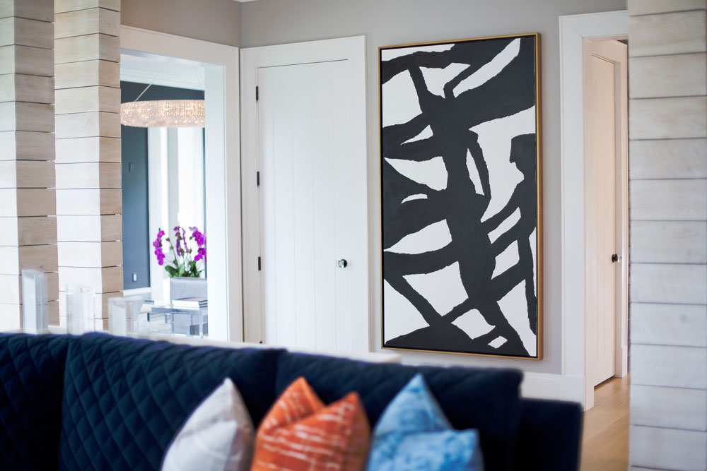
DNJ: When choosing artwork to enhance home décor, what are some tips homeowners should consider — or avoid?
KP: With artwork I find that bigger is most definitely better. When I see artwork that is too small for a space I immediately want to change it. Instead of placing one small painting on a big wall, why not place a grouping of small paintings and create a gallery wall?

“Kpalm Wall Story,” Ink on Arches Paper, (18″ x 18″ each) by Kathleen Palmeri; interior design, Diane Romanowski Interior Design in Little Silver. | Stacy Lyle Photography
KP: Large artwork can transform a space and take a room to the next level.
“John the King,” Acrylic on Canvas, (45″ x 83″) by Kathleen Palmeri; interior design, Rina Carrolli Interior Design in Fair Haven. www.carrolli.com | Melissa Mellor Photography
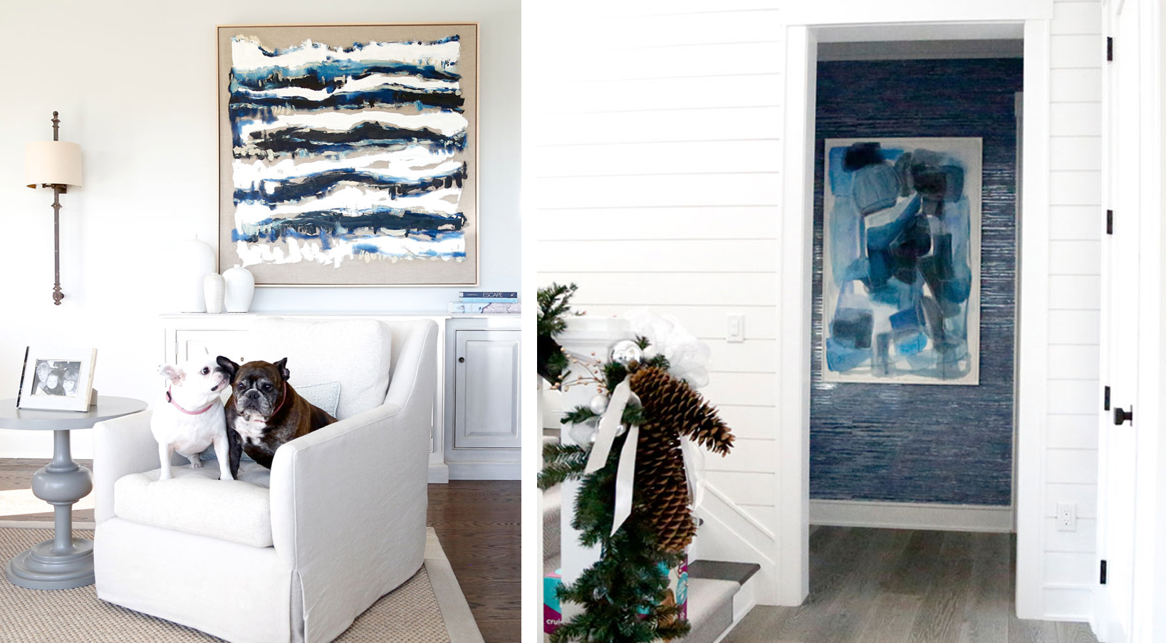
KP: Another important aspect of choosing art for a home is to choose a large variety of work. Recently, I was lucky enough to install four large works in a Rumson home: a gallery wall story, a 60″ x 60″ monochromatic white textural oil painting, a 58″ x 120″ modern coastal landscape painted on linen, and a mixed media painting made with gouache, oil sticks and graphite pencil. It was important to me to make sure that each piece fit the room perfectly. My goal was to represent a variety of painting styles and textures utilizing different mediums, papers, linens, canvases and frames.
DNJ: Should artwork blend with the room’s existing color scheme?
KP: Artwork does not have to match a room’s colors exactly. In fashion, it is often the color pop that makes the outfit. The same holds true for art. The only thing art has to match is the homeowner’s personality. After all, a home is an extension of the people that live there. The most memorable pieces of art are those that fit with the overall aesthetic of the home as well as the personality of the family that lives there. Art is what makes a house feel like a home. It connects people and their personalities to the space in which they live.
“Hello Again,” (43″ x 48″) Oil on Canvas by Kathleen Palmeri; interior design, Diane Romanowski Interior Design in Little Silver. | Stacy Lyle Photography
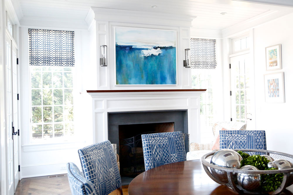
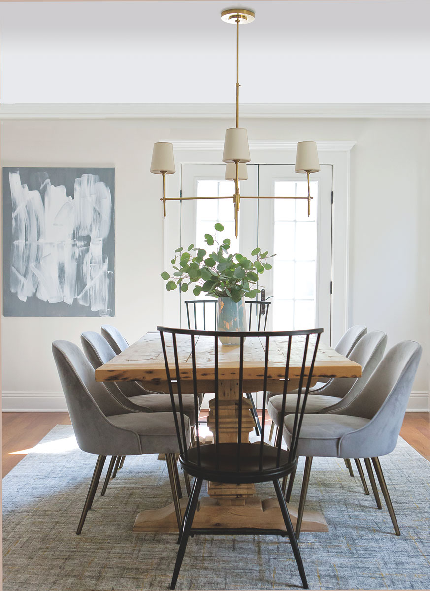
DNJ: Describe how the artwork chosen for this Rutherford dining room (DNJ: Feb/March 2019) works in this setting.
“Breathe Easy,” (36″ x 48″) Acrylic on Canvas by Kathleen Palmeri; interior design, Kara Theresa LLC in Monmouth County. www.karatheresa.com | Melissa Mellor Photography
KP: The brushstrokes in the artwork chosen by designer Kara Vacca for the Rutherford dining space give the area a sense of movement and energy. However, the calm gray and white color palette also makes the space feel grounded and serene.
DNJ: What are some of the art world trends you or others are following?
KP: It is important to me that my work does not appear trendy or dated. However, my color palettes are at times influenced by trends. Currently, I am having a very big blush pink moment. This color appears in so many of my paintings. However, it is always anchored by classic colors like Prussian Blue, Titanium White and Ground Stone. I would never paint something for a client that would need to be switched out in a year or two. I paint for people, not trends.
“Here and Now,” (140″ x 42″), Oil on Canvas by Kathleen Palmeri. | Melissa Mellor Photography
KP: My “Lucite Lovely” paintings are probably my trendiest paintings because they are framed in square, heavy, acrylic block frames. However, the modern frame is balanced by the simplicity of the paintings. They are timeless, organic pieces painted in oil, acrylic or ink on raw linen or thick, white Arches paper. This collection provides just a subtle bit of edginess, nothing that will be regarded as outdated in a few years time.
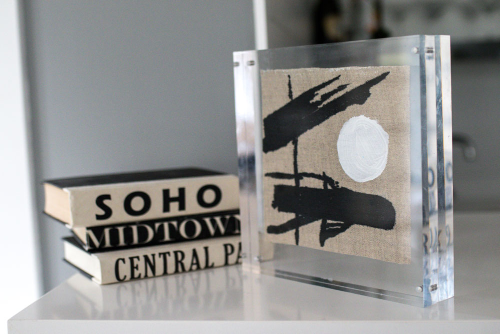
Example of “Lucite Lovely,” (10″ x 10″) Acrylic on Linen by Kathleen Palmeri. | Photo by Chelsea DeMonaco
KP: I also do a lot of big, bold India ink paintings, which make a powerful statement. To me, black and white will never be out of favor. They are timeless and they will look just as good today or twenty years down the road.
“Go Girl,” (52″ x 60″) Ink on Arches Paper by Kathleen Palmeri. | Melissa Mellor Photography
DNJ: You mentioned people are a great source of inspiration. Do you paint portraits?
KP: I have gravitated away from doing traditional portrait paintings that look like photographs. Although appreciated, I find realism to be tedious work. Additionally I find that this style, as beautiful as it is, does not always fit in today’s modern homes. A good portion of my work consists of palette knife portraits. I call this type of painting “modern portraiture.” It is whimsical, textural and abstract, but most of all it is happy, free and fun. I have done this type of portraiture as small as 4″x4″ and as large as 120″ long. One of these paintings, “Shades of Justice” depicts nine of my client’s favorite NJ and Supreme Court Justices. It is my favorite painting to date and the one of which I am most proud.
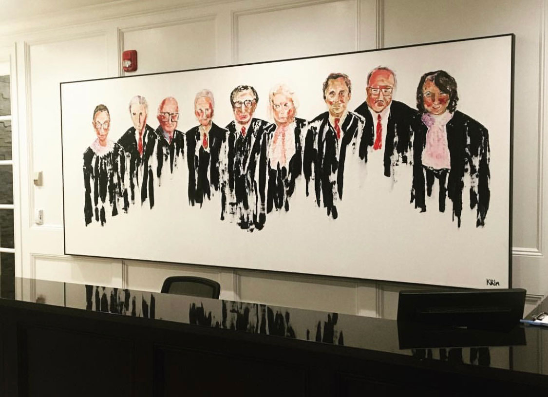
“Shades of Justice,” Oil on Canvas (120″ x 48″) done with palette knives by Kathleen Palmeri for Keefe Law Firm in Red Bank. | Photo by Lara Robby
DNJ: Where can we find your work?
KP: I am so grateful that my work can be found throughout the United States and in countries as far off as Italy and Costa Rica. In New Jersey you can find my work at: Schwartz Design Showroom (to the trade) in Metuchen, The Red Bank Design Center (to the trade) in Red Bank, Salt Design Co. in Asbury Park and Fair Haven, Gallery Jupiter in Little Silver and Gypsy Lane Home in Stone Harbor. Additionally, my work can be purchased through my website: www.kpalmfineart.com. I am also available for commissions.