Living Coral: Pantone’s 2019 Color of the Year embraces optimism
Living Coral — a shade of orange with a warm golden undertone — takes us to the depth of the ocean and feeds our desire to connect with nature. “The overriding influence [this year] was the environment,” says Laurie Pressman, vice president of Pantone’s color consulting unit. Think coral reefs and the arresting beauty we see in nature: a vibrant mood-lifting shade spotted on fashion runways, in home interiors, on websites and even in tech gadgets.
Design experts share their perspective on Pantone’s coral crush, predict how it may influence interiors this year and offer advice on how to use it.
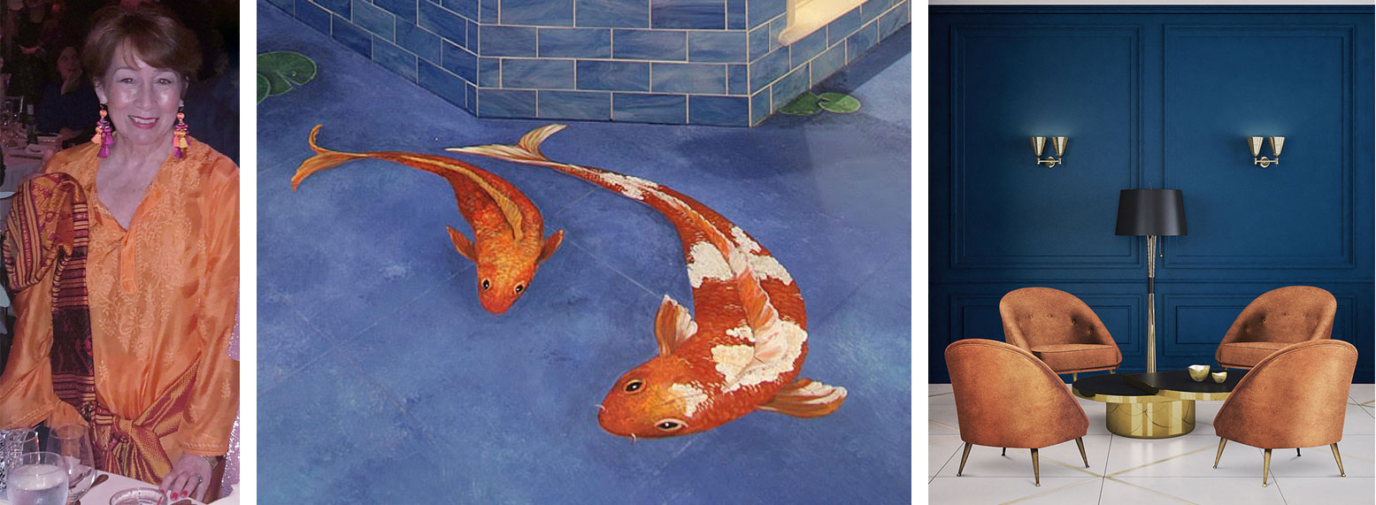
“Coral will add a burst of life to a room. It is the perfect dynamic complement to neutrals, such as grays or rich browns, but it also makes a fabulous statement when combined with turquoise or its natural environment: ocean blue. It’s a wow color. Think good vibes.” Interior designer Tess Giuliani, principal of Tess Giuliani Designs Inc. in Ridgewood www.tessgiuliani.com
Left: “Coral is no stranger to me,” muses interior designer Tess Giuliani, pictured in the high-fashion hue. | Center: Giuliani commissioned a faux coral koi fishpond — painted by artist Ornella Muth — in her Ridgewood bathroom. | Right: Arnchairs in an orange/coral color family pop against saturated blue walls in this midcentury-minded setting. www.delightfull.eu
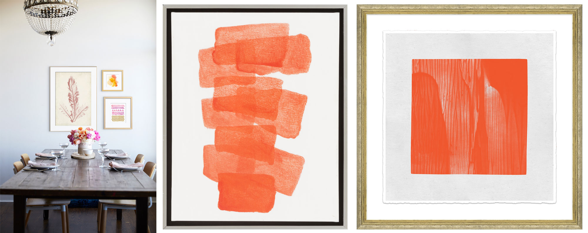
“The optimistic vibe of Living Coral leaves your space feeling cheery and upbeat. Hang a picture inspired by this hue where you’ll see it often — the kitchen, bathroom or entryway are great options — to channel its warmth when you need it.” Sandra Chandler, trend expert and lead buyer at Art.com.
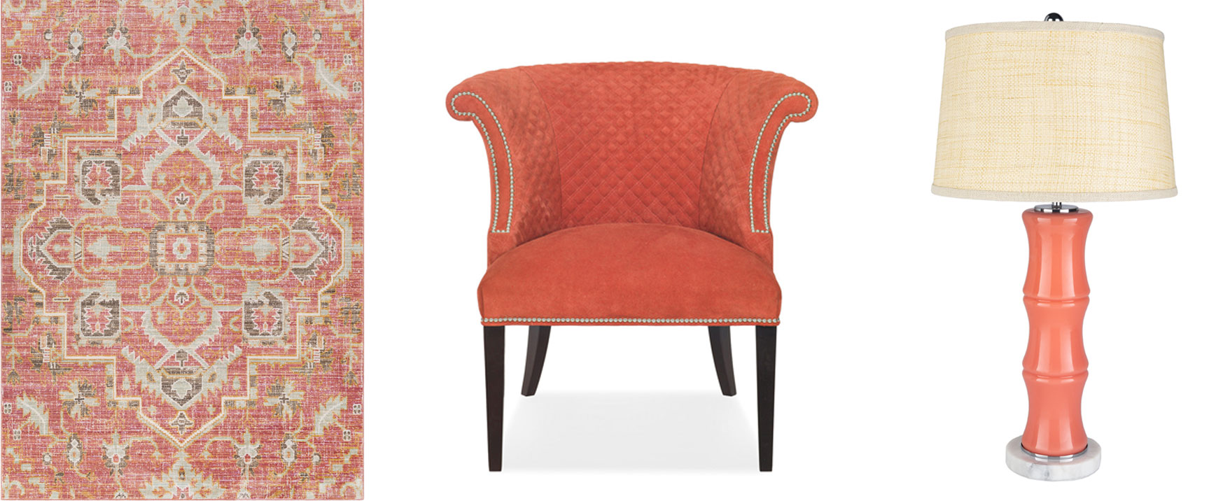
Left: Art.com. www.art.com | Center: Surya. www.surya.com | Right: CuratedKravet. www.curatedkravet.com
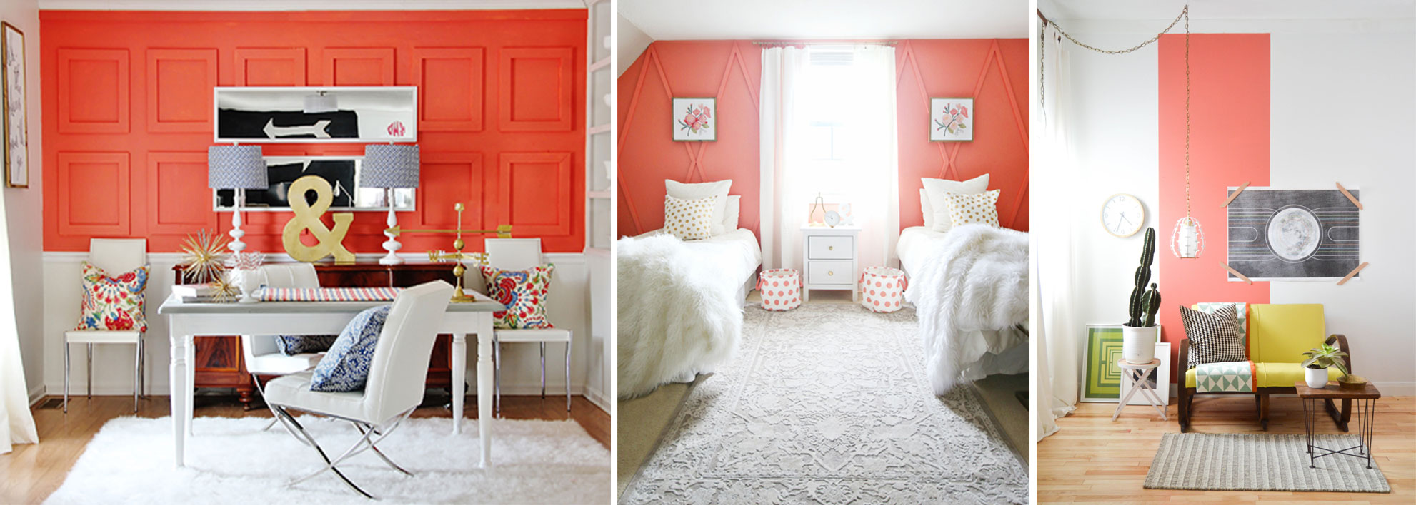
“Coral is a great accent and is often used to bring pops of color into more neutral spaces. If you want to go bold but not overcommit, try using Coral Reef SW 6606 to paint the kitchen island, as an accent wall or within artwork in the room.” Sue Wadden, director of color marketing at Sherwin-Williams. www.sherwin-williams.com
Courtesy of Sherwin-Williams
“Living Coral’s relevance in home interiors, particularly kitchens, is something that breathes life into a space and brings back color excitement. Dare I say it could even be a gateway back into red kitchens. We have started to see a rise of personal color preferences returning to cabinetry as accent areas, small appliances and décor, and this is a very usable color tone. We will likely see variations of this shade with even more intensity or in a paler range.” Stephanie Pierce, director of design & trends at MasterBrand Cabinets. www.masterbrand.com
Left: Courtesy of MasterBrand Cabinets. | Center: The Northstar line of retro-inspired appliances from Elmira Stove Works. www.elmirastoveworks.com | Right: Diva by Appiani Collection by Nemo Tile. www.nemotile.com
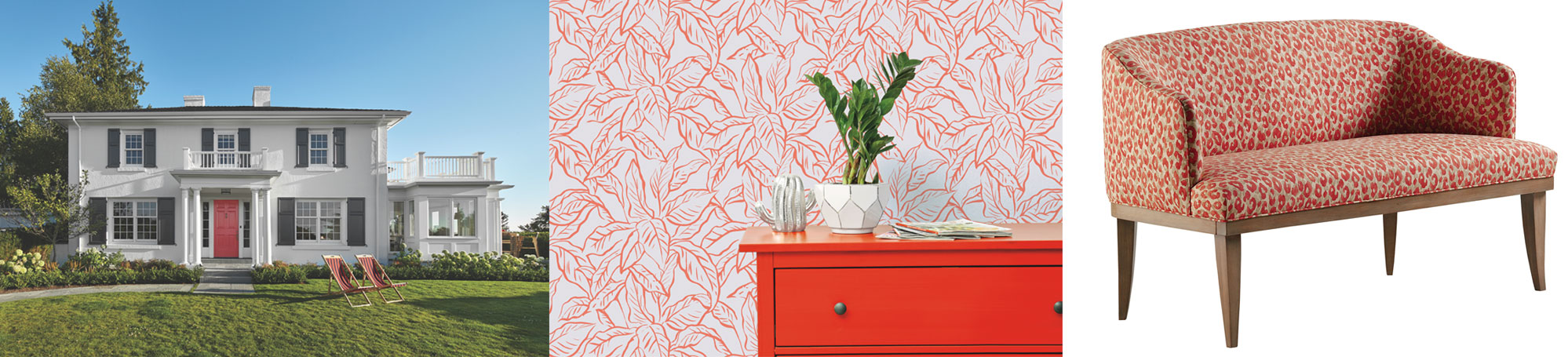
“Rather than specific design styles ruling the day, we’re seeing a preference for colors, shapes and textures that make us happy. Living Coral might be just the ‘pop of delight’ a space needs to come to life.” Christine Marvin, director of corporate strategy and design at Marvin Windows and Doors.
Left: Courtesy of Marvin Windows and Doors. | Center: Self-adhesive, removable wallpaper (Flora pattern) from NJ-based Tempaper. www.tempaperdesigns.com | Right: Pasadena Settee from Jessica Charles. www.jessicacharles.com
“Living Coral is a multifunctional color that can cater to a variety of design styles. We have seen coral tones emerging in our product development research and have brought similar hues to life … It bridges the gap between reds and oranges in a playful, lighthearted manner, making it much more commercially accessible across industries.” Satya Tiwari, president of Surya www.surya.com
Left: New rug design from Surya. | Center: The Kyra Chair in coral with nickel nailheads from Hancock & Moore. www.hancockandmoore.com | Right: Coral lamp with a marble base from Surya.