
Craving Color

Karen Wolf
Ready to hit the spring refresh button? Sometimes changing up the color scheme can be just the boost we need to invigorate our spaces. Interior designer Karen Wolf — principal and owner of Karen B Wolf Interiors in South Orange — shares some tips to consider when picking a palette.
1. When implementing color palette, the 60-30-10 approach is a great rule of thumb. Choose a combo of three colors: the base, which is usually neutral (60%); the contrast color (30%), which can be darker to create depth or lighter to create airiness within a space; and the accent color (10%), which pulls everything together to add life. The accent color is a good way to incorporate a color trend if you like it and it works with your color story or to incorporate an unexpected or bolder color that you may be afraid to commit to.
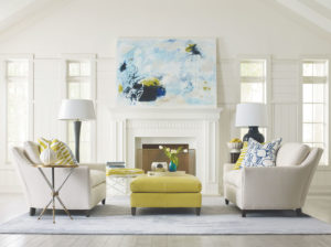
Loving chartreuse? Try it in small doses for a fresh and lively color statement. This three-color combo feels balanced with its neutral white background and bouts of blue — all derived from the high-impact artwork. Upholstery, CR Laine; artwork, Kerry Steel Art. Photo courtesy of CR Laine
2. Stick with movable, changeable elements for your color punch. Right now, dramatic and bold tile is in. While this looks great, the cost to change it out is significant. Same with colorful kitchen cabinets and unusual appliance hues. One misnomer is wallpaper. The perception is that wallpaper is expensive to remove. Unless the paper is highly textured, today’s paint primers can go right over the paper when you are ready for a change.
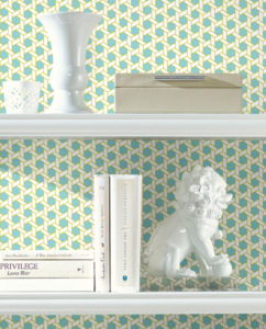
Updating the back panel of a bookcase is an easy way to bring color, texture and personality into the room if you’re not ready to paint or paper an entire wall. Wallcovering, York.
3. Consider the metals in the home and how they impact your color choice. Brighter buttery yellows may not look great with chrome, for example, but they work beautifully with warmer tones such as polished nickel or satin brass.
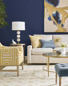
Yellow tones are given a helping of metallic warmth via satin brass accents. Upholstery, Wesley Hall. Photo courtesy of Wesley Hall
4. Try to avoid applying bold color in certain applications when the scale and space of the room is a factor. The most common use of a color pop is on an accent wall. I often discourage my clients from using an accent wall if the room is small because it will make the room appear even smaller. I also would not use a warm, vibrant color when you are trying to make a space feel larger. Warm colors advance and will close the room in more. Same with contrasting vibrant colors, which will make a space feel smaller. On the contrary, you can bathe an already small room in one deep color. This will actually make the room appear larger. I love to change up the sheen within the space to create depth, texture and volume.
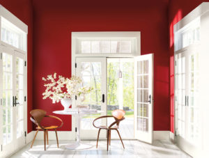
Benjamin Moore’s 2018 Color of the Year, Caliente, adds eye-catching depth to a room balanced by crisp white trim and natural sunlight.
5. A vibrant, vivid or bold statement color does not need to be primary to be impactful. In fact, the most dramatic colors are usually either highly saturated, which means they have the ability to sit on a wall rather than jump out at you, or highly tinted, which means they have been diluted with white just enough to take the edge off.
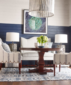
Layering the walls in a saturated blue tone lends just enough contrast to this tried-and-true color scheme. Photo courtesy of Imagine Home
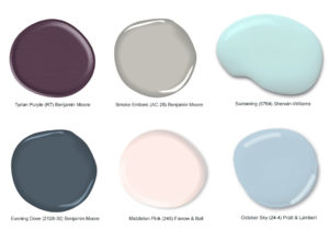
Looking for color inspiration? Here are some of Wolf’s favorite hues that when “combined with the perfect neutral, enables all colors to bounce off of it.”
Look for more of Wolf’s color tips in our June/July issue: “Tips from a Pro” Designing with Color.