
Switching Sides
Writer Marirose Krall | Photographer Brian Wetzel | Designer Ariel Fischer and Malorie Goldberg | Architect Michael A. Moritz, AIA, LEED APA new-build project in Westfield involves repositioning
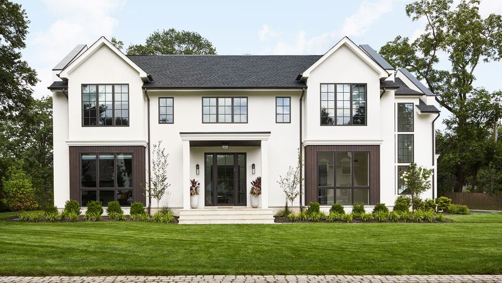
The new, 6,500-square-foot home is loosely based on Dutch West Indies style.

Michael Moritz, Founder Stonewater Architecture LLC 908-380-2496 StonewaterArch.com
THE ARCHITECT
Design NJ: What is the architectural style of this home?
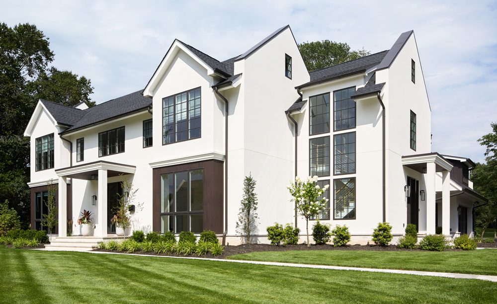
Michael Moritz: The design is loosely based on a Dutch West Indies look, which, today, is popular in certain areas of Florida. The style features white stucco, wood elements, parapets on the gable walls and roof overhangs. In this case, though, the homeowners wanted very clean lines. Dutch West Indies architecture has a lot of Colonial elements, such as decorative rafter tales and large crowns at the portico entries. We stripped all that away to create a more modern take on the style with box columns at the porticos and a facade with clean horizontal lines with no detail.
DNJ: The footprint of this home is quite unique. What was the motivation behind it?
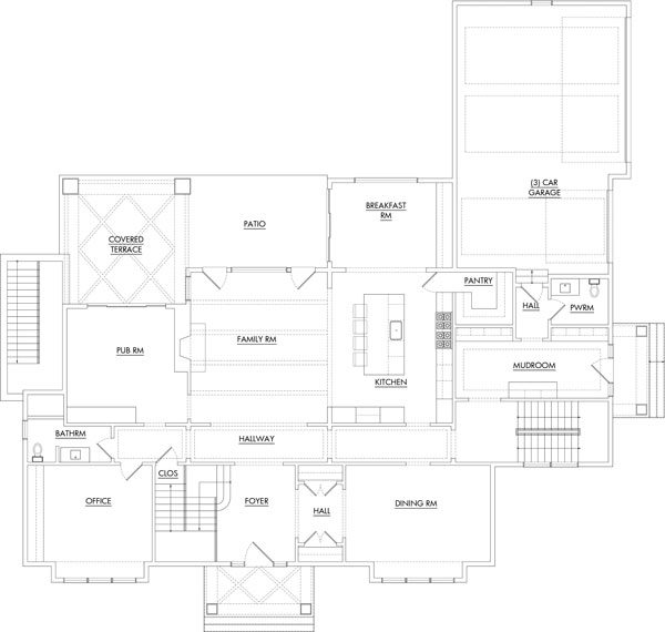
MM: The plan for the home was guided by local zoning ordinances. That was one of the bigger challenges we faced with this project. This is a corner lot situated adjacent to a main street on one side and a side street on the other. We built the house in reverse — the front door is on the side street and the garage faces the main street. That main street is where the noise is. The reversed orientation acts as a sound buffer. However, zoning guidelines indicated that we had to have a door facing the main street, so we included an entry door next to the garage bays.
In a reenvisioning of the lot, architect Michael Moritz positioned the home’s front façade facing a side street while the side of the residence faces the main street.
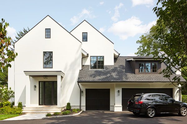
Per local zoning laws, a door was required on the main-street-facing side of the home. This side entry was designed with many of the features of a front entry, including steps, a portico and sidelights flanking the glass door.
In addition, we were not permitted to have walls longer than 25 feet on what was originally a side yard. The receding tiers on the rear of the home — which add a great deal of interest — are a response to that regulation; in essence, we had to push and pull our way around the house.
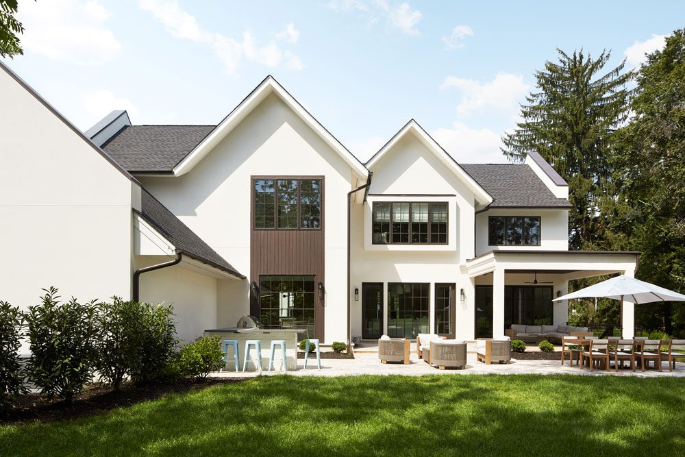
“Main spaces such as the kitchen and family room, face the backyard,” Moritz says. “We wanted it to flow; that’s why the patio is designed to be flat rather than tiered or broken up into pieces.”
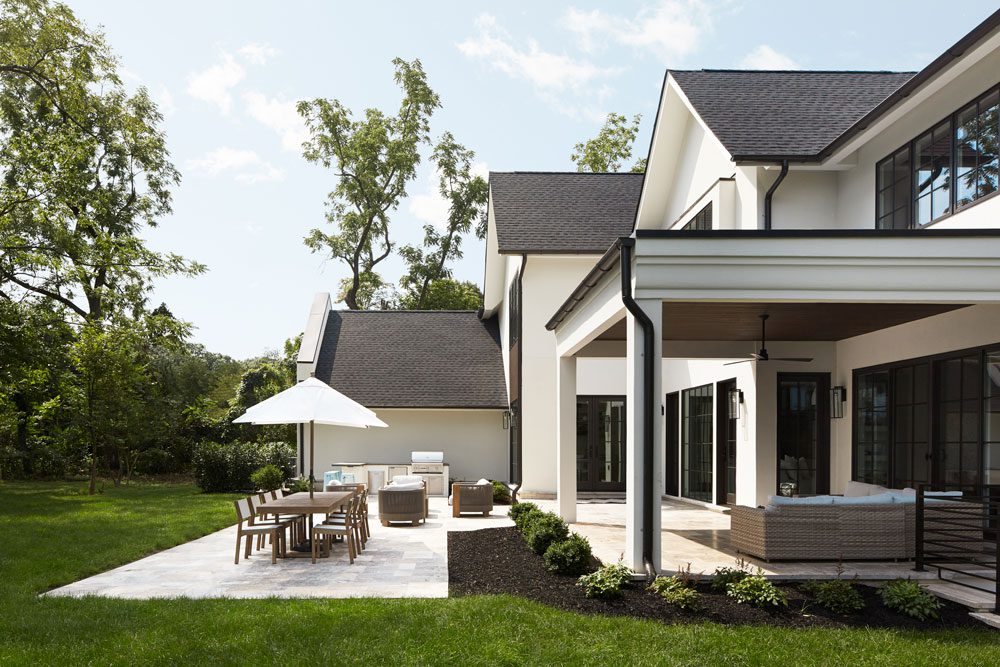
The home’s garage is situated between the main street and the backyard; it acts as a noise buffer. “Per zoning laws, any wall facing [what was formerly] a side yard cannot be longer than 25 feet,” Moritz says. So the architect designed recessed tiers to create a unique profile.
DNJ: The staircase is located on the right side of the house. What are the advantages of that location as opposed to the center of the residence?
MM: One of the main benefits is that, without a central staircase obstructing the view, there are clear sight lines from the front door straight to the back of the house. In addition, that window tower brings in a lot of natural light.
DNJ: How did the homeowners wishes and requirements inform the design of the house?
MM: The clients were great. They have a growing family and were moving from Hoboken. They like to entertain, and they wanted the home to have a layout that would be efficient for traffic circulation. We designed the house so that all the main spaces — the kitchen, family room and the pub room — face the back yard. They wanted a large patio area. That’s why we designed the patio to be flat rather than tiered or broken up into pieces.

Ariel Fischer and Malorie Goldberg
Noa Blake Design
Founders
Noa Blake Design in Marlboro
732-867-8188|NoaBlakeDesign.com
Photo: Jamie Perlowitz/Gracie Perl Photography
THE DESIGNERS
Design NJ: What interior aesthetic did the homeowners want?
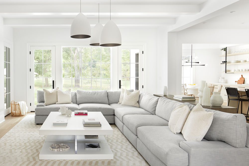
Malorie Goldberg: The homeowners are the perfect mix of poised and laid back, and we made sure that was reflected in the design of their home. Overall, they were looking for an elevated casual look — light, bright, airy and minimalist — but they also wanted coziness. That was the challenge — to make the minimalist aesthetic feel warm.
DNJ: How did you achieve that?
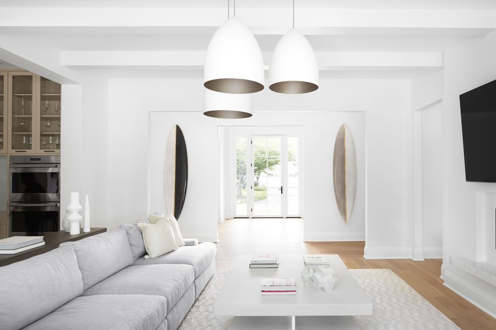
Ariel Fischer: The clients love the beach and wanted to incorporate the serene feel of the Shore without it feeling too coastal. To embody this idea, we pulled more modern elements — such as unique photographs of the beach, organic materials and boldly elegant surfboards — and mixed them with clean, fresh neutrals and tons of texture for a cozy and casual, but somewhat minimalist, aesthetic.
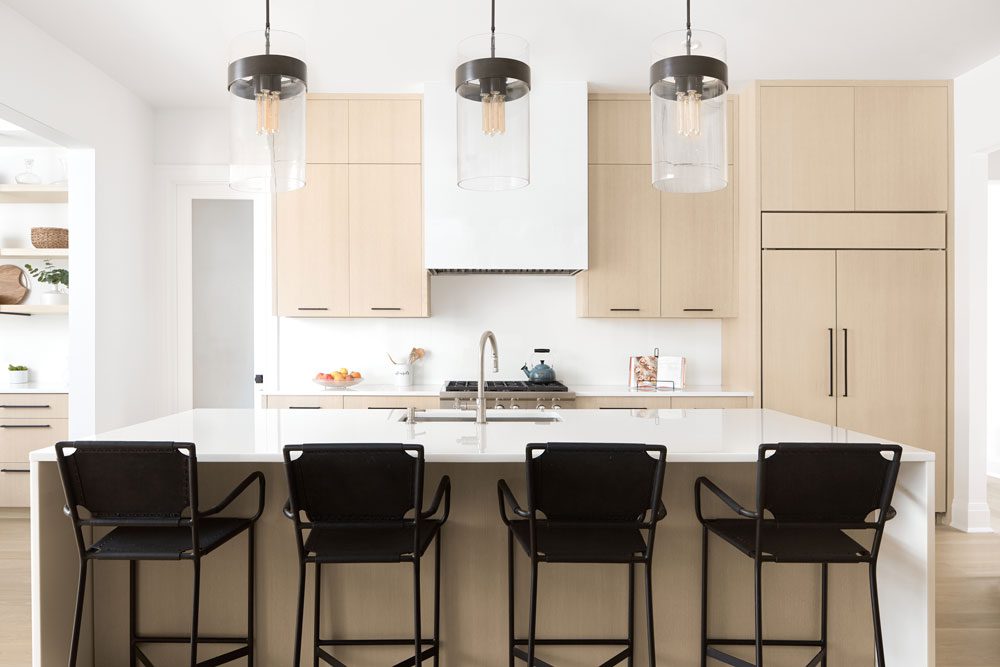
In the kitchen the homeowners knew they wanted natural white oak cabinetry. “They definitely wanted to deviate from a typical white kitchen but with something that wasn’t going to feel overly trendy,” designer Malorie Goldberg says.
DNJ: How did you enhance that aesthetic through the choice of furnishings and fixtures?
MG: It was important that the home could be well lived in and comfortable while maintaining its clean sophistication. We ensured the upholstery was plush and cozy, but we created a juxtaposition between that and very clean-lined accents, such as the modern leather and acrylic coffee table, the high-gloss kitchen table and even the metal straps on the open shelving in the kitchen dining area. Light oak elements and organic white materials such as rope, plaster and ceramic were used in smaller details like side tables and light fixtures to ensure that we added warmth and the slightest nod to being on vacation.
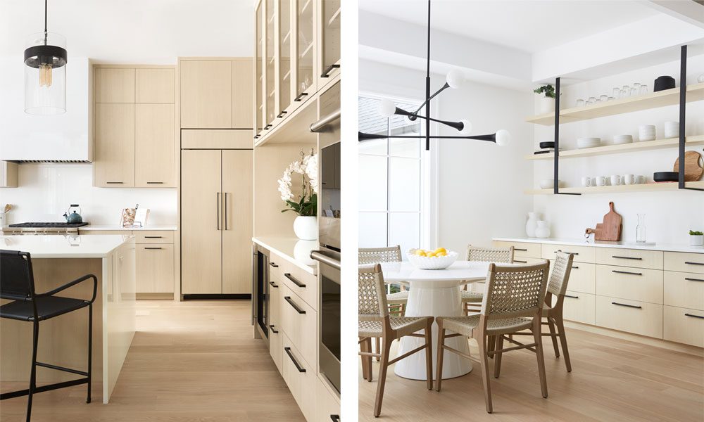
Left: The white oak cabinetry is accessorized with black hardware. “The clients wanted a little bit of a ‘cool factor,’” designer Ariel Fischer says. | Right: In the kitchen dining area, black metal straps on the open shelving and a modern black light fixture give the otherwise understated space a bit of an edge.
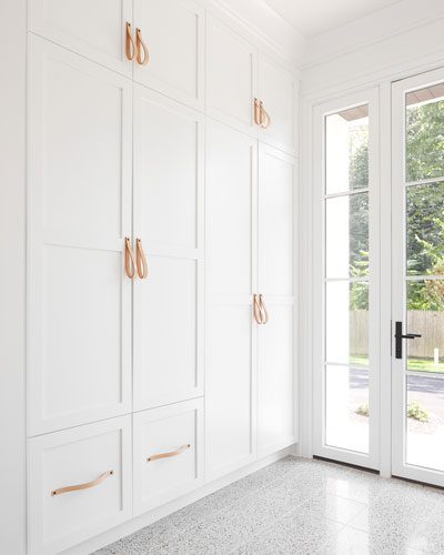
Terrazzo flooring greets those entering the home through the mudroom. The built-in cabinets feature leather pulls. “We tried to incorporate unexpected details,” Goldberg says. “That can add interest, but you don’t need to be worried about something like that getting trendy. You can change it down the road.”
DNJ: The light fixtures are all very distinctive. What inspired those choices?
AF: The homeowners were open to go bold with the lights. The ceilings are really high — 10 feet — so we had enough height to play with. The homeowners wanted to go minimalist with the furniture so we found other ways to add dimension to the space. Layering the lights gave us room to do interesting things with texture and dimension using organics such as rope and plaster and ceramic.
The architect and design teams achieved the “California Cool” aesthetic the clients sought, and the homeowners couldn’t be more pleased. The wife describes what she likes best about her new home. “I can’t pick just one: the fringe chandelier (it’s beyond gorgeous); my Jeff Trotter surfboards; my backyard. I really love everything.” She ponders a bit, then adds. “Oh, and the Bruce Springsteen picture in the office. You’ve got to have The Boss.”

Gold and nude leather strips add dimension to a spectacular light fixture in the stairwell. “It was custom built. It was a labor of love. It really had to be the perfect size for the stair tower, sit in the right place and be visible at the right scale from outside. ” says Goldberg.
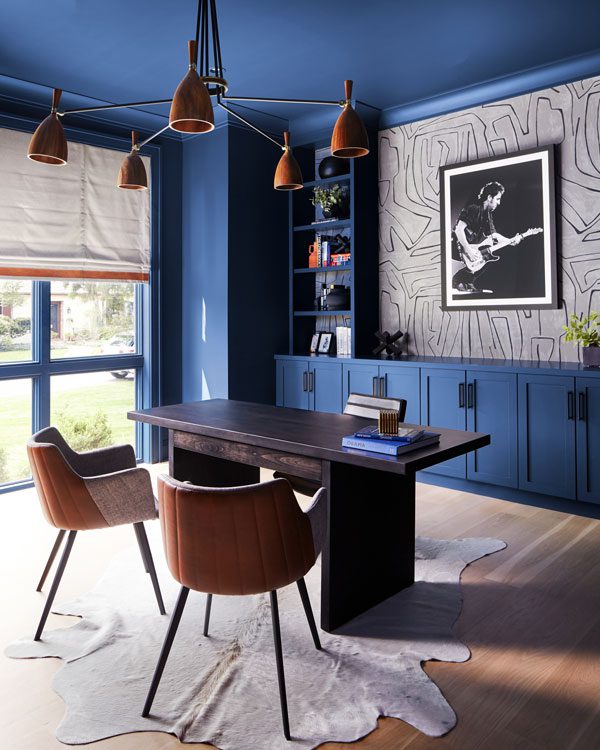
“We wanted the office to feel a little warm and moody,” Fischer says. The image of Bruce Springsteen on the wall behind the desk is a nod to the homeowner, who grew up on the Jersey Shore and is a big fan.

The vaulted ceiling in the primary bedroom is covered in the same natural white oak hardwood as the floor. “The house is minimalist with attention to detail in places you wouldn’t always notice,” the homeowner says. “I let the detail of the design be the artwork of the house. You’ll never be confused about the focal point of a room.”
The designers note that one of the challenges of the project was incorporating storage into an open and airy home for clients who wanted everything hidden. In the primary bedroom the pair solved that problem beautifully. “We made a linen closet into a focal point by recessing it into the wall and painting it the most soothing shade of green,” says Goldberg
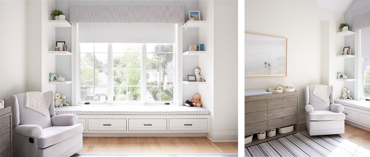
“We wanted the nursery to be super soft and soothing,” Fischer says. Artwork depicting surfers at a beach hangs above the dresser in the nursery.
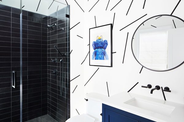
The walls in the kids’ bathroom feature faux painted confetti stripes.