
Cherry Hill Challenge
Writer Meg Fox | Photographer Rebecca McAlpin | Designer Libby Rawes | Location Cherry Hill, NJA dining room makeover in high contrast
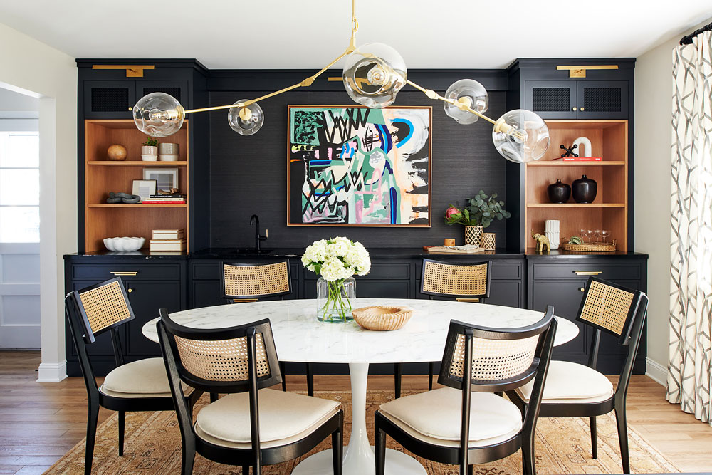
“The cabinetry is a modern spin on Shaker style” designer Libby Rawes says. The cabinetry is painted dark charcoal to give the homeowners’ colorful artwork its focal-point status. “I love the dark-on-dark look of everything and how all the dark textures and materials play together to create a really interesting piece that has a lot of depth.”
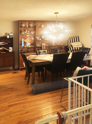
Before the makeover, the dining room housed a hodgepodge of hand-me-down family furnishings.
Shortly after moving into their split-level home in Cherry Hill, Camden County, Abbey and David Gancz began making improvements room by room, upgrading the kitchen first and stripping wallpaper and replacing dated carpet and flooring elsewhere.
When it came time to tackle the dining room — where they host Shabbat dinner every Friday — they tapped Libby Rawes, owner and principal designer of Sharp & Grey Interiors in Elkins Park, Pennsylvania. Says Rawes: “The homeowners have a modern aesthetic, and their goal was to create a cool, modern space that also felt welcoming and warm” for family and friends. They wanted a unique space that also flowed with the rest of the house and resonated with their love of dark bold colors paired with warm woods and vintage-style rugs.
The inspiration began with the couple’s artwork — a fun and colorful graffiti painting from an artist in Israel that would serve as the focal point of the room. Custom built-ins, painted in an “almost-black” dark charcoal tone, “act as a beautiful backdrop to allow the art to really be showcased,” Rawes says.
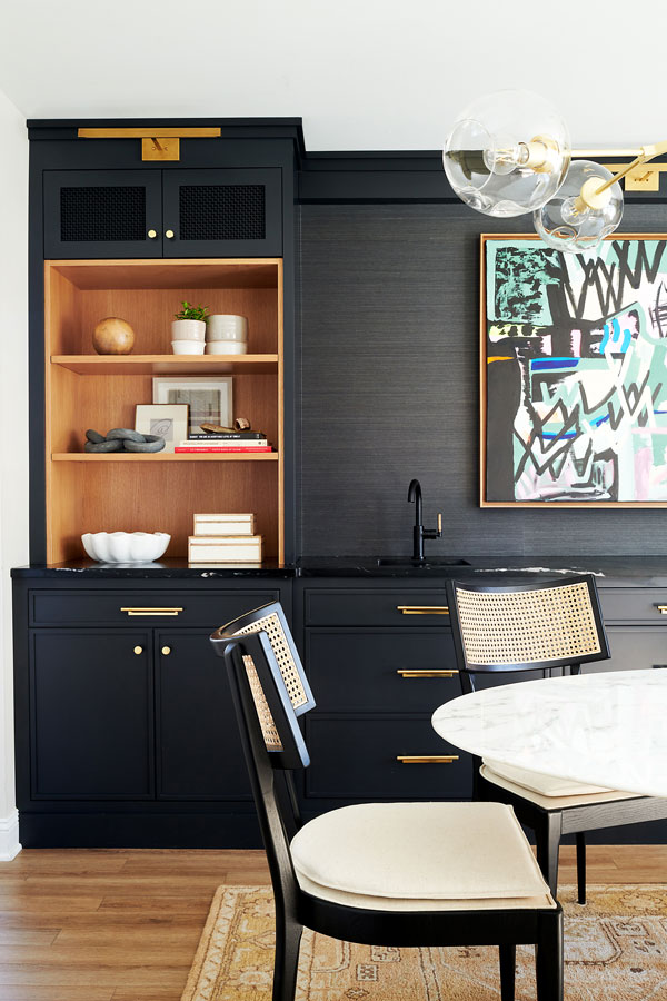
White oak inlays on tower shelving bring contrast and texture. Metal grate insets in the top cabinets tie in with caning details on the chairs and various accessories.
Details such as white oak inlay shelving on the towers “bring lightness and texture,” Rawes adds, while soapstone countertops bring a coolness with subtle veining and a slight sheen. “The texture of the grass cloth adds even more depth,” along with metal grates on the top cabinet towers that tie in nicely with caning in some of the furnishings and accessories, she adds.
The veining in the modern white tulip table juxtaposes the veins in the soapstone countertops, Rawes says. Moreover, “its oval shape cuts through and softens the straight lines of the cabinetry.” Black-framed chairs with natural caning details and light linen-look cushions “feel a touch more casual.”
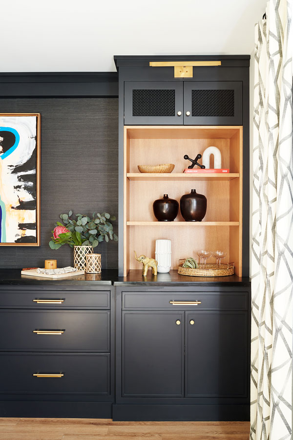
“I wanted the window treatments to bring softness and warmth to all the cabinetry and cool stone,” Rawes says. Its graphic pattern also mimics some of the lines in the vivid artwork.
Various lighting features also elevate the space. “I love how the chandelier feels branchy and almost dainty but also makes such a bold statement,” Rawes says. “It has linear and irregular qualities at the same time,” and its shape does not impact the view of the focal-point artwork and built-ins. Modern library lights in natural brass “warm up the dark paint just a touch,” she notes.
To add softness and break through some of the contrast of dark and light, Rawes brought in a vintage-style blush rug that grounds the room. Window treatments bring softness and warmth to the cabinetry and cool stone. “They feel casual and effortless with a simple ripple fold and a cool graphic pattern that mimics some of the lines in the artwork,” she says.
The makeover, undertaken during the height of Covid lockdowns, came with the challenges one might expect, including product shortages and backorders. “It was a process, given some of the delays,” Rawes says, but the homeowners — who are thrilled with the outcome — “were so patient and now use the dining room all the time to entertain family and friends.”