
Mission Statement
Writer Meg Fox | Photographer Erik Rank | Designer Wright & Robinson Architects | Architect Wright & Robinson Architects | Builder Classics RebornA kitchen remodel and mudroom addition captures the spirit of its storied past
Mark Wright, AIA and Karin Robinson | Wright & Robinson Architects | Glen Ridge, NJ | 973-566-0449 | Wright-Robinson-Architects.com | Photo by Jayne Finegan
Polly and Marc Murphy were drawn to the beautiful town of Glen Ridge, New Jersey, and the eclectic spirit of the European-style home they purchased in 2017. Built in 1910 by prominent architect Frank Goodwillie (1866-1929), there were authentic elements that endeared them from the start: gilded corbels featuring male and female faces that greet visitors in the foyer; a chimney piece that looks as though it might have been a souvenir of the architect’s travels. But it was the keys to a secretary in the home’s Craftsman-inspired library — fully paneled in quarter-sawn white oak — that revealed something unexpected: blueprints indicating Goodwillie built this home for his own family. A discovery that would inspire the Murphys to honor the home’s history in a kitchen renovation and mudroom addition seasoned by the past, but tailored for today. Architects Mark Wright, AIA and Karin Robinson, partners with Glen Ridge-based Wright & Robinson Architects, a firm that specializes in residential construction, preservation and commercial projects — often in historical contexts — took on the project with great interest and attention to detail. Wright shares how the simple, but beautiful, details found in Goodwillie’s library and the fireproof construction methods he employed would both inform and challenge the renovation in creative ways.
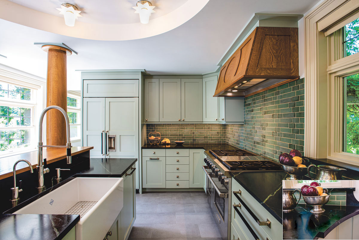
Simple pale green painted cabinetry, soapstone countertops, a farmhouse sink and cement-like flooring all pay homage to the period of the house. “We searched long and hard for a backsplash tile, which would balance the tones of the soapstone and the cabinets,” notes architect Mark Wright. Green, glazed ceramic tile delivers an “unexaggerated Craftsman-like quality.” The white oak column and custom hood, which echoes the raised ceiling’s oval motif, takes inspiration from the quarter-sawn white oak details found in architect Frank Goodwillie’s library. (INSET) Dark soapstone countertops feature prominent greenish veining and a unique curved profile.
Design NJ: This is no ordinary house. Can you provide a brief background on why Goodwillie built it almost like a fortress utilizing terra cotta block masonry in the early 20th century?
MARK WRIGHT: Goodwillie, known for his residential work in New Jersey and New York, was also renowned for his commercial work in urban centers, including New York City and Cleveland. For his own house, he chose to work with a fireproof construction system he employed on these large buildings: terra cotta block. Stuccoed, terra cotta block, bearing-wall systems are uncommon for houses of this period, but this one is even more unusual. Typically, these houses were built with wood-framed floors, which are easy to alter. For his own home, however, Goodwillie made a fireproof floor “slab” out of terra cotta block mortared to T-shaped iron bars acting in tension like the web of steel bars that reinforce modern concrete. This posed a unique design challenge for our work, in that if you were to cut one of these iron tees, the floor slab system could start to “unzip” and become unstable.
DNJ: What were the overriding issues with the existing kitchen and what did the Murphys hope to gain from the renovation?
WRIGHT: Laid out in a tight, dead-end “U” configuration, the existing kitchen was all but unworkable. There was a built-in table, but it would only seat three in any comfort. Their objectives were to eliminate that arrangement and improve working flow; provide counter seating for six and views of the bird feeders just outside the middle windows; make the kitchen appear as large as possible; and create a mudroom with overflow pantry space. On our end, we intended to respect the transitional Craftsman character found in Goodwillie’s library so that the kitchen they were investing in would not look dated and disposable.
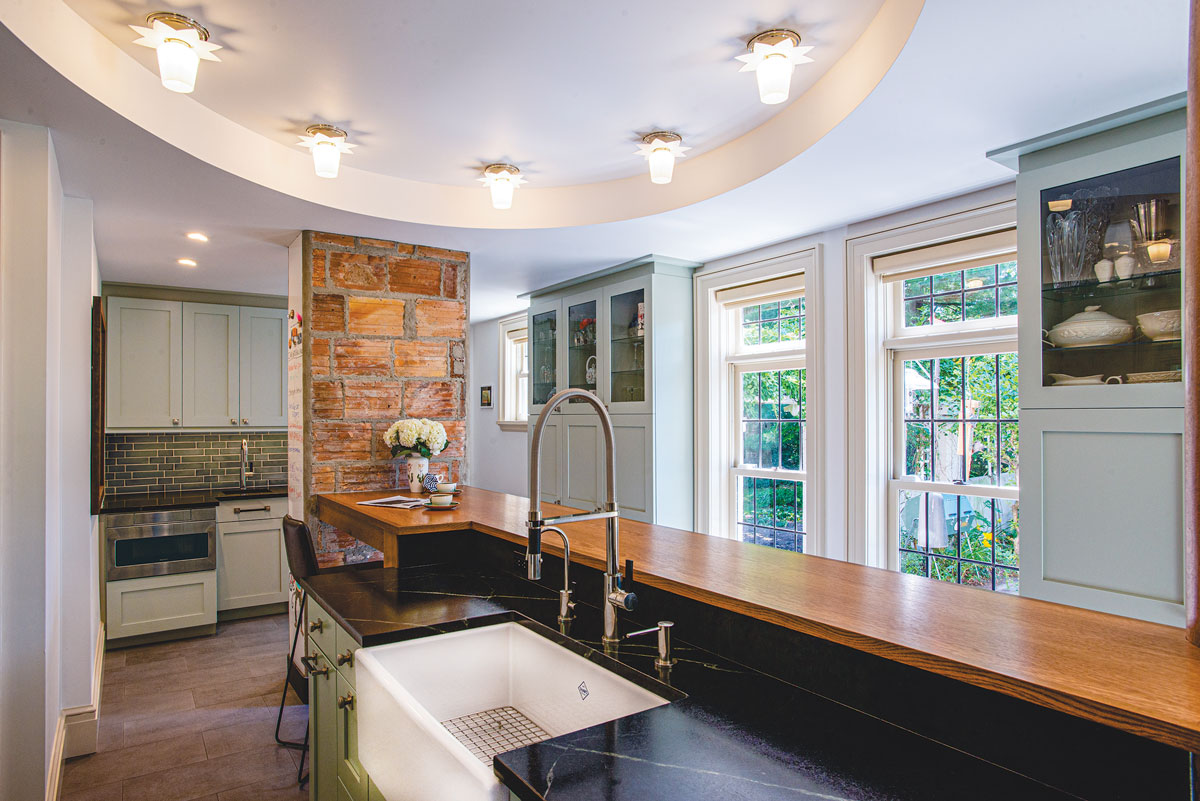
The kitchen’s new loop configuration is organized around a generous island that comfortably seats six; a convenient wet bar with an under-counter microwave drawer and wine fridge; and two floor-to-ceiling pantries flanking views of the bird feeders beyond.
DNJ: Was there anything left to salvage?
WRIGHT: The original service kitchen, butler’s pantry, ice-room, storage pantry and back porch had been demolished long ago, so there was no original fabric to conserve other than the rough terra cotta masonry and existing windows. We did elect to retain an existing structural steel column and the ceiling.
DNJ: Were moving or replacing those structural components not considered viable options?
WRIGHT: Any new beam strong enough to both do away with the steel column and adequately support the heavy masonry structure above it would have been quite large and would have seemed to divide the room in two. Also, we actually relished the prospect of making a new custom white oak jacket for the steel, and so we persuaded Marc and Polly to accept the relatively low ceiling and leave the existing steel in place.
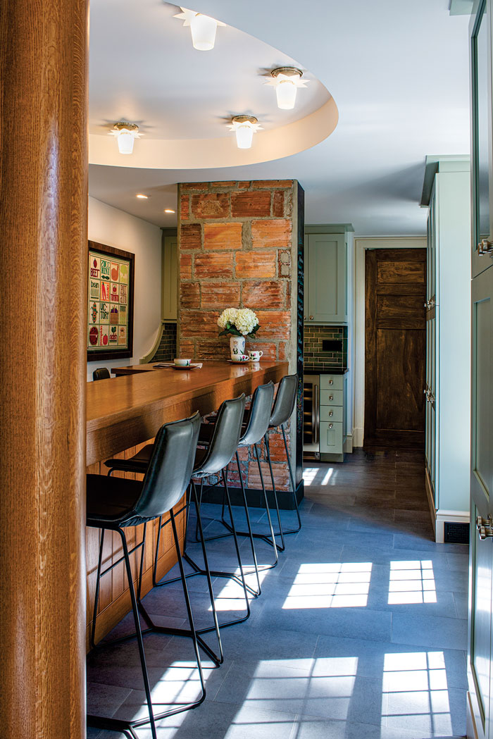
The raised oval ceiling with small, evenly spaced custom light fixtures, “was architectural genius,” homeowner Polly Murphy says. Not only does it draw the eye away from the heavy structural elements in the room, “It always shows up great on Zoom meetings,” she adds lightheartedly. The door leads to a formal dining room.
DNJ: You created the illusion of height with a recessed ceiling detail. Describe the effect.
WRIGHT: A new raised oval centers the space, and at 8 to 9 inches high, it seems lofty by comparison to the rest of the ceiling. This oval is twisted to align its long axis on the diagonal of the room and the deepest bellies of its curves center on the two offset window alignments: the existing pair — for bird watching next to the feeders — and the new window next to the range. This new window introduces afternoon light and allows good cross ventilation. The geometry of the oval is reinforced with evenly spaced custom light fixtures. There is no light or other feature at its center, which allows for a more casual disposition of working countertop and dining surface beneath it. We repeated the oval motif on the custom white oak range hood.
DNJ: The kitchen is now a model of efficiency. Briefly describe how you improved the workflow and added needed function?
WRIGHT: The challenge was to design a space where the person cooking did not feel trapped, where meaningful help could be offered and accepted, and where the entire family could happily spend time. This meant organizing the kitchen as a large loop around an exceptionally generous island that would comfortably seat six but allow smaller groups to sit opposite one another and talk. We sought to avoid the sort of island setup where family members are arrayed like customers opposite a short-order cook. Contrary to our usual practice, in this instance, we set the island top at two heights. The working, waterproof stone top and sink are at standard height, shielding the inevitable mess in the deep sink from view. Other amenities include a larger professional style range with two ovens, a bigger refrigerator/freezer, full-height storage cabinets and a useful wet bar arrangement. The new mudroom also offers generous pantry space.
DNJ: Describe the defining features on either side of the island.
WRIGHT: The long, high wood top is anchored at one end by the new white oak column, and at the other with the exposed mass of terra cotta blocks that became the family’s analog communication center. This block volume is finished on its more exposed “formal” side with an antique black chalkboard Polly’s parents had salvaged from a schoolhouse and kept in their Iowa barn for many years. On its less visible, more informal side, the slate is matched with a whiteboard where magnets and family art can come to rest.
DNJ: The exposed terra cotta block chimney flue is a testament to the home’s history. Did you or the homeowners ever consider concealing it?
WRIGHT: We were of two minds. We felt it should either be cleaned and exposed to reveal the highly unusual construction of the house, or coated with rough stucco with rounded corners. We never considered enclosing it either with gypsum wallboard or trim in imitation of the cabinetry. The final result has it both ways: the terra cotta block faces are exposed and the irregular demolished ends were capped with rough stucco and the inset of slate. The result feels almost monumental and avoids a simplistic, “exposed brick” look.
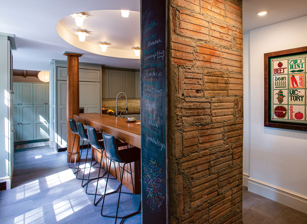
The long, wood top island is anchored at one end by the existing column, now wrapped in white oak, and at the other with the exposed mass of terra cotta blocks. “Now we can point to the terra cotta construction” as part of the home’s history, Polly Murphy says. “We love this house. We think we were gifted to take care of it.” One side is finished in an antique chalkboard that Murphy’s parents salvaged from an old schoolhouse in Iowa. “It now functions as a modern communication center,” she says. The framed needlepoint display at right—crafted by Murphy and her sister—is another family heirloom. “Victory Gardens are a thing again,” she laughs.
DNJ: What other elements speak to the home’s heritage or Craftsman spirit?
WRIGHT: In 1910, Goodwillie’s kitchen was considered a utilitarian space that was carefully isolated from the rest of the household. We believed that the new kitchen should retain some of this flavor by using simple painted cabinetry, blended with fancier elements like quarter-sawn white oak— matching the woodwork in Goodwillie’s library — that would make it feel congenial as a family space. Warm-to-the-touch soapstone countertops, often used in the 19th and 20th centuries, have a lovely, kindly quality and the backsplash has an unexaggerated Craftsman-like feel. We were all inspired by the inherent toughness of this masonry house and since the floor of the original service wing looked like concrete, Marc and Polly elected to recall this feature with indestructible, concrete-like porcelain floor tiles.
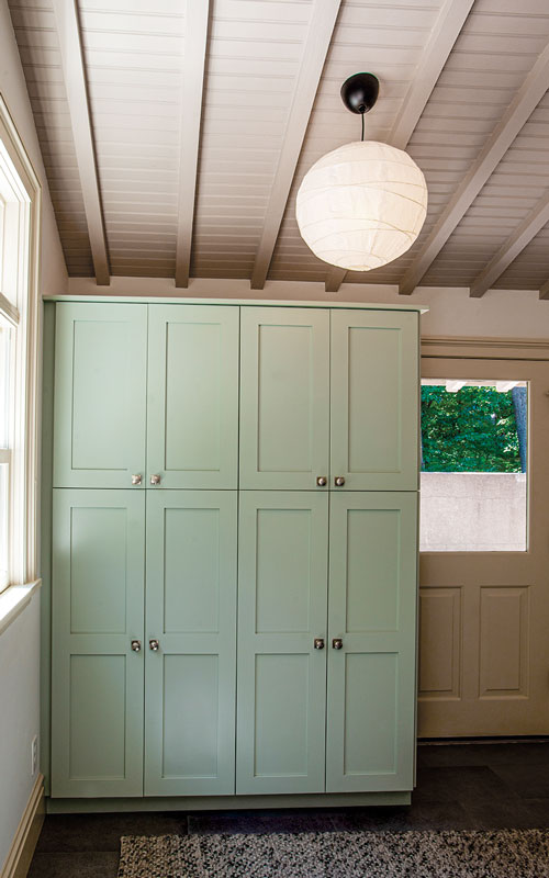
The new mudroom, which houses accessible pantry storage, “exposes the extra-wide rafters used to match Goodwillie’s carved rafter tails on the home’s exterior,” says Wright. “Our choice of simple paper lanterns allows the wooden ceiling to feel like the room’s principal ornament.”
DNJ: How would you describe the tone of the painted cabinetry? And what role did the homeowners play in selecting assorted finishes?
WRIGHT: Polly has an exceptional eye for color. She was trained by her mother, an artist, who would use color-wheel exercises as a kind of game with her daughter. She was a terrific collaborator. For the cabinetry, we began with Marc and Polly’s preference for a pale green. It needed to be calm and “grayed out,” but still distinctly green — unassertive and easy to live with — but not drab. It also had to read as colorful both in sunlight and under 3000K LED. The color we settled on is Benjamin Moore’s “Comfort Gray,” which sounds simply awful but works beautifully in the space, day and night.