
A Calming Place
Writer Denise S. Valenti | Photographer Peter Rymwid | Designer Jackie Currie-Taylor, Allied ASID | Location Colts Neck, NJ-
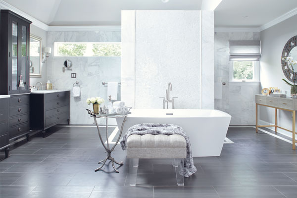
Placing the shower in the center of the bathroom created a striking focal point. The outer wall of the shower, covered in a marble-tile mosaic, is an elegant backdrop for the freestanding bathtub.
-
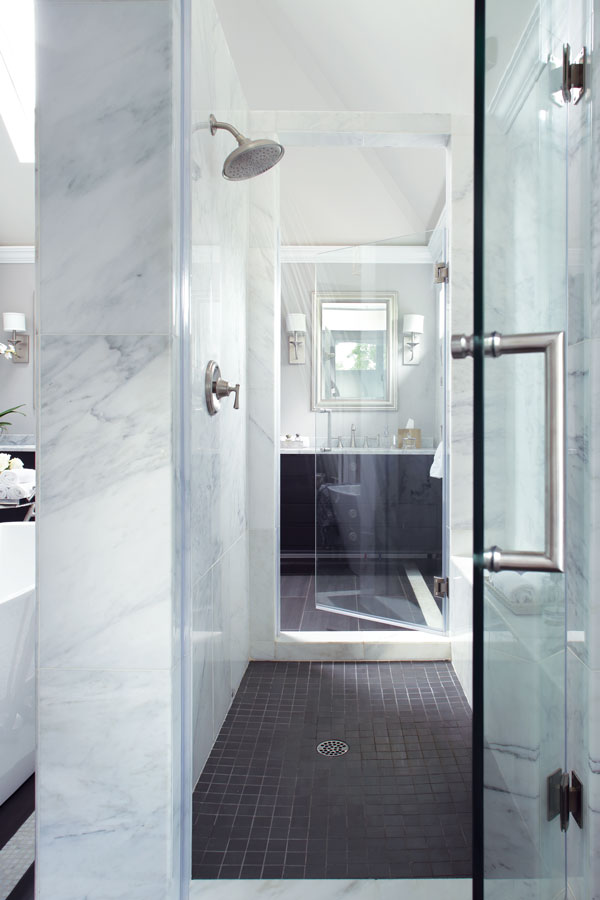
The shower stall has access from both sides of the bathroom and is open to the vaulted ceiling above.
-
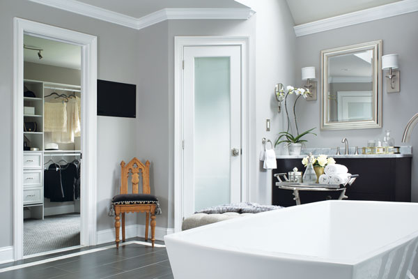
The toilet is hidden behind an angled doorway in one of the hexagonal corners of the bathroom, making economical and elegant use of the awkwardly shaped space. There’s also direct access to the walk-in closets.
-

The bedroom is serene but well defined with eclectic accents that add personality, including a box chandelier and three-legged side table.
-
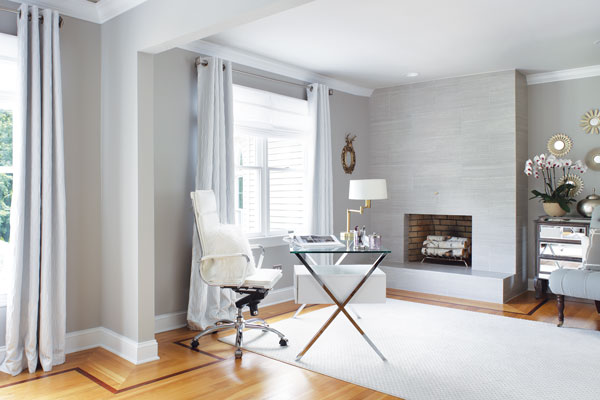
The homeowners are European and sometimes work with overseas clients into the late hours. A bedroom workspace allows convenient access to their computer without detracting from the overall design.
-
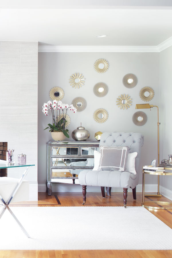
Designer and homeowner Jacqueline Currie-Taylor loves mixing modern and traditional furnishings, especially strong accent pieces that add punch.
-
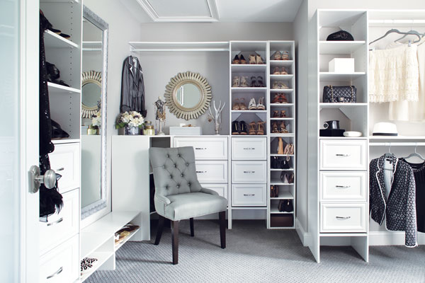
His-and-hers closets were extended to provide additional shoveling and drawer space. The wife’s closet (shown) includes jewelry drawers, shoe cubbies, a chair and full-size mirror.
-
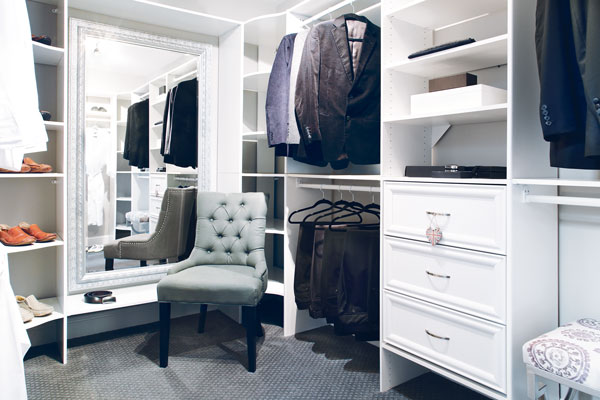
The husband’s closet also includes a chair and full-size mirror, and both closets were outfitted with a mix of long-hanging space, short-hanging space, drawers and shelves.
The solution to making an oddly shaped Colts Neck bathroom more user-friendly begins with a new walk-through shower.
Interior designers draw inspiration from many places. Sometimes they’ll launch an entire design scheme from a single color, fabric or piece of furniture. Other times it’s an overall motif or vibe that sparks their imaginations. Less often do they begin by solving an organizational problem within a space, but that’s where Jackie Currie-Taylor began the redesign of the master suite in her Colts Neck, New Jersey home.
Owner of GravitateTo Interior Design and an allied member of the American Society of Interior Designers, Currie-Taylor was confounded by the odd, somewhat hexagonal shape of the master bathroom along with its vaulted, double-height ceiling.
“Everything in here was pushed against a wall,” she says. The positioning of the shower, toilet and vanities was far too economical for a room of its size. It was, in fact, a terrible waste of space that left an enormous void in the center of the room.
The shower was a walk-in tucked in a corner with poor lighting. With gray walls and floor, it was hardly welcoming. Then there was the irregular shape of the room itself, lacking symmetry or any real geometric sense.
The Solution
Currie-Taylor’s epiphany for addressing her design conundrum came one day while exploring a bath and tile showroom where she saw a striking freestanding shower with a single wall. With the high ceilings in her own bathroom, she knew she could build a similar structure in the center of the room. But when she did some research, she found one panel would be too heavy and unstable—it would need some support.
Instead, she designed a stall with two joined Carrera marble walls and a floor with drainage. It can be accessed from both sides. Standing majestically in the middle of the bathroom, the shower is a natural focal point, with a marble mosaic running the full height.
From there, Currie-Taylor worked her way out into the room. She placed a freestanding tub in front of one shower wall for added visual impact. “I wanted it to give a luxury feeling to the room,” she says.
Adding Contrast
She could have gone for an all-white bathroom, but opted instead for some contrast on the floors, which are fitted with dark gray porcelain tiles accented with a four-inch marble mosaic border. The border traces along the lines of the room, the shape of which was adjusted slightly and improved with the installation of angled doors. One of the doors conveniently hides the toilet.
The rest of the design was far more straightforward. Currie-Taylor didn’t want a clinical-looking bathroom, so she placed transitional-style vanities and a hutch along one wall and a console table along the opposite one. A mixture of brushed silver and brushed gold fixtures gives the space an eclectic feeling and keeps the bathroom from being too “matchy-matchy,” she says.
The designer conceded to her husband on one point and added a television that is visible from the bathtub (she admits to using it more than she thought she would). The only structural change to the space was the shifting of one wall to expand the his-and-hers walk-in closets that are accessible from the bathroom. “It’s a really good layout because the two closets are directly off the bathroom,” she says. “You’re not walking back into the bedroom for things.”
Finishing Touches
The bathroom, closets and the master bedroom are well integrated as a master suite, with similar colors and materials. The rooms are primarily white and gray with hints of purple, particularly in the soft furnishings. The bathroom and bedroom both have the same type of goldtone box chandelier. She also switched the stone face of the fireplace in favor of a sleeker gray porcelain tile.
In the master bedroom, Currie-Taylor found more freedom to design from the hip, punctuating the look of the room with strong accent pieces and accessories. “I don’t like to stick to old-school design,” she explains. “I like to mix a little bit of modern with the traditional.”
Her ability to think outside the norm was where the master suite got started, but the end result remains a classic. “It’s a very calming space,” she says. “It’s also very orderly. You want to spend time there, relax, chill out.”
Denise S. Valenti, a regular contributor to Design NJ, is a Cranford-based writer.